About this book
To cite this book, please use the following.
Frazier, Tyler James. (2021). Data Ekistics: Data Science for Human Communities and their Settlements. Williamsburg, Virginia: William & Mary / Data Science Series IA. https://tyler-frazier.github.io/dsbook/
For more about the author please see this webpage.
Preparations
description: >- Create a GitHub site that will use to populate with results from your geospatial data science investigation on your selected LMIC and administrative subdivision(s).
Getting started with GitHub
Through the course of this semester you will use GitHub as a repository to save and share your work. GitHub uses a fairly simple programming language called markdown which you will use to present content you have created. Upon completing your different GitHub sites, I will ask you to post a link to your website on the appropriate slack channel #data1X0_ prior to the given deadline.
To begin go to https://github.com and create a new account. You should see a website that is very similar to the following image.

After clicking on the sign up link, create your account by designating your username, e-mail address and password. In order to simulate the process of signing up, I am using the username wicked-problems. My real GitHub account is https://github.com/tyler-frazier, and you are welcome to follow me, although it is not necessary for this final project.
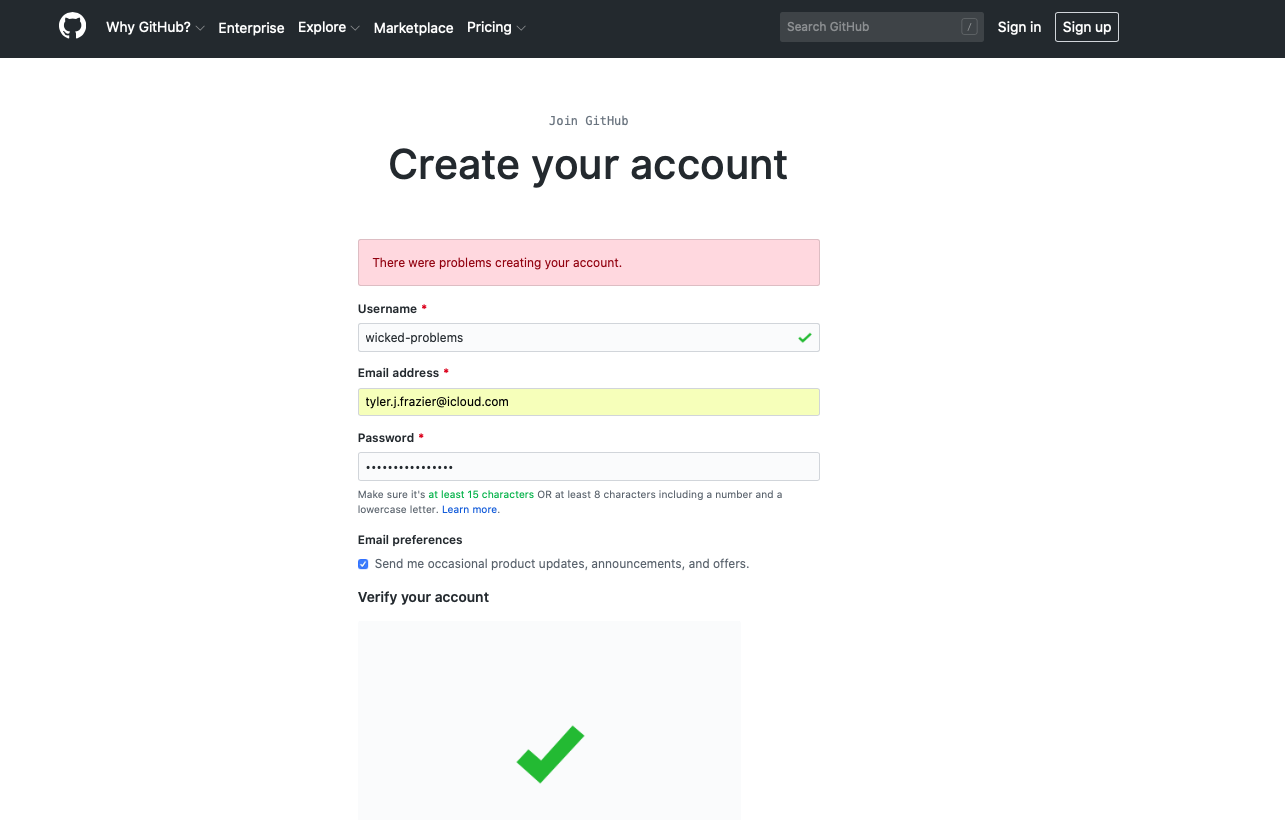

After creating your account, you should receive an e-mail asking to verify your account. Go ahead and verify, so GitHub can permit you to create a new repository. Once you verify your e-mail address, GitHub will likely ask if you want to create a new repository. If somehow you are not automatically asked to create a new repository, it is also possible by selecting the + pull down arrow in the top right corner of the page.

You will also notice that there is a guide made available for new users (the green, read the guide tab). This is really good guide to read, in order to learn how to use GitHub as a version control system. Although you will be using only a small amount of GitHub's full potential for this final project, I highly recommend making a mental note of the guide and returning to the 10 minute read when you have some time. If you are planning to major or minor in data science, computer science, or any discipline that has a signficiant compuational component, it will be very likely that at some point in the future you will need to use a version control system (such as GitHub) for repository control, sharing, collaboration, conflict resolution etc...https://guides.github.com/activities/hello-world/
Create your first repository. In the following example I have named my repository workshop.
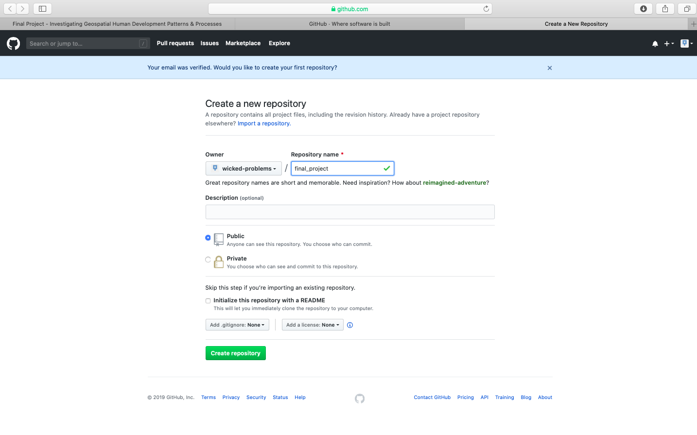
After creating your repository, go to the main page for your repository. You should see a quick setup script under the code tab. Click on create a new file under the quick set-up at the top of the page in order to populate your newly created repository with a file named README.md. The .md extension after the filename is the extension for a markdown file. Markdown is a simple, plain text, formatting, syntax language which has as its main design goal, as-is readability. It is a relatively simple language that will enable you to program webpage content fairly easily.

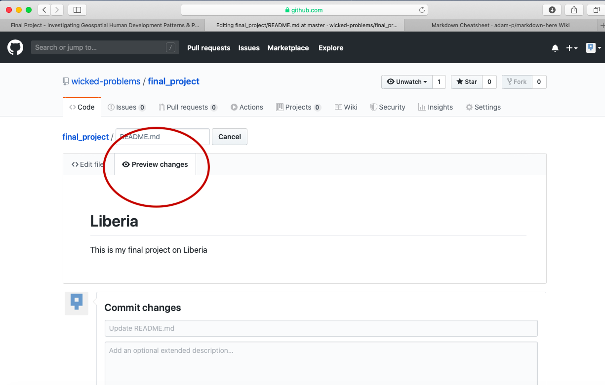
This should bring you to a new page where you are able to create a new file. In order for your GitHub Pages site to function properly, you will need a README.md file in the root folder of your repository. Below the field for the file name is the markdown file body, where you will type your script. Add a first level header to your README.md file by adding one # and following it with your title.

You can also preview the output from your markdown file, by clicking on the preview changes tab.
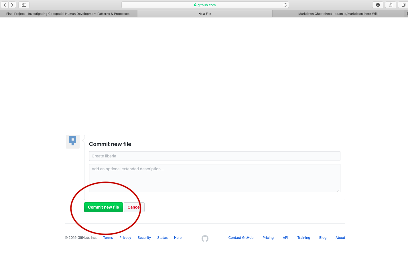
After typing the simple markdown script, scroll to the bottom of the page and click on the green commit button, to commit your file to your repository. You will need to press this green button, each time you edit the content within a file or add new files to your repository. By making a new commit to your repository, you are essentially updating all of the changes you had previously made. While in the case of your final project, there is essentially only one person executing changes per repository, potentially a version control system has the power of resolving conflicts amongst multiple persons all committing changes to the same file simultaneously. That is the power of a version control system, such as GitHub.
To begin getting an understanding of how to use markdown, have a look at the following cheatsheet. The two main areas to note are how to use headers and then a bit further down in the cheatsheet, how to produce tables.
{% embed url="https://github.com/adam-p/markdown-here/wiki/Markdown-Cheatsheet" %}
For the final project, you will only be using headers, paragraph text and inserting images. After having a look at the markdown cheatsheet, return to the main page of your repository, which should appear similar to the following image. After navigating to that location, click on the settings tab in the top right hand corner.

Scroll down to the GitHub Pages section under settings and change the page source from none to master_branch.
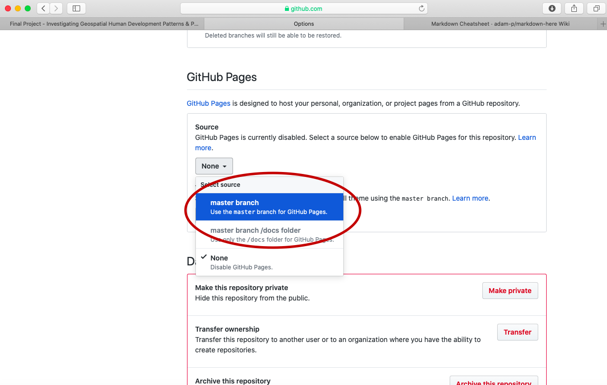
After setting the branch where your GitHub Pages files will reside, also select the theme tab and choose one of the available themes. I chose the theme Caymen for my page, but you are welcome to select any of the available themes for your final project. After, selecting your theme and returning to the GitHub Pages section, you should notice a web address appear where your site has been published. It might take a few moments for your webpage to appear, but not more than 10 or 15 seconds. Usually it updates and publishes almost immediately.
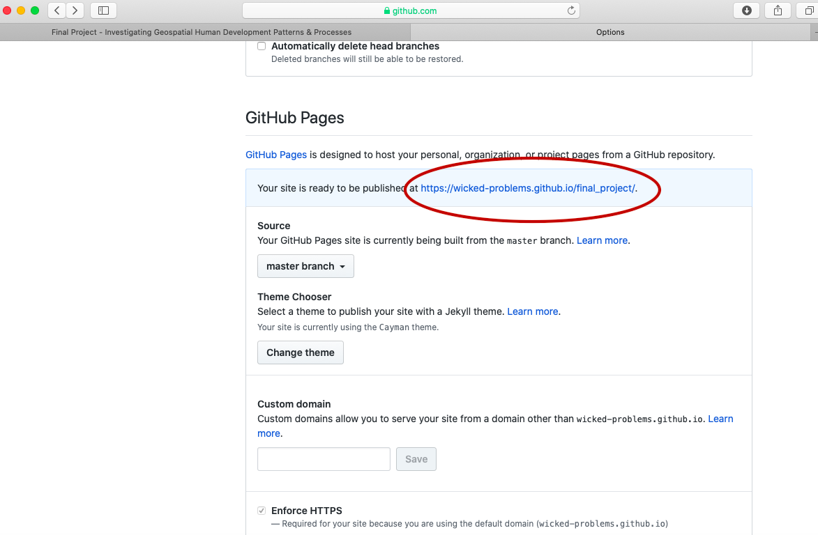
After clicking on the link, the newly created webpage that you will use to publish the results from your investigation should appear. To start making changes to your website, go back to the main page of your repository and select the upload files tab.

This should bring you to a page that will enable you to upload the images you have produced from each of the previous projects. The interface should appear similar to the following image. You can simply drag and drop images directly through the GitHub upload files interface.

I will begin by dragging and dropping a few of the plots produced that describe the administrative subdivisions of Liberia as well as the spatial distribution of it's population.
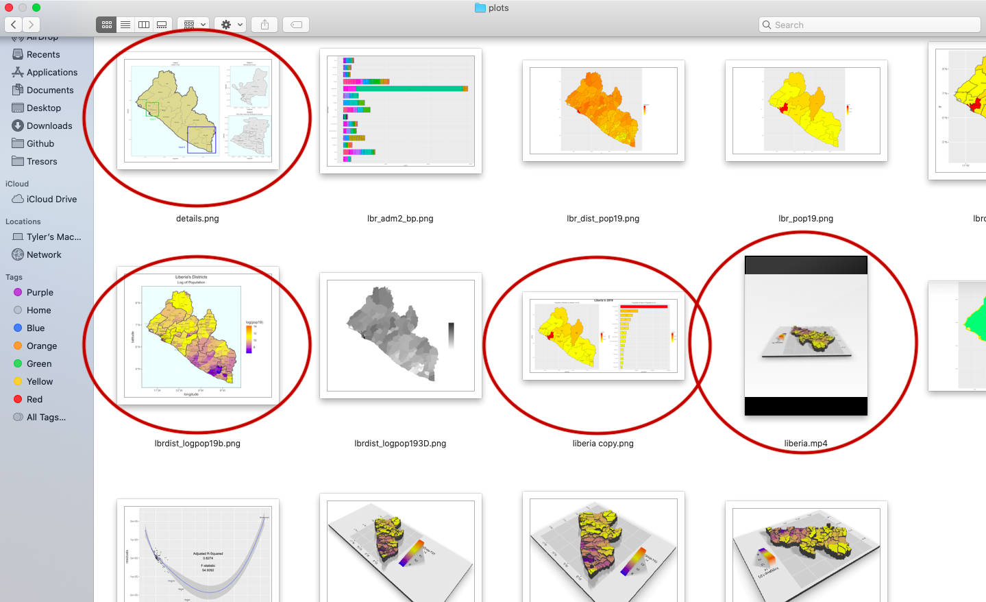
After dropping the files into my repository, the basic file structure appears as follows.
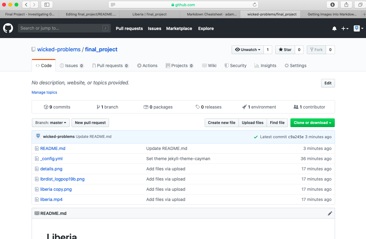
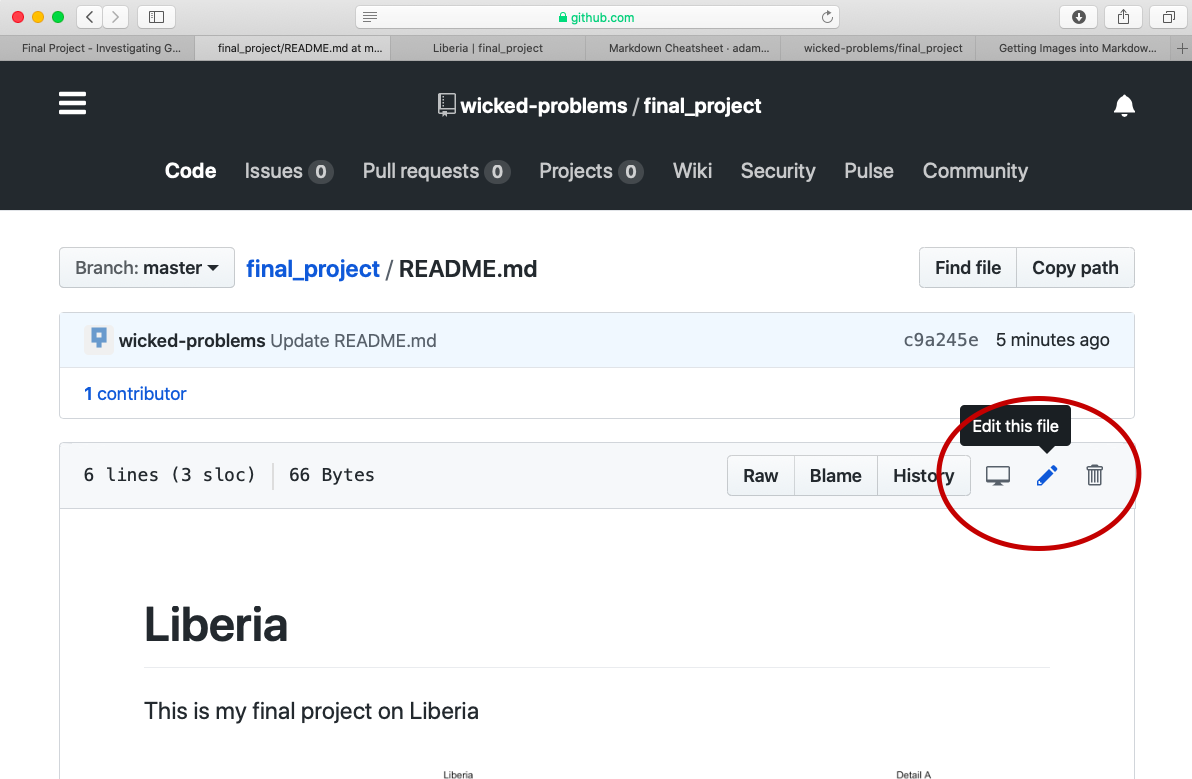
To add the image details.png to your README.md file, first select the README.md file, and then select the pen image in the upper right hand side of the screen to begin editing the content you already saved to your markdown file.
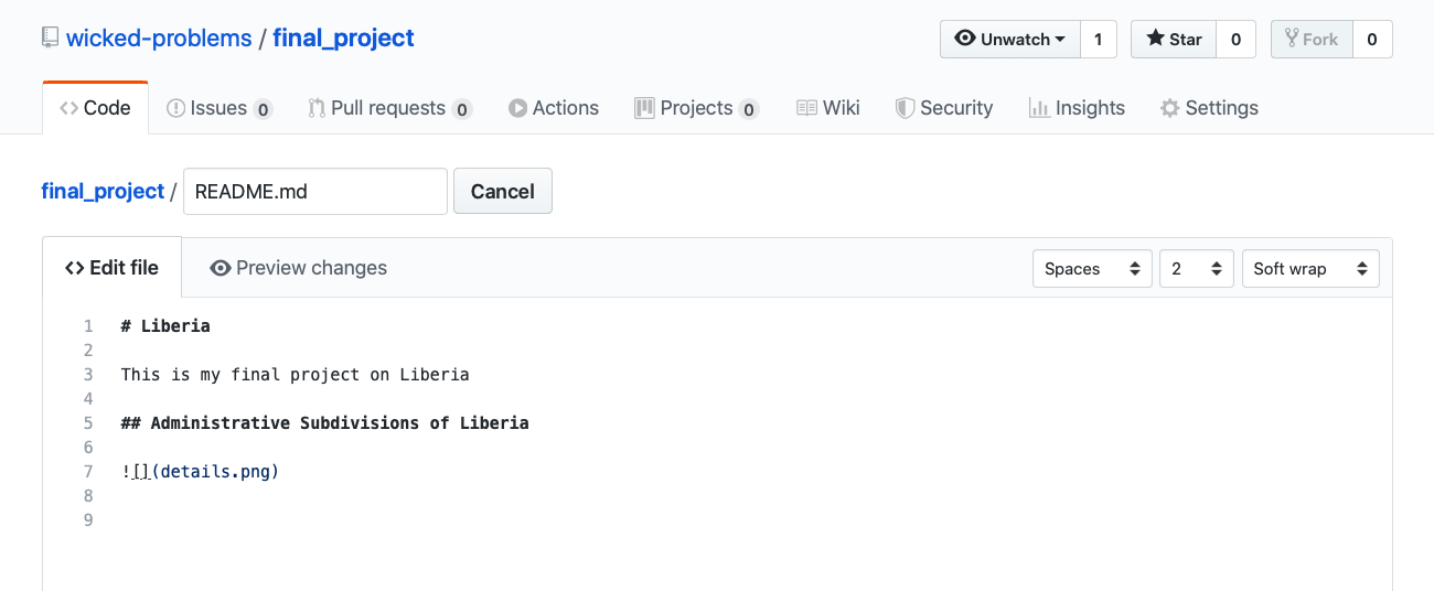
After opening up the markdown file editor, add a second level header by preceding the text with two ## and then add your image by adding a ![] in advance of the file name details.png , which is contained within () . Don't forget to scroll down to the bottom of the page and click on the commit button to make sure the changes you have made to the file are properly committed to the repository. If you do not commit your changes to your repository, your file will not have been saved nor will your webpage updates be published.
After committing the changes and waiting a few moments, your changes will appear to the published webpage.

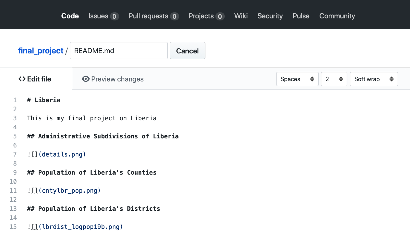
After adding your map that describes the political subdivisions of your LMIC, also add your description of population as spatially distributed at different adm levels.
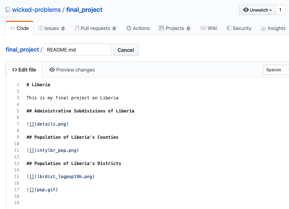
If you created an animated video, such as a .mp4 file that rotates and describes population in three dimensions, you will need to convert that file to a .gif in order to include it in your project webpage. This is fairly easily accomplished by using an online conversion tool. I simply entered "online conversion of mp4 to gif mac" into google, and the search engine returned several possible options, such as https://ezgif.com/video-to-gif, among many others. After converting your .mp4 to a .gif , upload the file to your repository and include it as an image in your markdown file, just like the other images.
Which will produce the following image as part of your webpage.
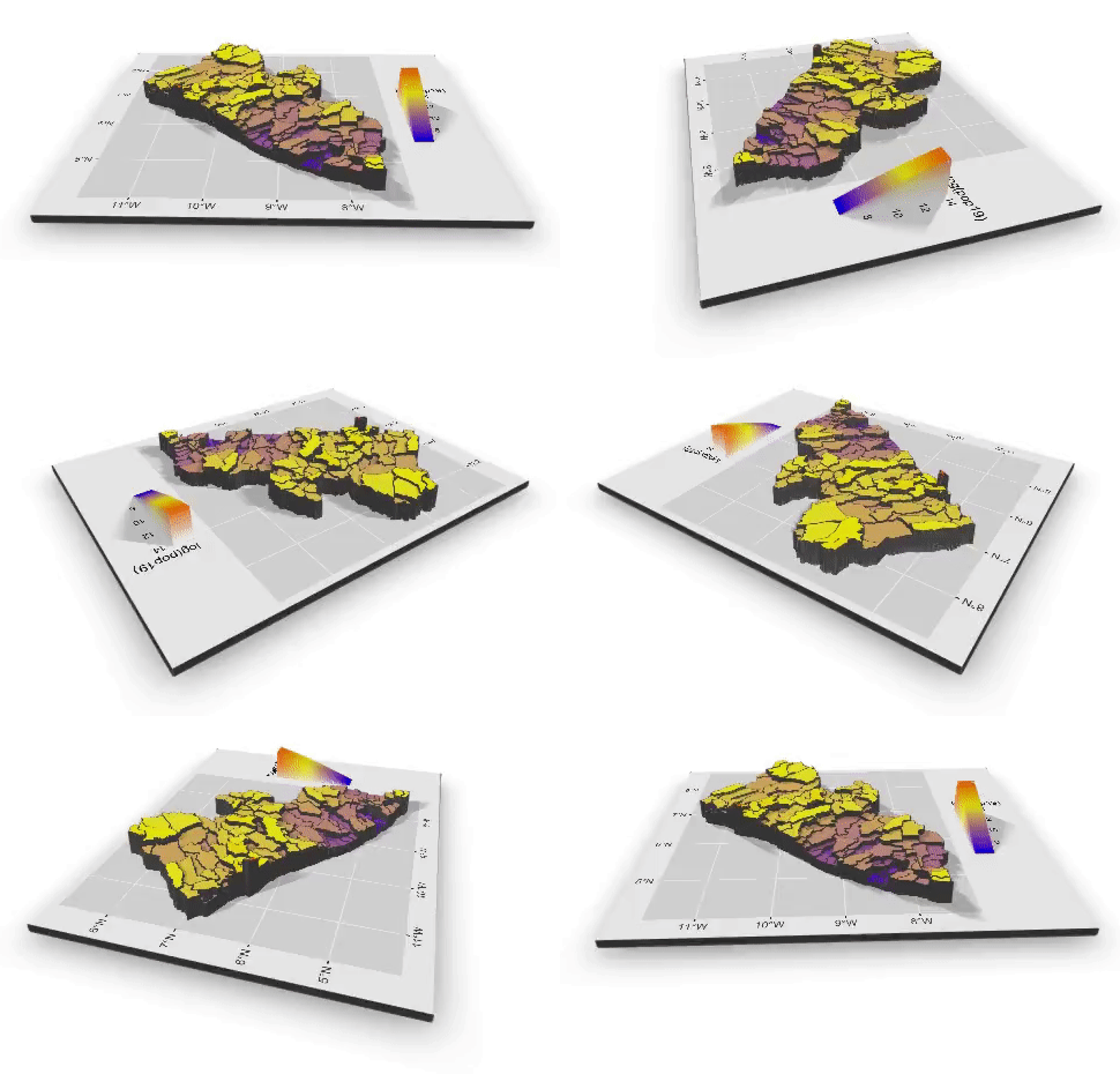
{% embed url="https://wicked-problems.github.io/final_project/" %}
Now continue to populate your newly created GitHub Pages site, using markdown and your README.md file. There are a multitude of different structural approaches you could take to creating your webpage, such as creating different markdown files and providing links to each, but in the most basic form, you can simply use the README.md file to produce your final project.
images/# Installing R and R Studio on your Computer
What is R?
R is a free, open source, programming environment for statistical computing and graphics that compiles and runs on Linux, Windows and Mac OSX. It is a very capable programming environment for accomplishing everything from an introduction to data science to some of the most poweful, advanced, and state of the art computational and statistical methods. R is capable of working with big data, high dimension data, spatial data, temporal data, as well as data at pretty much any scale imaginable, from the cosmos to the quark and everywhere in between.
The statistical programming language R is often called an interpreted programming language, which is different from machine or native programming languages such a C or Java. An interpreted programming language is distinguished from machine languages because commands and arguments are interpreted prior to being executed by the programming engine. Python is another, closely related interpreted programming language that is also popular amongst data scientists. Although the use of an interpreter compromises speed, interpreted languages have a distinct advantage in their capacity to be more readily accessible and understandable. For example, commands such as plot, read.csv(), or cbind() can be fairly easily understood as the commands for plotting an object, importing a .csv file or binding together columns of data. This accessibility has led to the strength of an open source community that is constantly developing new functions for use within the R programming framework and well as supporting their use by the larger community. One of the major advantages of an open source approach to programming is the community that supports and contributes to R continued development.
In addition to being an open source programming framework, learning to use R also fullfills one of the fundamental principals of the scientific method, reproducibility. A reproducible programming environment functions by always keeping source data in its original state external from the R framework. Data is then imported to the work session and all changes occur within the framework through the code as it is sequentially executed. In this manner, any code one writes is perfectly reproducible not only an unlimited number of times you choose to run it as well as by any other person who has access to your code (unless you are incorporating probabilities type methods in your code). Compare this reproducible workflow concept to software that employs a graphic user interface (GUI), where commands are executed by selecting a pull down menu and following a series of preset options associated with each command. Excel, Pages, Arc or QGIS are examples of software that use a GUI as their primary means of user interaction. Most programming environments keep the code separate from the interpreter or compiler and is much more easily reproducible.
While R is easier to learn than more difficult programming languages such as C or Java, increasing its ease of use can be greatly advanced by using an integrated developer environment (IDE). One of the most popular IDEs for R is called RStudio. RStudio is dependent upon R in order to function, and literally sends commands and receives results to/from the interpreter. RStudio has a number of different features that facilitate programming, project management, graphics production, reviewing data and a whole slew of other useful functions. First you will want to install R and the associated tools, then follow by installing RStudio on your computer.
Installing R
Before installing R on your operating system, it is a good idea to briefly assess the state of your computer and its constituent hardware as well as the state of your operating system. Prior to installing a new software environment, such as R, I always recommend the following.
- Do your best to equip your personal computer with the latest release of your operating system
- Make sure you have installed all essential updates for your operating system
- Restart your computer
- Make sure that all non essential processes have not automatically opened at login, such as e-mail, messaging systems, internet browsers or any other software
After you have updated your computer and done your best to preserve all computational power for the installation process, go the R Project for Statistical Computing website.
Find the download link and click on it. If this is the first time you have downloaded R, then it is likely that you will also need to select a CRAN mirror, from which you will download your file. Choose one of the mirrors from within the USA, preferable a server that is relatively close to your current location. I typically select, Duke, Carnegie Mellon or Oak Ridge National Laboratory. A more comprehensive install of R on a Mac OS X will include the following steps.
- Click on the
R.pkgfile to download the latest release. Following the steps and install R on your computer. - Click on the XQuartz link and download the latest release of
XQuartz.dmg. It is recommended to update your XQuartz system each time you install or update R. - Click on the tools link and download the latest
clang.pkgandgfortran.pkg. Install both.
Following are two video tutorials that will also assist you to install R on your personal computer. The first one is for installing R on a Mac, while the second video will guide you through the process on Windows.
Video tutorial of how to install R on a Mac
Video tutorial of how to install R on Windows
Installing RStudio
RStudio is an integrated developer environment that provides an optional front end, graphic user interface (GUI) that "sits on top" of the R statistical framework. In simple terms, RStudio will make your programming experience much easier, and is typically a good way for beginners to start off with a programmer langauge such as R. RStudio assists with coding, executing commands, saving plots and a number of other different functions. While the two are closely aligned in design and function, it is important to recognizing that RStudio is a separate program, which depends on R having first been installed.
To install RStudio go to the following webpage and download the appropriate installer for your operating system.
Local Installation of Python and PyCharm
Downloading Python and Pycharm installation files
In order to install python, you can simply go to the python website and find the correct version, download and install it. The latest version of python is 3.9.1, although if you are planning to use the tensorflow library of functions (to employ applied machine learning methods for example), at this time, the tensorflow library is only functional up to python version 3.8.7. For our purposes let's just stick with Python 3.8.7, although I will also provide the main link below.
Once you have Python installed, go ahead and open the application and run it. On a Mac, you should find a Python 3.8 folder within your applications folder. If you run the IDLE app, a shell window running python 3.8.7 should open. Later you may need to know the path to your python 3.8.7 executable file, so go ahead and enter the following commands and copy the output.
import sys
print(sys.executable)
The interpreter should return the path to the executable file being used to run this version of python. Make a note of that path for later use.
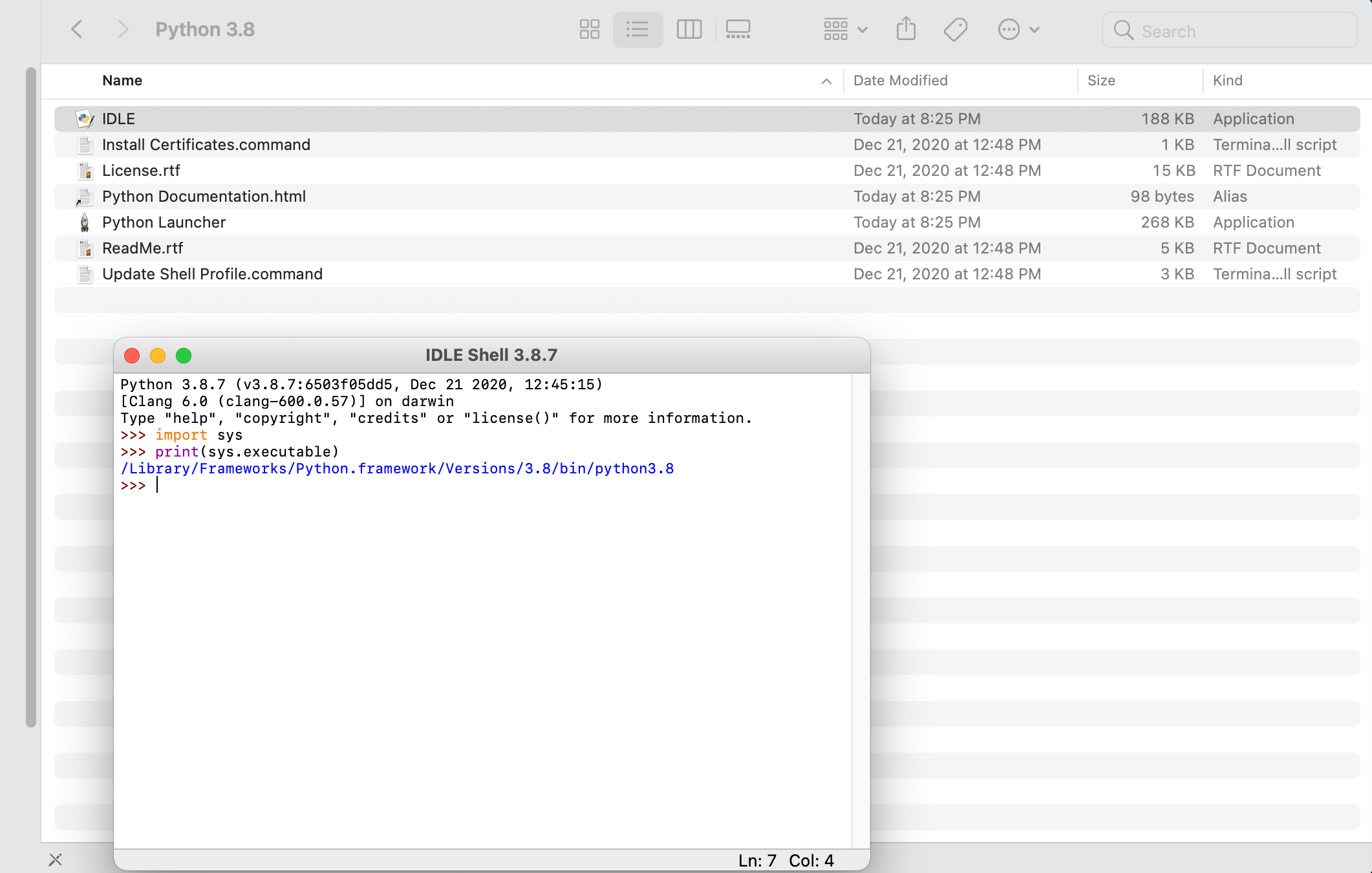
Next proceed to install the Jetbrains IDE (integrated developer environment) that has been created for use with python called PyCharm. We are going to select the professional version, and then register with JetBrains as educational users, which should offer us nearly the full functionality of the IDE.
Once PyCharm is installed you should find it in your applications folder (Mac) or search for it in your Windows search box (bottom left-hand corner). In order to gain full functionality of PyCharm, you will want to register your product as a student license, which you should be able to accomplish from the "Welcome to PyCharm" screen. Before entering a new license for your PyCharm software you will need to create a JetBrains account. You can do so at the following website.
JetBrains Products for Learning
Once you have registered your product, from the Welcome to PyCharm screen, select New Project. You should see a window that gives you the option to name your new project and select an interpreter. Since you just installed python 3.8.7 we should find that interpreter and add it to your newly created project. To do this select "previously configured interpreter" and select the ... off to the right.
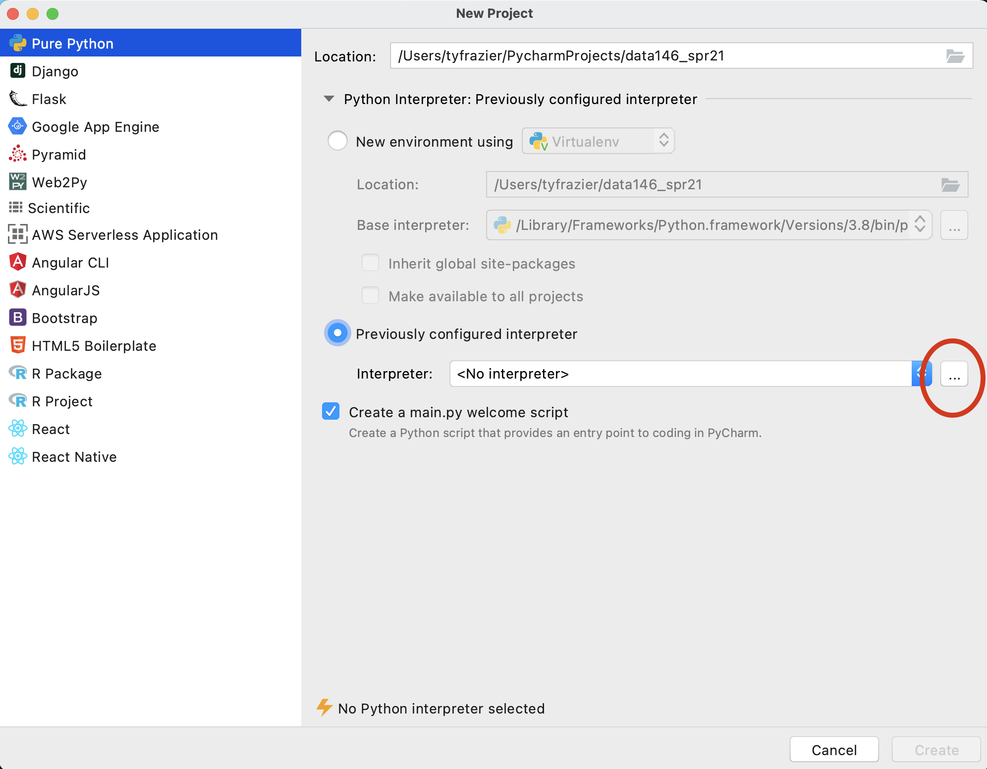
On this screen, again click the ... off to the right of the pull down to select your "Interpreter" in the "Virtualenv Environment" pane. Recall the path you previously recorded from when you initially installed python 3.8.7. Find this file using the "Select Python Interpreter" window and then select "OK".
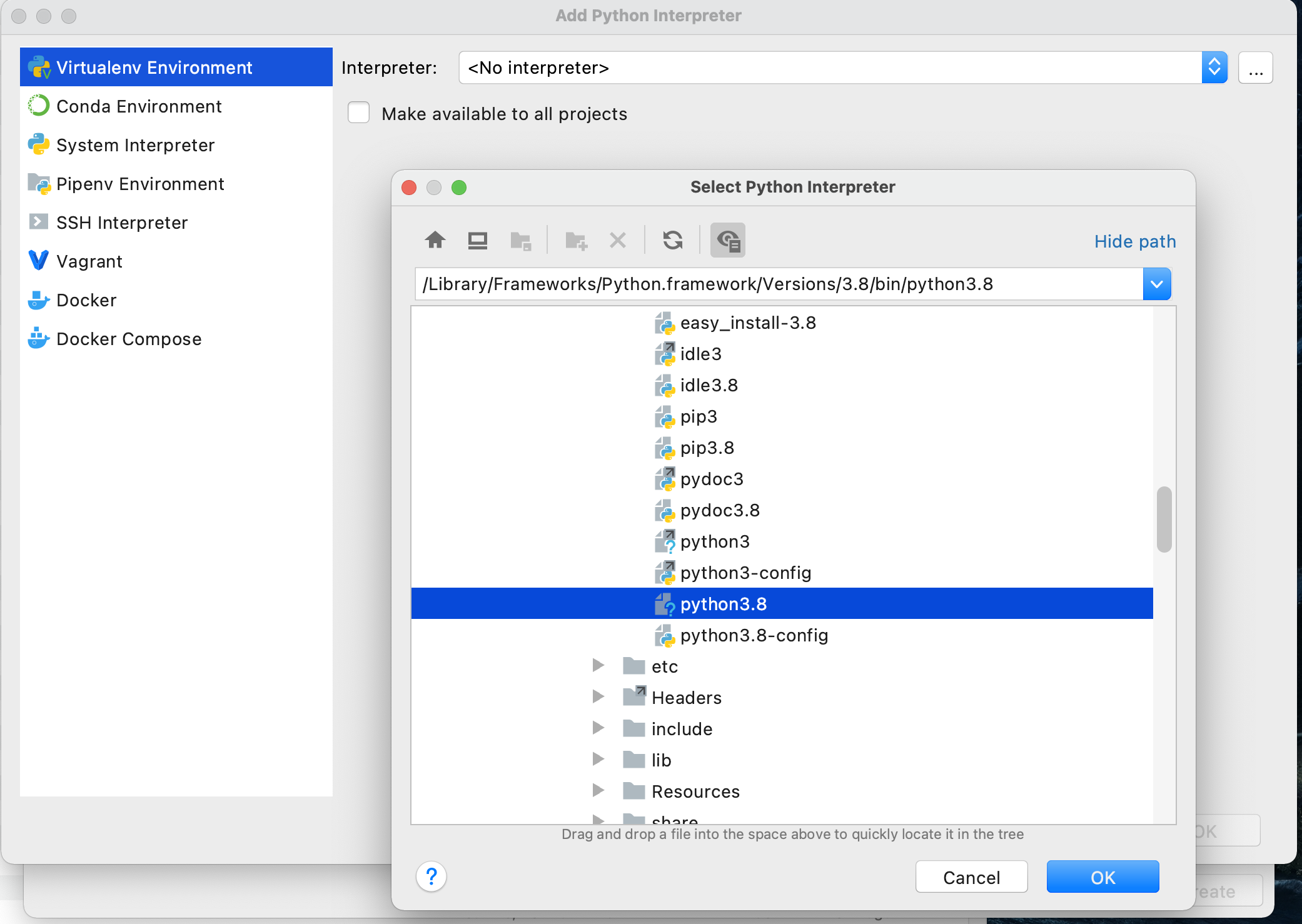
Upon completing the previous steps, you should return to the "New Project" window. Go ahead and create your new python project.
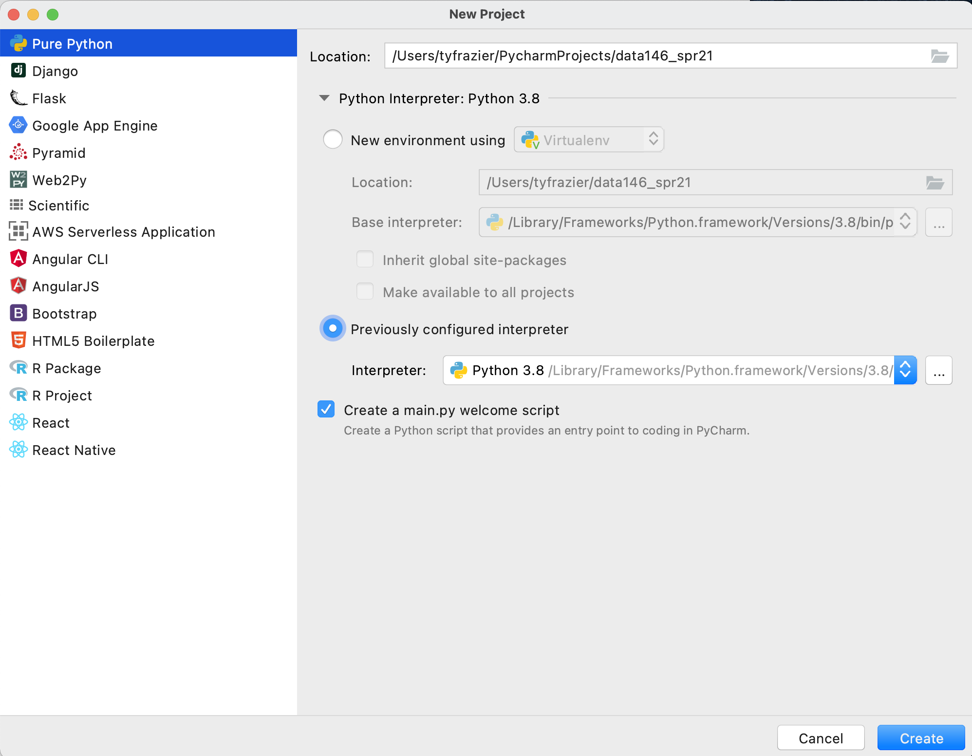
Once you have created your new project and designated the python interpreter, your integrated developer environment should appear. If you left the "create a main.py welcome script" check box selected, then you should also have a main.py script in the right pane of your console. To execute this script, select the entire code either by highlighting it with your cursor or using command-A, and then right click on the selected code select the option "Execute Selection in Python Console".
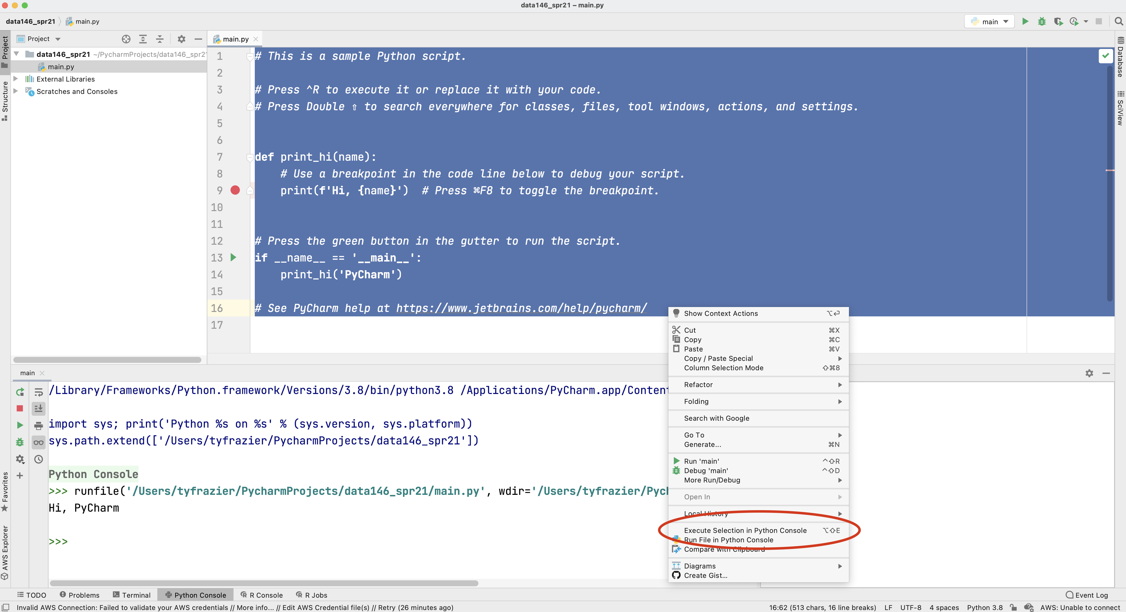
Alternatively you can also run your selected code by executing the option-shift-E combination of keys. If your console returns a "Hi, PyCharm" then you have successfully installed Python and PyCharm!
Remote access via William & Mary Virtual Desktop
A good back-up option for running Python and PyCharm is to remotely access a laboratory computer. The William & Mary IT department offers virtual access to most of our physical labs using a virtual desktop.
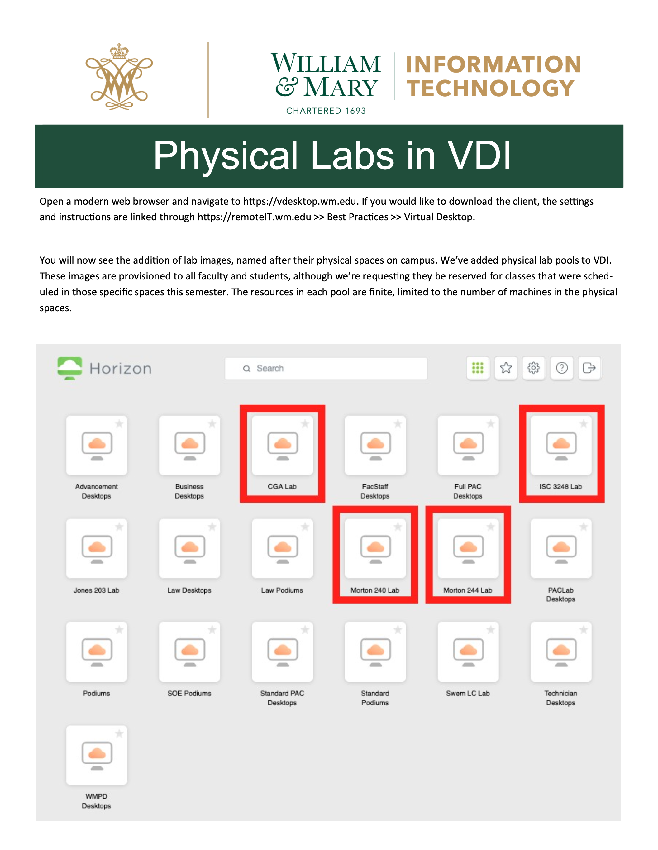
Point your browser to the web address in the image above and follow the instructions in order to gain remote access to a lab computer on campus. The computers in ISC 3248 should have Python and PyCharm available for your use. For additional instructions please see the following link.
Also, if you wish to simply visit the computer lab in ISC3 #3248 (or elsewhere on campus) and open PyCharm on a local machine at that location that is also an option.
Remote access via Jupyter Notebooks or Google Colab
Jupyter notebooks employ a slightly different approach to running python or alternatively R or Julia. An advantage of using a Jupyter Notebook is that the installation process is typically removed from the local workstation and executed on a remote server. Project notebooks employ cells and integrated text that sequentially alternate instruction and execution of code in order to facilitate teaching and learning. Jupyter notebooks are a popular choice for running python, and we have a local server that is available for your use and can be found at the following web address.
Another possible option for remote python execution is Google developers free Jupyter notebook environment called Colaboratory or often just simply Google Colab. Like the jupyter hub installation, google colab also runs in a webbrowser and is accessed via the following address.
Both Jupyter notebooks and Google Colaboratory offer simple, remote interfaces that readily enable access to python from the outset.
One final note regarding jupyter notebooks. With your professional version of PyCharm, you should be able to run and modify .ipynb file types (jupyter notebooks) within your PyCharm IDE.
More advanced option: using a Package Manager
Package managers or package management systems are an effective way to keep track and automate the process of installing, upgrading, configuring and removing computer programs for a computer operating system. While there are several possible options available, there are two recommended options, depending on the operating system you are running on your local machine. The package manager itself, requires a bit more investment on the front-end in order to implement and understand, but ultimately in the long run, this investment can pay off with a more smoothly running operating system and encountering fewer technical complications and conflicts.
Installing Homebrew for Mac Operating Systems
One of the most preferred Mac OSX package managers is homebrew. To install homebrew on your Mac, go to the homebrew webpage, copy the link beneath where it says "Install Homebrew" and then paste it into your terminal. Your operating system may ask you to provide your password in order to install the package manager with administrative privileges.

One of the first things you will want to do with your new homebrew installation is to run a few commands in order to get your system up to date, cleaned up and ready to go.
% brew upgrade
- Upgrades your homebrew installation to the current version
% brew update
- Updates the package installation formulas
% brew cleanup
- checks system links and removes them as needed
% brew doctor
- Checks the installation of your programs for possible configuration conflicts. Ideally this command returns "ready to brew" although some possible warnings can be laborious to investigate and fix, and may require further study for novices.
Once you have homebrew installed you can start by installing python. Go back to the main homebrew page and have a look at the [Homebrew Packages](Homebrew Packages), formulas that are available. Scroll down through the list until you find the formulas for python. The basic syntax for installing a package using homebrew is brew install [package name here].
The latest version of python is 3.9.1, although if you are planning to use the tensorflow library of functions (to employ applied machine learning methods for example), at this time, the tensorflow library is only functional up to python version 3.8.7. I will start with the python version 3.8.7, which can be installed using the basic homebrew command. If you find the python@3.8 formula page, you can simply copy the formula to your clipboard and paste into your terminal.
brew install python@3.8
From the following image of my terminal you can see that I already have python 3.8.7 installed, but none the less, I have decided to go ahead and reinstall again. There are a number of symlinks that probably need to be addressed, which also show up when I run brew doctor, but I'm simply going to ignore these for the time being. At the end, I did go ahead and run the command that exported a path to my configuration file (in my case zshell) and likewise did for compilers and also package configuration. Just as you did above, you will want to identify the location of your newly installed python interpreter for use when creating your new python project and initially selecting an interpreter.
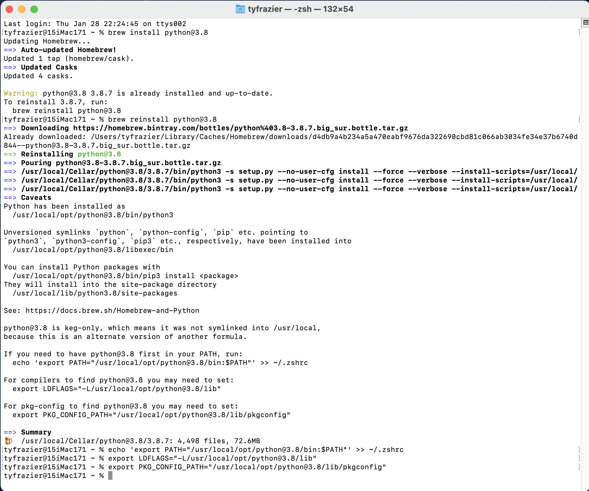
Once you have python installed, next you can proceed to install the Jetbrains IDE (integrated developer environment) that has been created for use with python called PyCharm. We are going to select the professional version, and then register with JetBrains as educational users, which should offer us nearly the full functionality of the IDE.
brew install pycharm
Once you have installed PyCharm, you should be able to find it in your applications folder. You are welcome to go ahead and open it and look for the add license tab. Before entering a new license for your PyCharm software you will need to create a JetBrains account. You can do so at the following website.
JetBrains Products for Learning
It might take a few minutes to complete the registration, but once finished you should be able to enter your e-mail and password in order to activate PyCharm. Once you have activated your software, and started up PyCharm, you should see a "Welcome to PyCharm" window where you can open a new project. Go ahead and select "new project." Following this step, you should see a window that has a similar appearance to the following image. Choose "pure python" and give your project a name there it will be located within your PycharmProjects home folder. I will assign the name of my course and select the "virtual environment" and python@3.8 as the base interpreter for this newly created project.

Once you have created your new project designate the python interpreter. Rather than using the full path to the executable you should be able to locate your interpreter in its system folder. On my Mac, there are separate interpreters for both python@3.9 and python@3.8 within the /usr/local/bin/python3 folder. You can create two separate virtual environments within your PyCharm IDE and select per project as needed. After selecting your interpreter PyCharm should appear.

If your PyCharm IDE appears similar to the previous image, you are pretty much ready to get started using python!
Installing Chocolatey for Windows Operating Systems
Chocolatey is a relatively new package manager that is similar to homebrew but is designed for use with the Windows operating system rather than a Mac. To install chocolatey on your Windows computer go to the Chocolatey installation webpage and follow the instruction under "Step 2."
Chocolatey functions in a manner very similar to homebrew (as described in the previous step), although instead of entering your commands at the terminal of a unix shell, on a windows system you will enter the installation command using the powershell. Copy the command using your clip board and paste it into your powershell.
Once you have the Chocolatey package manager in place, you should be able to begin installing software using the chocolatey formulas. Have a look at the python 3.8.7 formula page and copy the formula onto your clip board and then enter it into your powershell.
choco install python3 --version=3.8.7
Which should effectively install python to your system.
Again, in a manner that is quite similar to applying a homebrew installation formula, go ahead and install the PyCharm IDE using that particular formula.
choco install pycharm
Once you have installed the PyCharm IDE to your operating system, follow the instructions above under the homebrew installation in order to register with Jetbrains and to obtain a student educational license. After licensing your product, go ahead and create a new project, select a virtual python interpreter and open your PyCharm IDE!
Getting Started with RStudio & R
Starting RStudio
Once you have finished the installation process, run the RStudio IDE, which will automatically find R on your computer. Find the application RStudio on your computer. The RStudio executable should be located in the applications folder on a Mac. Once running the RStudio application on a Mac it is often helpful to keep the application icon in the dock, which is the bar of applications that exists along the bottom of your computer desktop screen. On Windows, if you select the Window icon in the bottom left corner and begin typing RStudio, you should see the application icon appear. On a Linux system, the application should appear in one of the OS drop down windows. Choose the application icon and open it.
If both R and RStudio were properly installed, then the start up for RStudio should appear something like the following image.
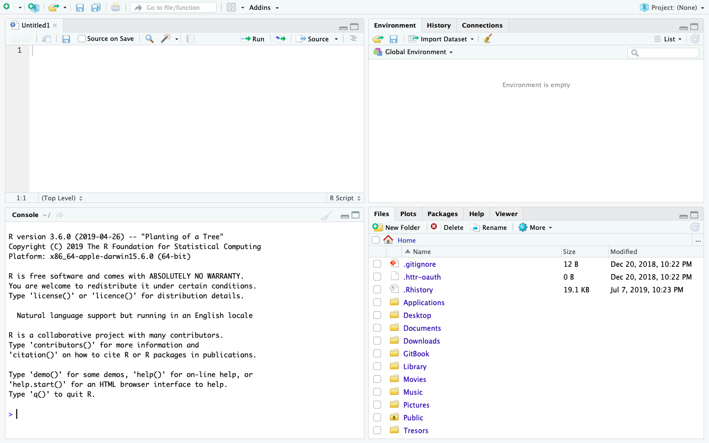
One of the first things to note at start up is the bottom left hand pane, which is essentially a window to the R interpreter. RStudio reports the version of R that has been installed on your computer. Next go to the pull down menu for File > New Script > R Script and select that option. This will create a new R Script that will appear in the top left pane of your R Studio IDE. One can think of the script as the location where all computer code will be written and saved, in a manner somewhat analogous to writing a letter or essay with a work processor. Below the script in RStudio is the console or the location where your commands are sent and responses from R will be returned. You can think of the > symbol in the console as R somewhat figuratively waiting for your command and subsequently also the location where R will respond.
Since you now have a script file where you will save your first R commands, you should also have a working director where you will save your my_first_script.R file. At this point you should minimize RStudio, and return to your file explorer or finder and create a folder that you will use to save your script, output as well as any files you may import to R. Generally, I create a project specific folder and then within that folder I begin with two subdirectories, one that is dedicated for storing data and a second one that is dedicated to saving my scripts. After you have created your project folder, return to RStudio and then select Session > Set Working Directory > Choose Directory from the drop down menu. Choosing this command will result in a file explorer window appearing in order for RStudio to select the working directory for your work session. The working directory is the default location where R will automatically look in order to import or export and data. Go ahead and select the data subdirectory you just created within your project folder. Upon selecting your data folder, you should notice a command appear within the console pane in the bottom left hand corner of RStudio.
setwd("~/my_folder/my_project_folder/my_data_folder")
By using the RStudio IDE GUI you have just executed your first command. You can confirm that the command was properly executed from within the console by typing the following command directly in the console.
getwd()
You should notice that R returns the path from the working directory you just designated. Instead of setting your working directory using the drop down menu, the preferred method is to designate that path by using code in R. Fortunately, RStudio has already specified the command for you, so just go ahead and copy the setwd() command from above and paste it into your script file in the top left hand corner of your RStudio work session. You could also retype it, but in general, copying and pasting is going to be much more efficient. On a Mac copying and pasting is accomplished by using the ⌘C & ⌘V keys or on Windows control-C and control-V. **** After copying and pasting that line of code within your script, go ahead and execute the function again, except this time, send the command directly from your script to the console. To do this use, move the cursor to the line where you pasted the code and then select ⌘return on a Mac or control-return on Windows. Congratulations! You have just written and executed your first line of code.
Now that your script has content, you should save the file. Select the >File>Save command from the drop down window and choose the data subdirectory you created within your project folder. Name your script file and then select save. Your RStudio work space should appear similar to the following image.
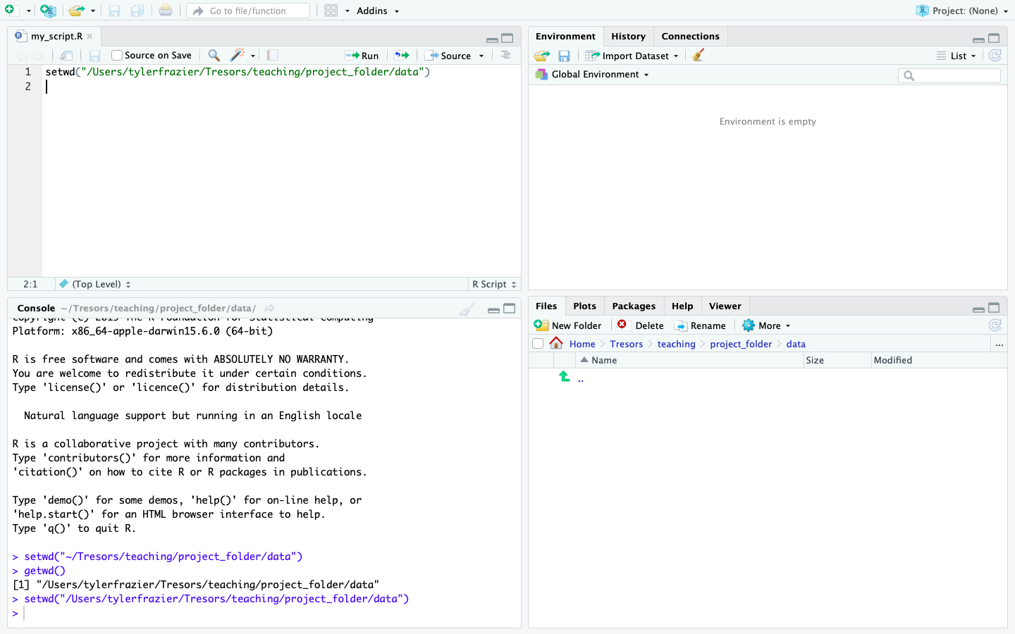
One noteworthy observation regarding the command setwd(), notice how the path to the working directory is specified within quotation marks. In general, whenever RStudio is communicating with your operating system (OS) or any entity outside of its workspace, what ever is being sent to that computer will be included within quotation marks. For example setwd("the/path/to_my/working/directory") is contained within quotation marks in order for RStudio to traverse the path as defined by your OS to that location on your computer.
description: >- In this exercise you will learn how to create vector and data frame objects, use the sample function and generate a plot that includes different types of squares, circles and lines.
Creating and Plotting Objects
Creating an object & creating a plot
Since you have already set your working directory in the previous step, now you can create your first object. Do so by writing the following command in your script.
x <- 1:10
There are essentially three parts to this command. First take note of the <- symbol, which is often called the assignment operator. The <- operator will function by assigning everything on its right hand side to the newly named object on the left. For example, if you entered the command t <- 1 and then typed t directly in the console and pressed return, R would inform you of the value of t, which would be 1. After creating and defining x do the same thing for y but this time start with the highest value and decrease sequentially to 1.
y <- 10:1
Now lets move to the console and ask R a few things directly. Sometimes we want to save our script, while at other times we just want to ask R a quick question. First lets ask R to list all the objects that exist in our workspace at this point in time. We use the ls() command to list all objects that exist in our workspace.
[1] "x" "y"
Let's also ask R to tell us more about the two objects we have created and placed in our workspace. Go ahead and type x and then y directly into your console and consider the output.
x
[1] 1 2 3 4 5 6 7 8 9 10
y
[1] 10 9 8 7 6 5 4 3 2 1
We can see that our earlier use of the colon in x <- 1:10 created an object named x that contains each whole number in sequence from 1 to 10, while y likewise did the same except in reverse. Also by simply typing the name of the object, R reveals to us everything it knows. Since we have two objects of equal length, lets plot x & y together.
plot(x,y)
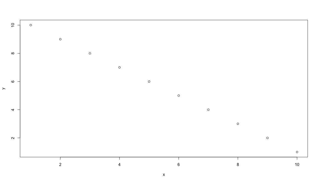
We can continue to describe our plot by adding an argument to our command by specifying the plot type as a line and not simply points
plot(x, y, type = "l")
or alternatively a plot with both a line and points over that line.
plot(x, y, type = "o")
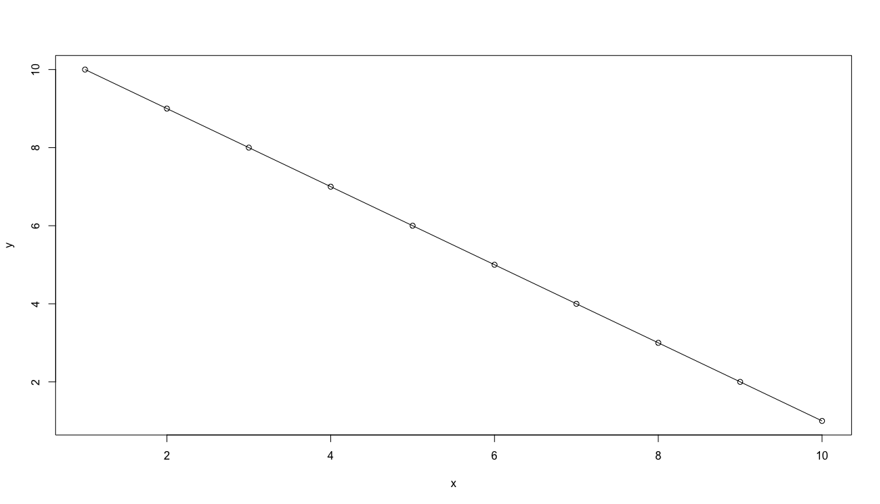
We can also add some description to our plot in order to better communicate our results. We can begin by adding a title, indicating the units of measurement while also adding labels for both the x and y axes.
plot(x, y, type = "o",
main = "The Path of a Running Boy",
sub = "units of distance = meters",
xlab = "longitude",
ylab = "latitude")
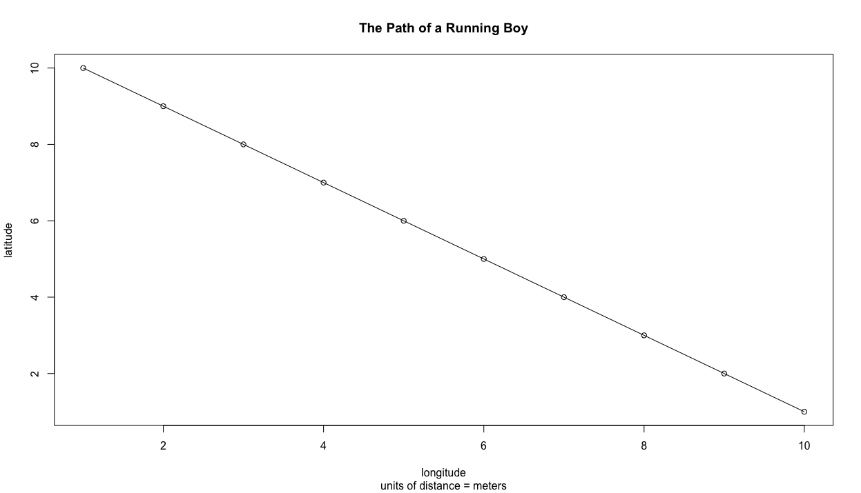
We can also change the linetype by specifying the lty = argument or set the lineweight by using the lwd = argument. The color of our line can be changed using the col = "some_color" argument, while the point symbol itself can be modified by using the pch = argument. Scale of the symbol is increased or descreased using cex =. Have a look at the Quick-R website for a comprehensive list of some available graphical parameters.
plot(x, y, type = "b", main = "The Path of a Running Boy",
     sub = "units of distance = meters",
     xlab = "longitude",
     ylab = "latitude",
     lty = 2,
     lwd = .75,
     col = "blue",
     pch = 0,
     cex = 1.5)
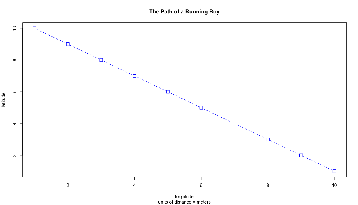
Creating a More Complicated Plot while also creating and then using a Data Frame
Now lets make your plot a bit more complicated than simply a line with points. First increase the scale of our plot area by increasing the range of values for both the x & y axes.
x <- 1:100
y <- 1:100
Now instead of using those values, let's randomly select from both x & y in order to produce a random series of x & y coordinates.
east <- sample(x, size = 10, replace = TRUE)
north <- sample(y, size = 10, replace = TRUE)
The above command sample() will randomly select in a uniform manner, one number from x and then also y, 10 times, creating the vector objects east & north. I have also included the replace = TRUE argument, such that each time a number is selected, it is returned and potentially can be selected again in the next draw. Now, lets take each value and use it as the coordinates for the center point of a number of squares. We will use the symbols() command in order to add additional specifications to our command.
symbols(east, north, squares = rep(.75,10), inches = FALSE)
Following is one possible outcome produced by the randomly produced coordinates. While the squares produced in your plot will be in different locations, the number of squares as well as the size of each, should be very similar. Lets also consider the additional arguments in the symbols() command. In the squares = argument within the command, I have also used the rep() function, which will repeat the length of each square, .75 in this case, 10 times, or 1 time for each square. I have also added the inches = FALSE argument so the units are considered to be similar to the axes.
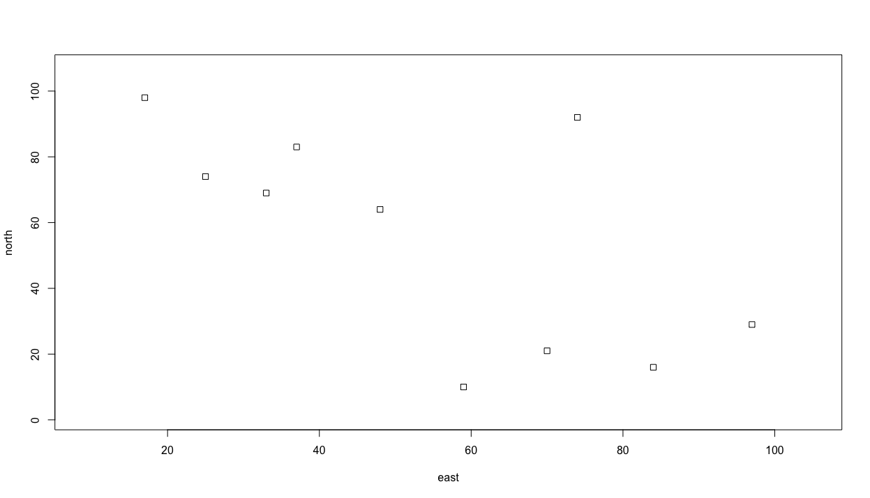
Now lets add some circles to our plot. This time, instead of assigning an object a permanent value by randomly selecting from a series of numbers, lets randomly select values as part of creating the plot with the symbol() function.
symbols(sample(x, 10, replace = TRUE),
        sample(y, 10, replace = TRUE),
        circles = rep(.75,10),
        inches = FALSE,
        fg = "green",
        add = TRUE)
Where as before I created two objects and plotted their values as x & y coordinates, this time I have nested the sample() command within the symbols() function, in the place where R is looking for the x & y value coordinates. In this manner, each time I execute the command, 10 circles will be randomly placed throughout the defined area, each with a radius of .75. I have also included the add = TRUE argument within the command, in order to add the circles to our previous plot of square. The fg = argument permits us to select a color for each circle.
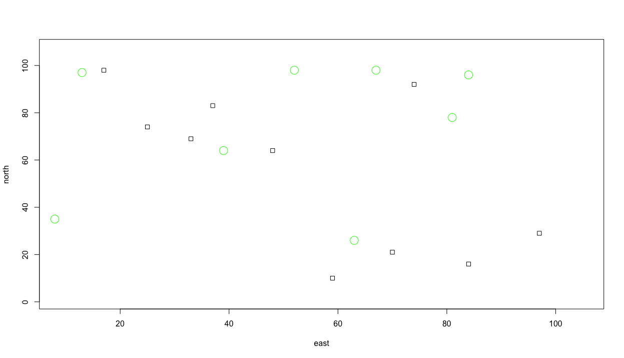
Let's also add some larger trees and specify their color as well. Again we will randomly place them while using the add = TRUE argument so they are added to our previous plot. Also, consider a wider range of colors to use as the outline for each circle, while also filling each circle with a color. In order to determine how to fill the circle with a color, use the ? followed by the command you are interested in learning more about in order to view all of the available options. In this case you can type ?symbols directly in the console in order to see all of the arguments possible. If you scroll down in the help window, you will see that fg = is used to specify the color or your symbol border, while bg = is used to indicate the color for your symbol's fill. You may also be interested to know which colors are available to select. In order to review a list of all available colors, simply type colors() directly into your console. Running the following chunk of commands will then produce a plot similar to the following image.
symbols(east, north, squares = rep(.75,10), inches = FALSE)

symbols(sample(x, 10, replace = TRUE),
        sample(y, 10, replace = TRUE),
        circles = rep(.75,10),
        inches = FALSE,
        fg = "green1",
        bg = "beige",
        add = TRUE)

symbols(sample(x, 10, replace = TRUE),
        sample(y, 10, replace = TRUE),
        circles = rep(1.5,10),
        inches = FALSE,
        fg = "green4",
        bg = "beige",
        add = TRUE)
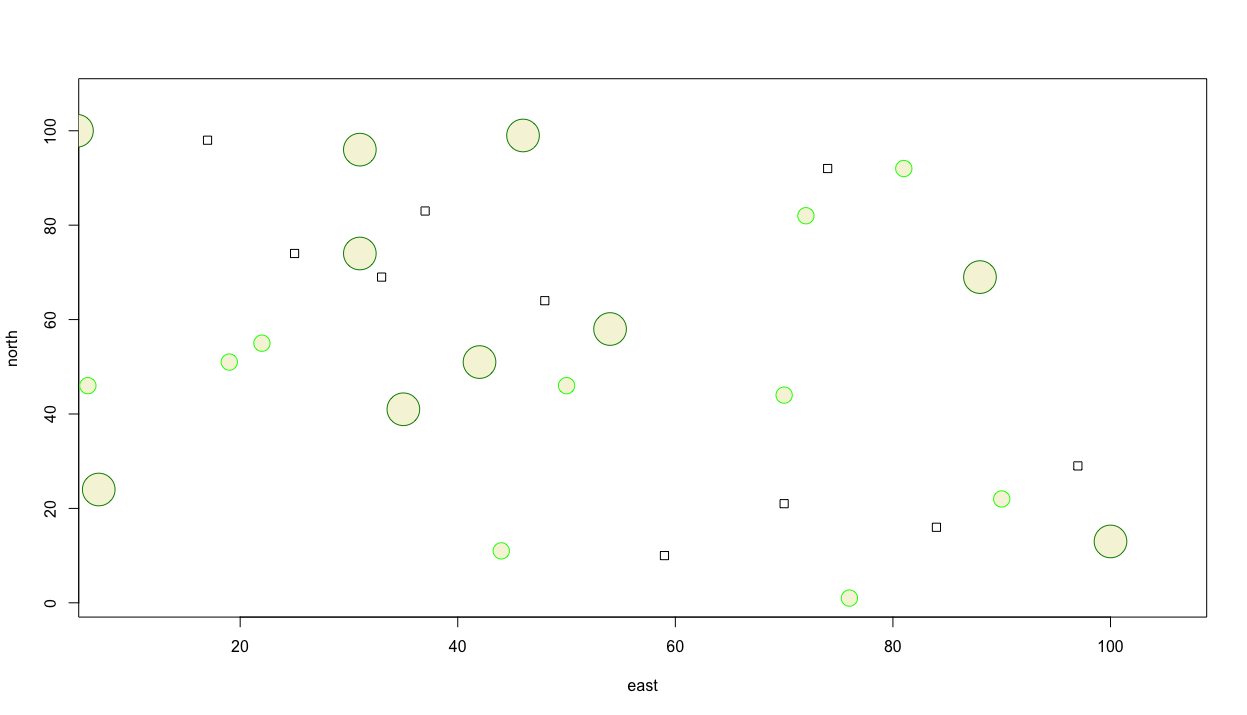
Thus far we have only created R objects that are of the vector class. We can review the class of one of the objects we have created by typing class(east) directly into the console and observe that R informs us that the object is a vector of integers. Now let's create a new class of an object called a data frame that contains a series of rows and columns where each row represents an observation while each column represents a different variable. We can start with the coordinates that represent the center point of each square.
dwellings <- cbind.data.frame(id = 1:10, east, north)
In this case, we are using the cbind.data.frame() command to column bind together the newly created variable named id with our two integer vectors east & north into a newly formed data frame named dwellings. After executing the above command, you can type the name of your data frame directly into the console to review its content. Within the environment pane in the top right hand window, under the data tab, you can also use your mouse to click on the data frame symbol that is off to the right of the dwellings data object.
| id | east | north | |
|---|---|---|---|
| 1 | 1 | 48 | 64 |
| 2 | 2 | 25 | 74 |
| 3 | 3 | 59 | 10 |
| 4 | 4 | 37 | 83 |
| 5 | 5 | 97 | 29 |
| 6 | 6 | 74 | 92 |
| 7 | 7 | 84 | 16 |
| 8 | 8 | 17 | 98 |
| 9 | 9 | 70 | 21 |
| 10 | 10 | 33 | 69 |
You'll notice that R also provides row numbers that in this case are identical to the identification number we have assigned to each square. Instead of assigning our id variable manually, we could have just as easily used id = row.numbers(dwellings) in order to achieve the same result, if the object dwellings already exists.
Now let's add a line that represents some type of transportation activity between each of the different dwelling units we have represented within our plot as squares. We can add lines to the plot with the lines() command. In order to identify the beginning and ending point of each line we set the x = argument to the east variable within the dwellings data frame. Likewise we set the the y = argument to the north variable also witin the dwellings data frame. One manner of informing R which variable is needed within a data frame is to use the $ operator. In general terms, the form to call a variable is my_data_frame$my_variable. Following is an example, which should produce something similar to the subsequent plot.
lines(x = dwellings$east,
      y = dwellings$north,
      lty = 2,
      lwd = .75,
      col = "blue")
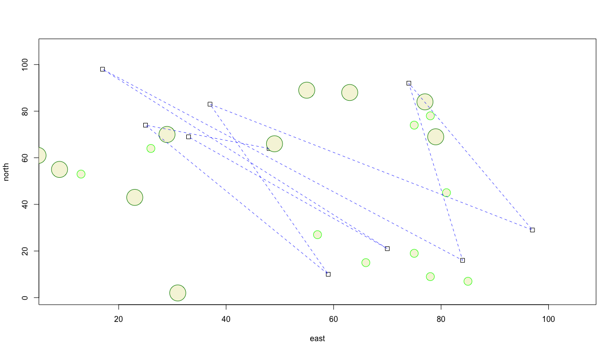
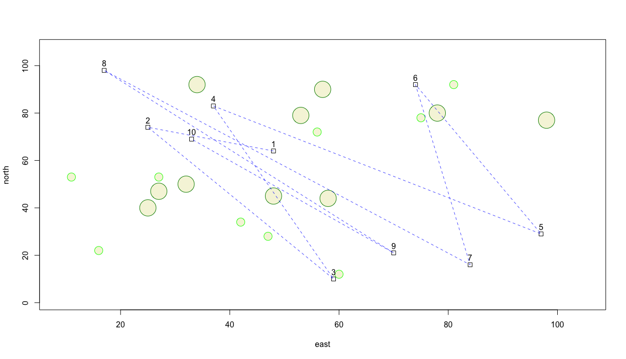
You'll notice that unlike the previous commands, it wasn't necessary to include add = TRUE in order to add the lines to the plot. Perhaps it would also be helpful to add some text to annotate each household. We can accomplish this using the text() command. As with lines(), we also do not need to use the add = TRUE argument. The text() function also requires identifying the location of the text you will use to annotate each dwelling unit. That is accomplished through using the labels = argument. Again, identify the variable where the id is located within the data frame using the my_data_frame$my_variable format.
text(x = dwellings$east,
     y = dwellings$north,
     labels = dwellings$id)
Since label coordinates are the same as the center point for each square, reading the labels is confounded. Instead of placing the label directly on top of the dwelling unit, add a few units north to the y = argument in order to displace each label a bit in the northerly direction.
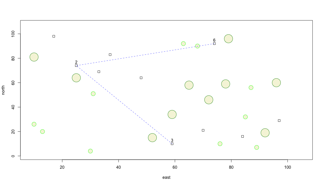
Now perhaps instead of traversing a path between each house sequentially, our traveling person selected on 3 of the dwellings and moved between each of those buildings. First we will randomly select 3 numbers that will be used to identify the chosen homes. This time, set the replace = argument to FALSE since our traveling person will only visit each dwelling unit one time.
locs <- sample(1:10, 3, replace = FALSE)
Now instead of using the lines() command to identify the x = and y = coordinates of each dwelling unit's center point, we will select only 3 building locations. To do this, we wil lintroduce another method of traversing and selecting rows and/or columns from a data frame for use in an command and its arguments. The [ and ] symbols are extremely powerful operators and can be used to subscript from within a function or argument. Subscripting operators follow the format of first selecting the rows followed by a comma and then columns in this [row_numbers, column_numbers] format. If either the rows space or columns space is left blank, then R assumes ALL rows and/or columns should be selected. In the following command, I am using these subscripting operators to first select the 3 rows from the data frame that were randomly identified and then also include either column 2 for the easterly coordinate, or column 3 for the northerly coordinate.
lines(x = dwellings[locs, 2],
      y = dwellings[locs, 3],
      lty = 2,
      lwd = .75,
      col = "blue")
Alternatively I could have also specified x = dwellings[locs, ]$east and y = dwellings[locs, ]$north in order to achieve the same result. The following snippet demonstrates how that is accomplished while adding text in order to annotate each house with its id.
# text(x = dwellings$east,
#      y = dwellings$north + 3,
#      labels = dwellings$id)

text(x = dwellings[locs, ]$east,
     y = dwellings[locs, ]$north + 3,
     labels = dwellings[locs, ]$id)
You'll notice in the previous snippet of code that the # sign has been added to the first character space on lines 1, 2, & 3. Adding the # sign enables you to comment out that line of code so R will ignore it. In the above example, I have commented out the lines of code we produced earlier where we labeled all 10 houses, and followed it with out code that serves to label only the 3 units that were randomly selected. At this point our plot should appear similar to the following image.
Now instead of using a straight line, let's use a spline to represent a more continuous path betweem each of the selected locations along the persons travel path. Comment out the previous lines() command and instead use the xspline() command to identify the path. I will set the shape = -1 in order to interpolate all points while crossing each dwelling unit.
xspline(x = dwellings[locs, 2],
      y = dwellings[locs, 3],
      shape = -1,
      lty = 2)
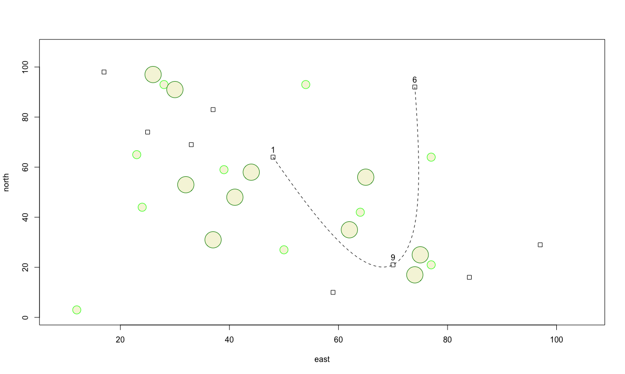
Finally, add a title to your plot using title(main="A Person's path between Homes").
Challenge Question
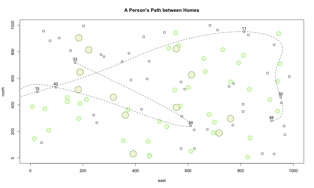
Create a similar plot as the one produced above, but instead meet the following specifications.
- Increase the minimum and maximum limits of your area from 1 to 1000 in both the
x&ydimension. - Randomly place 50 dwelling units throughout the 1000 x 1000 dimensioned area. Size each square appropriately.
- Randomly place 40 small circles (trees) throughout the 1000 x 1000 dimensioned area. Set the radius of each circle to the same or approximately the same as the width of each home.
- Randomly place 12 large trees throughout the defined area, such that each tree has almost twice the radius as each home's width.
- Randomly select 7 homes from the 50 total, and use a dashed spline to describe the path between each labeled dwelling unit.
- Title your plot.
Python Review
Some basic operations
First lets do some basic operations in Python. See if you can execute the following tasks.
- add 1 + 1
- print 'Hello World!'
- create a variable x that is equal to 1
- create a variable x that is equal to x + 1
Logical operators can be important when working with data that requires us to assess logical comparisons, such as equality, greater than or less than. Logical operators can be used to find specific data we are looking for, or perhaps to filter out rows of data that we may need.
Practicing with logical operators
Now let's practice comparing values using some of the logical operators available in Python.
- write a logical operation that compares the sum of 1 + 1 with the numerical value 2
- compare the character values of the words 'cat' and 'dog'
- write a logical expression that determines whether 4^6 is greater than 6^4
- write an inclusive "or" statement (use the pipe which is the | character as the "or" operator) evaluating both the character values of the words 'cat' and 'dog' AND whether 2 is greater than or less than 1 -- in this case either A or B, or both is true
- write an exclusive "or" statement evaluating both the character values of the words 'cat' and 'dog' AND whether 2 is greater than or less than 1 -- in this case either A or B, but not both is true
Next up is something you should definitely be aware of! NaN ("not a number") is not equal to itself! It is also the ONLY value for which this is the case! This is important, because missing records in a data set are often treated as NaN, and you will sometimes need to be careful about how you handle them. It may not happen very often, but it will happen eventually and can cause confusion if you're not aware of it.
Try assigning float('nan') to the variable x and then evaluating that same variable with itself in an equality statement (using the == logical operator). Also try using the not equal logical operator (in this case !=) to evaluate x with itself.
From the results of the logical comparison, you could conclude that x must be NaN. This may show up at some time in the future, don't forget it! There's also usually special operations for checking if something is NaN. Use the import() to load the math library of functions into your PyCharm work session. Now evaluate x with the command math.isnan(). Also try running the same command from the numpy library by again first using the import() library command and then using the isnan() command. To distinguish the two similarly named functions from the two different libraries, specify the library in the command itself numpy.isnan().
Evaluating Lists and Subscripting with an Index
If we attempt a similar approach where we evaluate each term in a list, we might not obtain the expected results. For example try the following.
y = [1,2,float('nan'),4,5,float('nan')]
y
First we could extract one of the values in the list by using a subscripting operator such as y[2]. Notice that Python indexes values in a list starting with 0, thus the 2 will in essence retrieve the third value in the list. Also, consider the evaluation of y == y, which is evaluating the equality of two lists rather than two float objects as in our previous example. To isolate and evaluate individual values within the list we could evaluate each term as part of a loop, one by one.
for yi in y:
    print(yi==yi)
To simplify the command in a single line of code, use "list comprehension" syntax.
[yi==yi for yi in y]
An even simpler approach is to evaluate the list y using the np.isnan() command.
Last but not least, you might want to identify which values in a list match some criteria, and then perhaps remove or keep those elements from the list. Let's suppose that we wanted to remove the NaN values from y. To do this, first, identify the elements in the list that match your criteria by creating an object idx and then assigning the output from y using the np.isnan() command. You can negate boolean values using the ~ preceding the object (in this case idx).
To isolate and drop our Nan values we start by assigning the output from np.array(y) command back to the y object and essentially writing over and replacing that object. Now use the inverted values to retain those values that have true records in the list by subscripting the index like this y[~idx]. Go ahead and assign those values to a new object named y_filtered.
Using the pandas library and DataFrames
The first thing you'll usually do when writing Python code is to import any libraries that you'll need. When working with data files, the pandas library offers all sorts of convenient functionality. You can also give the library a shorter name (alias) in the process using "as" like this import pandas as pd.
Next, let's get our file imported. First, open up the file in the text editor and take a look at it. You'll notice that there are tabs between each value in the file. In other words, it's a tab-separated file. We'll need to let pandas know this when we import it because, by default, it's going to assume a comma-separated file.
First, specify where the file is located by creating an object named path_to_data and then assign the path of your tab separated values file to that object. If your gapminder.tsv file is in your project folder, then you only need to specify the name of the file itself. Don't forget to nest the file name in '' quotes.
To import the data use the read_csv() command from the pandas library of functions with the path_to_data object you already created. In order to specify that command first use the library alias followed by the command itself, pd.read_csv(). Assign the output from reading your gapminder.tsv file to a new object that is simply named data. Finally, in order to inform Python that our data is in a tab separated format, we need to add an additional argument following the path_to_data object. Use the \t specification in your argument to execute the command as follows.
new_object = library_name.function_name(path_to_file_object, sep = '\t')
To interrogate the new data frame object we just created, you can start by simply typing data in the console. You can also look at just the top, or just the bottom, using data.head() and data.tail(). To further specify the number of lines from the data object you would like printed in the console add that number as a value within the .head() or .tail() command.
You can check the number of rows and columns in your data frame with the .shape command or if you would like to have the number of total cells returned you can use .size. If you would like to manually confirm the number of cells, you can subscript the first and second values from the shape of the data. Keep in mind that the first value is in the 0 place while the second value is in the 1 place.
data.shape[0]*data.shape[1]
To get a quick summary of the names of the columns, as well as what type of data use data.info() or if you just want a quick list of the column names use data.columns. If you check the your data.columns output with the type() command, you will find that the columns themselves within your pandas data frame are an Index. To return a list of just the column names, instead use list(data.columns). Using the .describe() command is a good way for Python to return descriptive statistics about your data frame.
Subsetting our data frame
Now let's extract all the data for Asia and store it in a new DataFrame. To do this create an index of all the rows where data['continent']=='Asia' is true. Then once you have your index in place, use it to subset from your data object with all of the records where data['continent'] == 'Asia'. You could use the subscripting operator to subset on the fly like this.
data_asia = data[idx_asia]
Now consider if we only wanted the data for the most recent year, from Asia? We could again select by using our data frame data_asia with the column (or variable) identified using the ['year'] syntax and then append a .max() command to the end. This value for the maximum year from the data frame can be assigned to a new object, and used to create an index for subsetting all rows (or observations) where the year variable is equal to the maximum year
new_obj_w_max_yr = all_countries_in_asia_df['year_variable'].max()
idx_year = (countries_in_asia_df['yr_var'] == max_year)
data_asia = data_asia[idx_year]
data_asia
Alternatively, you could have setup the subscript from your data frame as one command.
data_asia = data[(data['variable']=='select_continent') & (data['yr_var'] == data['yr_var'].max())]
Even though the results above are what we wanted, the logic we used is not equivalent to what we were originally trying to do. For example, if there were no records for Asia for 2007, then we would have gotten back an empty DataFrame. So, here's a better way. First, I would write down what I want to do:
Goal: Specify a continent, and extract the most recent data from that continent
Next, do one operation at a time to get to the desired result:
cont = 'select_continent'
idxCont = data['variable']==cont
temp = data[idxCont]

year = temp['variable'].max()
idxYear = temp['variable']==year
data_final = temp[idxYear]

data_final
And if this was something I thought I would be using a lot, I might even write a function. Start out with the def command and follow it by the name of the function you wish to define and specifications within a parenthesis.
def GetRecentDataByContinent(data,continent):
    idxCont = data['continent']==continent
    temp = data[idxCont]
    year = temp['year'].max()
    idxYear = temp['year']==year
    return temp[idxYear]
Now execute the function you just created by running GetRecentDataByContinent() with your data object and the 'Asia' outcome for the continent variable. Assign it to a new object and review the output.
Back to the original dataset - can we get a list of all the countries that exist in the data? As you did before, append a function to the end of your data frame object where your variable specified. In this case the unique() function will help us to isolate all of the individual country names.
data['variable'].function()
How many countries are in that list? It's a little long to count manually. Nest the entire previous command in a the len() function in order to return the number of unique observations in the list.
function2(data['variable'].function1())
What if we wanted to know how many records there are for each individual country? Append the value_counts() command to your data frame and variable specification in order to return these results. If you would like to return the entire list, assign the results to a new object and print() this data frame with the .to_string() command appended.
new_data = data['variable'].value_counts()
print(your_new_data.to_string())
Can we sort the list by the country name? Yes - but we need to understand what type of object we are working with first. Use the type() command to return the class of our object. It appears this is a series object. A Series is basically a column of a DataFrame, and just like a DataFrame, it is a special type of object that has all sorts of built-in functionality. The column with the country names is the index of the Series. Just like with DataFrames, the index is not an actual column. If you want to sort by it, then you would need to use the sort_index() function.
print(your_df.sort_index().to_string())
Indexing DataFrames
There are several ways to extract individual rows from a DataFrame, usually you will be using .loc or .iloc. Let's identify the record with the largest GDP per capita:
max_gdp = data['variable'].max()
max_gdp

max_gdp_idx = data['variable'].idxmax()
max_gdp_idx
If this were an array, you might try data[max_gdp_idx] but instead use the location command .loc to extract the row with the label (index) 853 data.loc[max_gdp_idx].
Using .iloc is a little different. To see why, compare the output from data_asia.loc[11] and data_asia.iloc[0], and notice how .iloc is fetching the row by it's integer position, whereas .loc is fetching the row by its label. In this case, the first row of the data (starting counting at 0) has the label 11.
Sometimes, you might want to reset the index so that the rows are labeled sequentially again. Append the reset_index() command to your data frame to do this. Adding the drop=True argument drops the previous used index as it is no longer needed.
data_frame = data_frame.reset_index(drop=True)
data_asia
Exercises
-
Get a list of all the years in this data, without any duplicates. How many unique values are there, and what are they?
-
What is the largest value for population (pop) in this data? When and where did this occur?
-
Extract all the records for Europe. In 1952, which country had the smallest population, and what was the population in 2007?
References
Python Review by Ron Smith, Data Science Program, William & Mary. Converted from an .ipynb. 2021.
Chapter 2
Describe
Locating and retrieving administrative subdivisions for your selected LMIC, as well as plotting boundaries and labelling each local government unit.
Projecting, Plotting and Labelling Administrative Subdivisions
We have had a bit of practice creating a theoretical environment, but now we will move to a more practical application. In this exercise you will learn how to install a package and load a library of functions into R, install spatial data as a simple feature and then use the grammar of graphics (aka ggplot::) to plot your geospatial data. To begin, install a package that will be used in order to describe and analyze our simple features.
install.packages("tidyverse", dependencies = TRUE)
In the above command we are installing a collection of packages designed for data science, where all packages share a common design. Once RStudio has informed you that the package has been installed, you may then execute the command that makes the library function available for use during your current work session.
library(tidyverse)
After executing the library command, R may inform you about the current version of attached packages while also identifying any conflicts that may exist. Conflicts between functions often exist when one package installs a function that has the same name as another function in another package. Generally, what happens, is the latest package to be installed will mask a same named function from a previously loaded library.
The tidyverse is not one library of functions, but is in fact a suite of packages where each one conforms to an underlying design philosphy, grammar and data structure. In the previous exercises we used commands from the base R package, but in this exercise we will begin to consider the more recent development of the tidyverse syntax nomenclature that emerged from the gramar of graphics (ggplot2). The tidyverse is arguably a more coherent, effective and powerful approach to data science programming in R.
After installing and loading the tidyverse suite of packages, let's install yet another important package that is used when working with spatial data.
install.packages("sf", dependencies = TRUE)
This will install the sf package, or simple features, which like the tidyverse is a recent, arguably more effective implementation of a design philosphopy for using spatial data in R. The sf:: package also has been designed to integrate with the tidyverse syntax. After installing sf::, then as before run the library() function to load the library of functions contained within the package for use in your current R worksession.
After running the install.packages() command successfully, you should add a # at the beginning of that line in order to comment it out. Running the install.package() command is generally necessary only once, in order to retrieve the package from a remote location and install it on your local machine, but it is necessary to run the library() command each time you open R and wish to access a function from within that library.
Another helpful command to add at the beginning of your script is rm(list=ls(all=TRUE)) , which will delete everything from your R workspace from the outset. By running this line of code first in your script, you will be working with what John Locke called a tabula rasa or a clean slate from the outset. After adding the remove all function as your first line of code but after installing your packages and loading those libraries, be sure to set your working directory. While it's fine to use the drop down menu to find the location of your working directory, the first time, it is a good idea to copy that line of code into your script, so the setwd() command can be executed programmatically instead of through the GUI (which will save you time). At this point your script should look like the following snippet of code.
rm(list=ls(all=TRUE))

# install.packages("tidyverse", dependencies = TRUE)
# install.packages("sf", dependencies = TRUE)

library(tidyverse)
library(sf)

setwd("the/path/to_my/working/directory")
The next step is to visit the GADM website, which is a repository of spatial data that is describing global administrative subdivisions or every country on earth. Select the data tab and become familiar with how the portal presents the administrative subdivision of each country. Find the country link towards the top of the page that forwards you to another page with a drop down tab for downloading GADM data.
As an example, I will select the West African country of Liberia. The result should present a number of different options for obtaining a spatial data that describes of Liberia's administrative boundaries. Administrative boundaries refer to the national border as well as all of the regional, district and local government subdivisions of that country.
Throughout the course of the semester we will use a number of different data sets that describe healthsites, settlements, roads, population, pregnancies, births, and a number of other local dimensions of human development. Some of the data made available through WorldPop or the Humanitarian Data Exchange will have been remotely sensed, usually from a satellite orbitting the earth. This remotely sensed data is then classified according to different discrete types or perhaps by assigning values or intervals of possible values. Other times the data available will have been obtained from a source in the field, and most typically from some institution or group located or working within that particular country. Surveys and census data are examples of secondary sources that were most often obtained from local institutions. Like remotely sensed data, secondary sources also serve to provide a description of existing conditions, while serving as the basis for further analysis, modeling, inference and potential simulations.
Typically, administrative boundaries and subdivisions have been obtained and provided by one of the regional offices within the United Nations Office for the Coordination of Humanitarian Affaris (OCHA). For example, the secondary sources of data that describe Liberia's political geography were likely provided by the Regional Office of West and Central Africa (ROWCA), presumably as they have obtained these sources from a ministry of government from within Liberia. Every country employs a unique nomenclature in order to describe its administrative subdivisions. Liberia is first subdivided into counties with each county further subdivided into districts. Each of Liberia's districts is then further subdivided into what are called clan areas.
Once you have found the the page for downloading Liberia's administrative subdivisions, note the different available spatial data types, as well as the different levels.
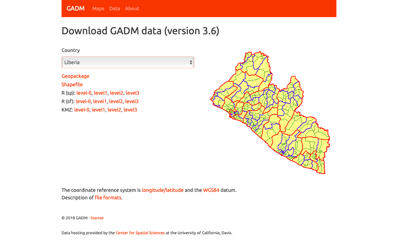
For our purposes, we want to obtain the national boundary (LBR_0), first level administrative subdivisions (LBR_1) and second level administrative subdivisions (LBR_2). Click on the Shapefile link in order to download a folder that contains a shapefile as well as a number of different corresponding files. After the folders have been downloaded, go to your working directory and create a new folder named data and then move the folders describing Liberia's administrative subdivisions to within that folder. The structure of your working directory should look something like the following (minus the additional folders).
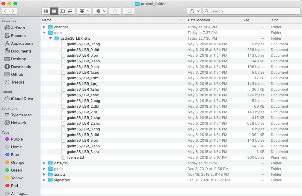
You will also notice that there are a number of different files, each one with the same file name yet also having a unique file extension. The file extension is the three letter part of the file name that is to the right of the period, and acts somewhat as an acronym for the file type. For example, files that have the .shp file extension are called shapefiles. A shapefile contains the geometry of the points, lines and polygons used to spatially describe, in this example, the political geography of Liberia. A shapefile also requires most of the other files found in the folder in order for it to function properly. For example, the .prj file provides the projection that is used when plotting the geometry. The .dbf file provides the attributes associated with each spatial unit (for example the name associated with each county or district). Other files also provide information that enables RStudio to further interpret the spatial information in order to better serve our purposes.
In order to import a shapefile into RStudio we are going to use a command from the sf:: package (simple features). RStudio will need to find each of the .shp files in order to import the international border, the first level administrative subdivisions and the second level administrative subdivisions. If I have set my working directory to the data folder, then RStudio will need to traverse through the subfolder in order to locate the correct .shp files. You also will need to use the read_sf() command to import the .shp file into RStudio and create a simple feature class object.
lbr_int <- add_command_here("add_folder_here/add_file_name_here.shp")
Once you have successfully executed the above function using the sf::read_sf() command, you should observe a new object named lbr_intappearing in the top right data pane within your RStudio environment. To the right of your newly created object there is a small gridded box that you will be able to click on in order to view individual attributes associated with this simple feature class spatial object. You will also notice that within the data pane, RStudio also provides you with some basic information about the object, in this case 1 observation that has 7 variables.
The sf:: package also includes a function called st_geometry() that will enable you to view some of the basic geometry associated with the object you have named lbr_int. Type the name of your object within the st_geometry() command so that RStudio will return some basic geometric information about our spatial object that describes Liberia's international border. You don't necessarily need to write this command in your script, you can just enter it directly into the console
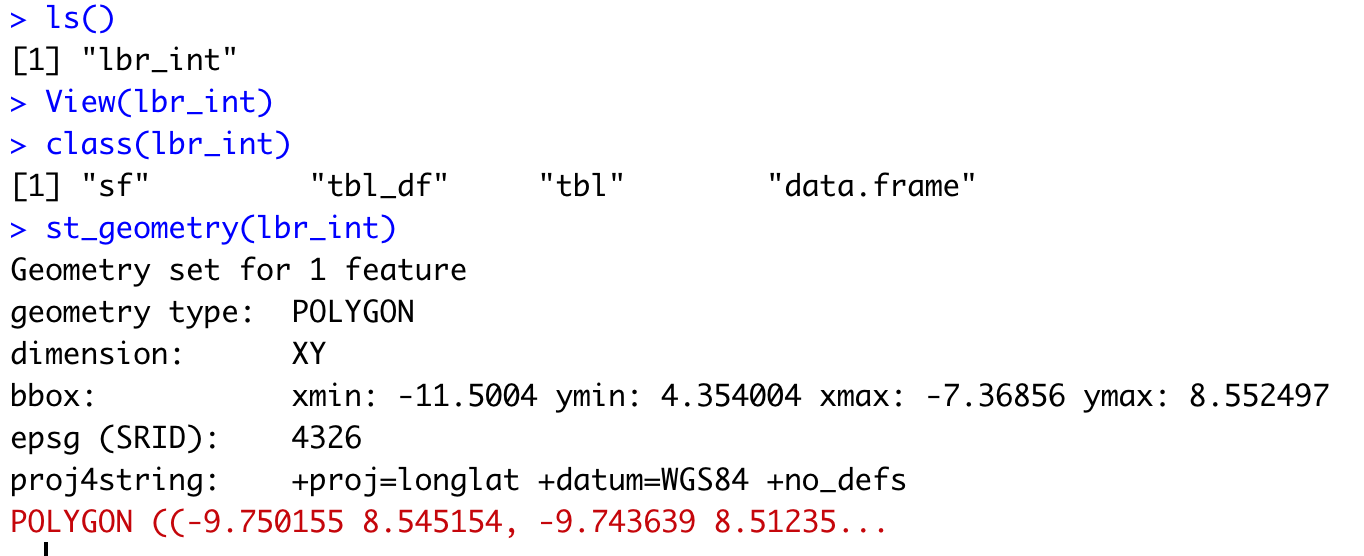
After using the st_geometry() command with our lbr_int object, RStudio provides us with a basic description that includes the geometry type (polygons in this case, but it could also return points or lines), the x & y minimum and maximum values or also known as the bounding box (bbox), the epsg spatial reference identifier (a number used to identify the projection) and finally the projection string , which provides additional information about the projection used.
Now that we have conducted a cursory investigation of our simple feature object geometry, let's plot our simple features class object that describes the international border of Liberia. To plot, we will use a series of functions from a package called ggplot(). The gg in the package name ggplot:: stands for the grammar of graphics, and is a very useful package for plotting all sorts of data, including spatial data classes created with the sf:: package. To start add ggplot() + to your script and then on the following line add the geom_sf(data = your_sf_obj) in order to specify the data that ggplot() should use in producing its output.
ggplot() +
  geom_sf(data = your_sf_obj)
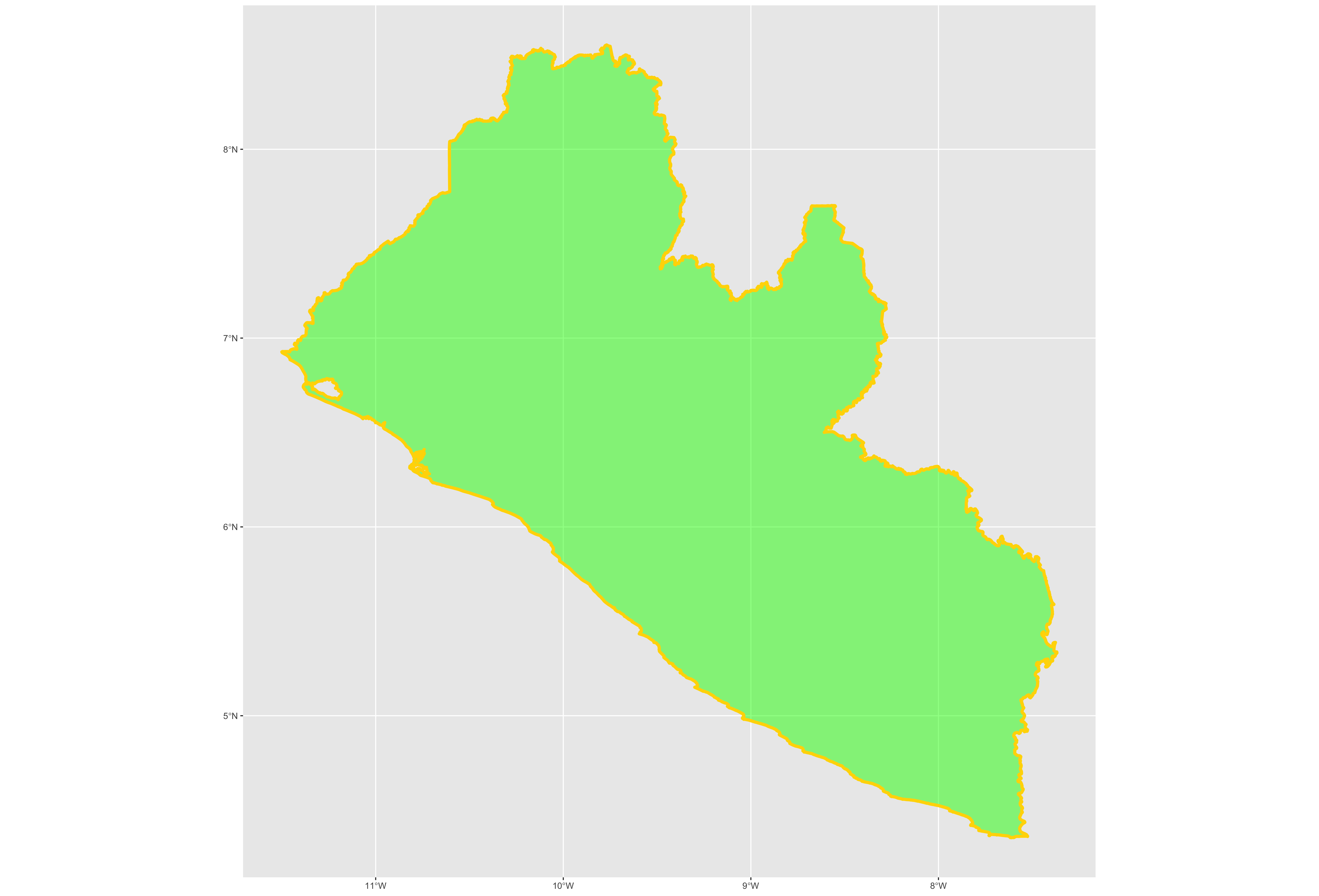
Following the data = argument, you can also specify the line weight for the border using the size = argument. It is also possible to specify the color = as well as the opacity / transparency of your polygon using the alpha = argument. With the following script I have set the international border line weight width to 1.5 , the color of the border to "gold" , the fill color for the internal portion of the polygon to "green" and the alpha = value to .5 or 50% transparent.
It would also be helpful to have a label describing our plot. In order to do this we can use either the geom_sf_text() command or the geom_sf_label() command. In the following snippet of code you will notice that I have added the aesthetics argument within my geom_sf_text() command. The aes = argument enables us to specify which variable contains the label we will place on our object. If you click on the blue arrow to the left of the lbr_int object in the top right data pane, the object will expand below to reveal the names of all variables. The second variable is named NAME_0 and provides us with the name we will use as our label, Liberia. Following the aes() argument, you can also specify the size = of your label as well as its color =.
ggplot() +
  geom_sf(data = your_sf_obj,
          size = value,
          color = "color",
          fill = "color",
          alpha = value_between_0_&_1) +
  geom_sf_text(data = your_sf_obj,
               aes(label = variable_name),
               size = value,
               color = "color")
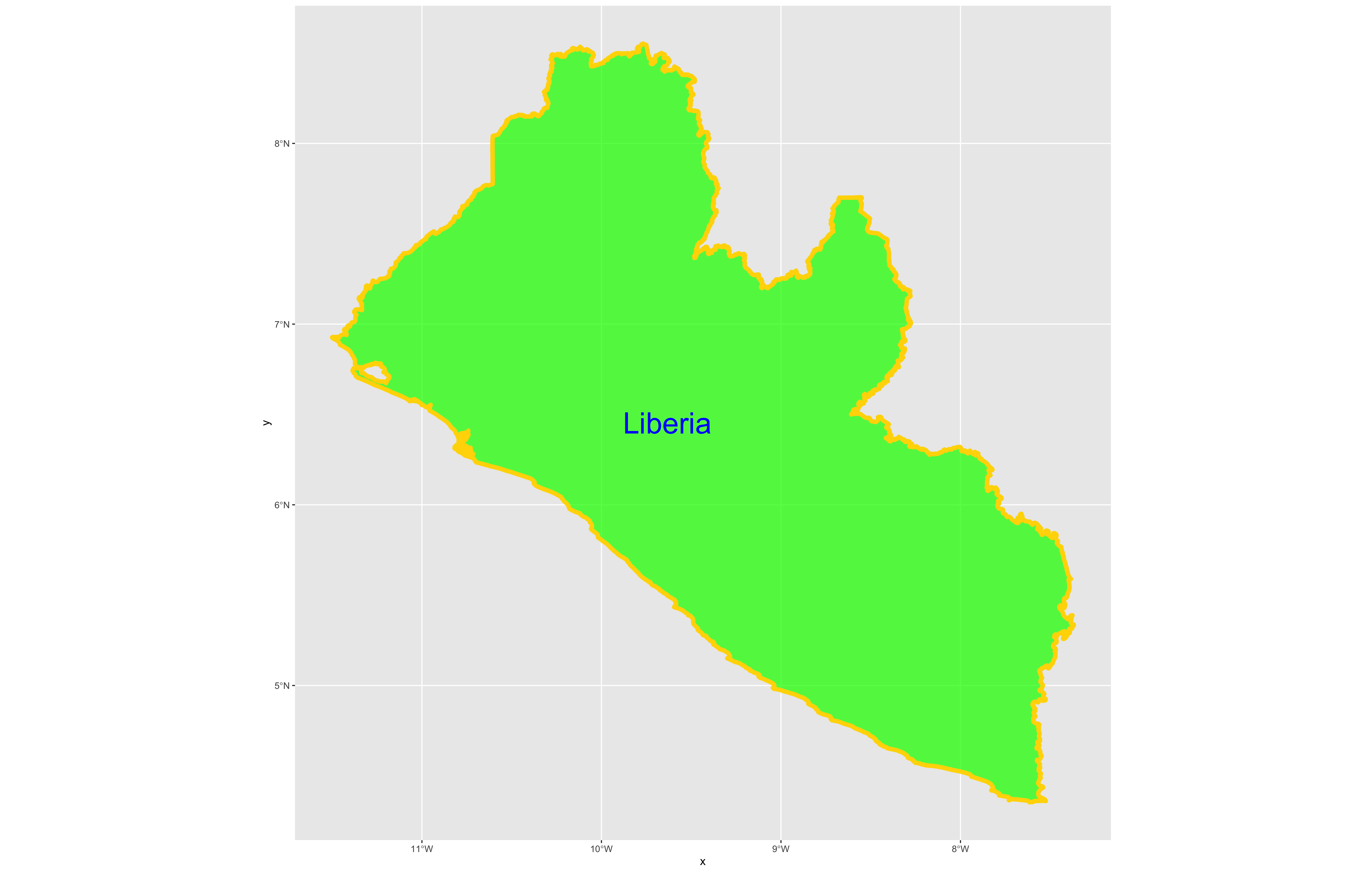
Good job! You have successfully used ggplot from the tidyverse with the simple features package in order to properly project and plot Liberia's international border, as well as to include a label. Now continue with the first level of administrative subdivisions, Liberia's fifteen counties. In order to do this, return to your use of the read_sf() command in order to import and create an object named lbr_adm1.
lbr_adm1 <- add_command_here("add_folder_here/add_file_name_here.shp")
As before you could use the data pane in the top right corner to expand your view of the lbr_adm1 file you created. You can also click on the small grid symbol to the right of your data object (within the data pane) in order to view your data in a new tab in the same pane where your script is located. Whereas before we had a simple feature class object with 1 observation with 7 variables, your lbr_adm1 simple feature object has 15 observations, with each observation having 8 different variables describing some attribute associated with each individual polygon. Let's plot both Liberia's international border as well as its 15 counties.
To do this, follow the same approach you used with the lbr_int object but replace it with the name of your adm1 spatial object, lbr_adm1. Also follow the same approach you used for adding the labels in your previous snippet of code, but this time specify the variable with the county names from lbr_adm1.
ggplot() +
  geom_sf(data = your_adm1_sf_obj,
          size = value,
          color = "color",
          fill = "color",
          alpha = value) +
  geom_sf(data = your_int_sf_obj,
          size = value,
          color = "color",
          fill = "color",
          alpha = value) +
  geom_sf_text(data = your_adm1_sf_obj,
               aes(label = variable_name),
               size = value,
               color = "color") +
  geom_sf_label(data = your_int_sf_obj,
               aes(label = variable_name),
               size = value,
               color = "color")
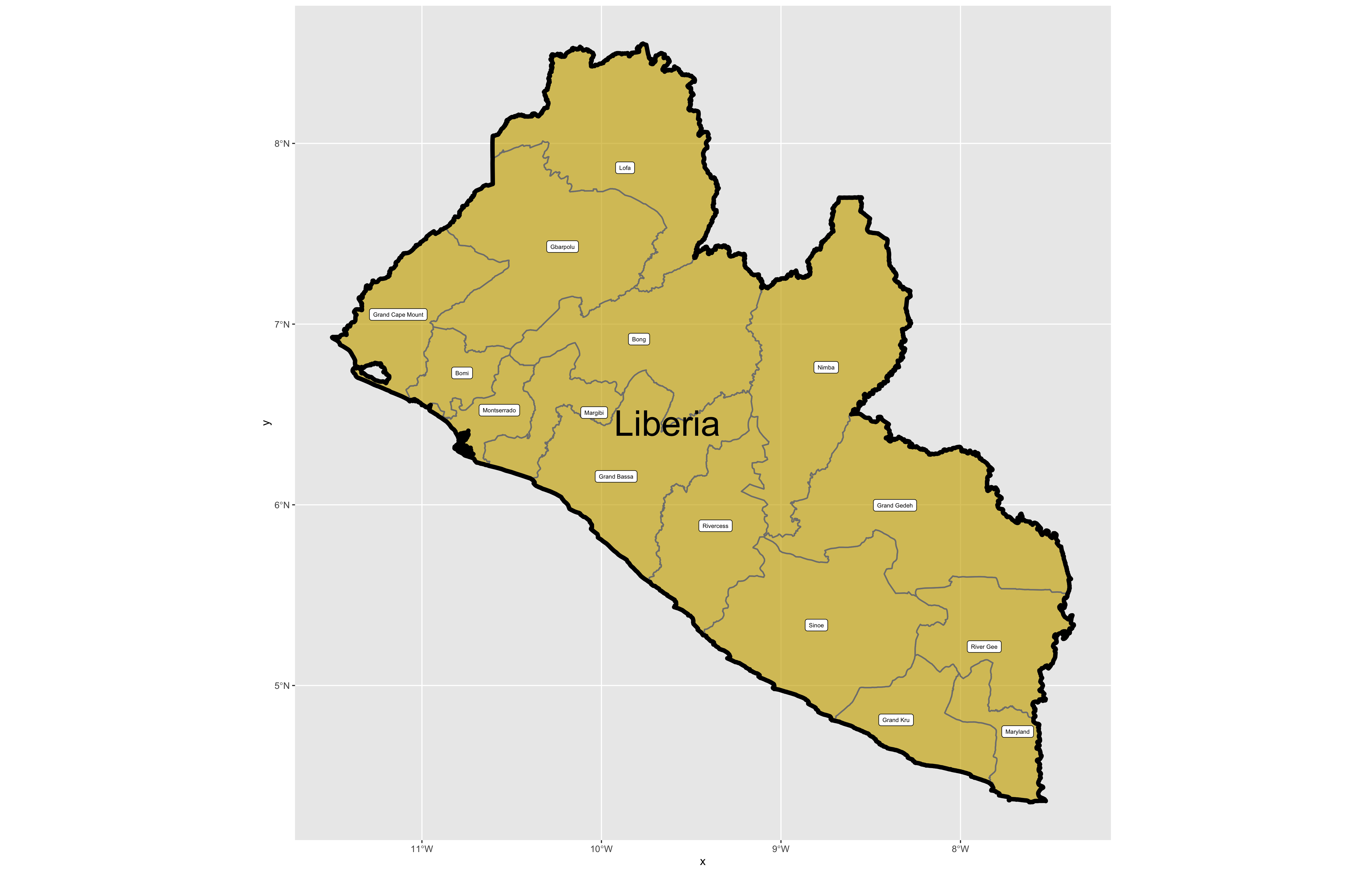
The code above will produce the plot below when thegeom_sf() function using the lbr_adm1 arguments is specified with a line weight size = 0.65, line weight color = "gray50", a polygon fill = "gold3" and a 65% opacity value of alpha = 0.65. Additionally, I have set the size = 2.0 , and the alpha = 0 (100% transparent) for the data = lbr_int object. The geom_sf() command will default to a color = "black" if the line color is not specified. Additionally, since the alpha = 0 no fill = "color" is needed (since it will not appear). The county labels have a size = 2 (and also defaults to a color = "black", while the geom_sf_text() command to label Liberia has a size = 12 argument. In order to nudge the label to the east and south I have also added the nudge_x = 0.3 and nudge_y = -.1 arguments to the geom_sf_label() command.
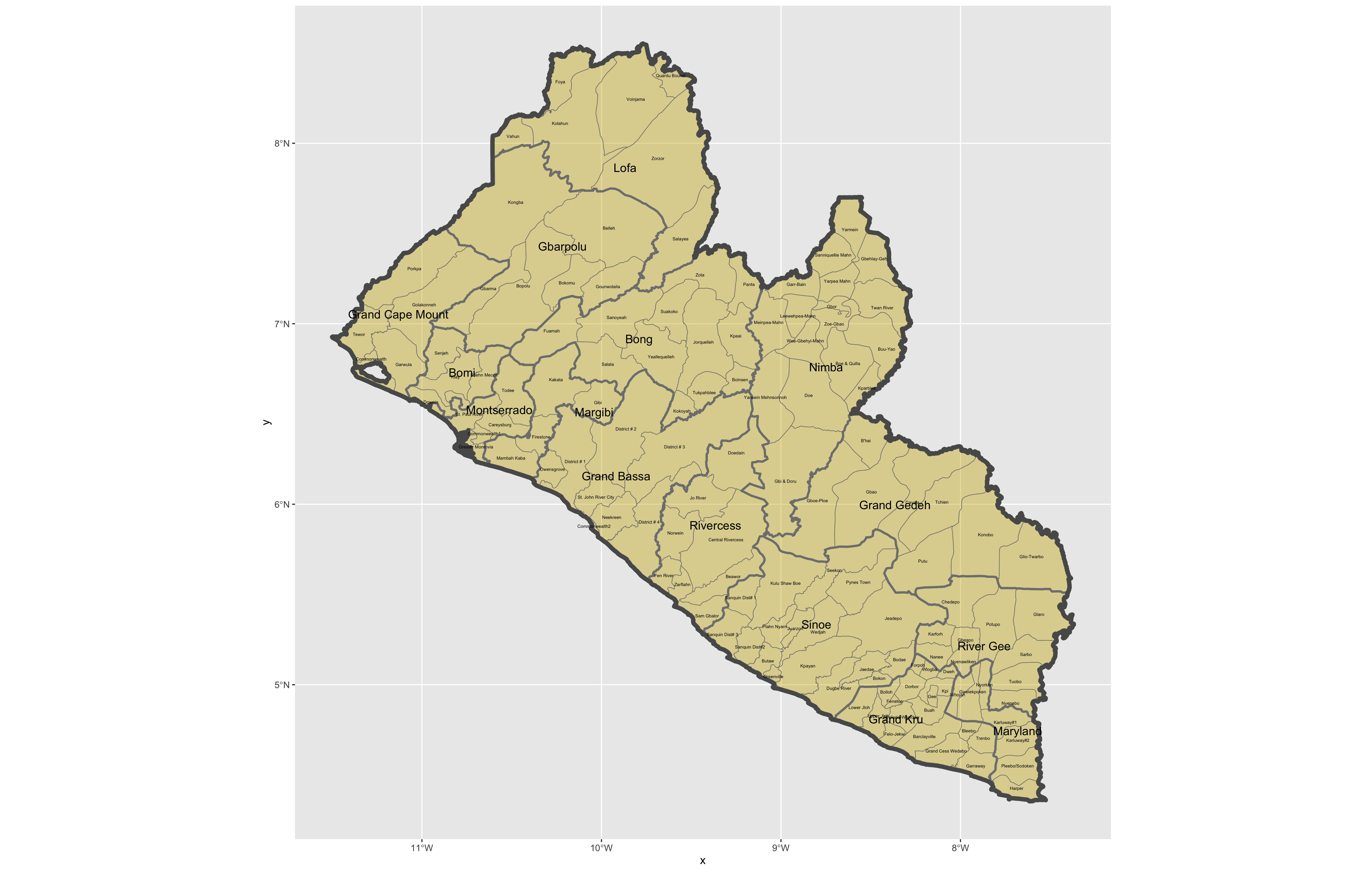
After adding the counties go back and add the second level of administrative subdivisions, or districts. Again use read_sf() to import that shapefile as a simple feature object into your RStudio workspace. Use the geom_sf_text() command to add the labels, while also making sure to specify the correct variable name in the aes(label = variable_name) argument. Size the district borders and labels so they are smaller than the internation border as well as the county delineations.
rm(list=ls(all=TRUE))

# install.packages("tidyverse", dependencies = TRUE)
# install.packages("sf", dependencies = TRUE)

library(tidyverse)
library(sf)

setwd("~/Tresors/teaching/project_folder/data")

lbr_int  <- add_command_here("add_folder_here/add_file_name_here.shp")
lbr_adm1  <- add_command_here("add_folder_here/add_file_name_here.shp")
lbr_adm2  <- add_command_here("add_folder_here/add_file_name_here.shp")

ggplot() +
  geom_sf(data = adm2_object,
          size = value,
          color = "color",
          fill = "color",
          alpha = value) +
  geom_sf(data = adm1_object,
          size = value,
          color = "gray50",
          alpha = value) +
  geom_sf(data = int_object,
          size = value,
          alpha = value) +
  geom_sf_text(data = adm2_object,
               aes(label = variable_name),
               size = value) +
  geom_sf_text(data = adm1_object,
               aes(label = variable_name),
               size = value)

ggsave("liberia.png")
Use ggsave(file_name.png) to save your plot as a .png file, to your working directory.
Challenge Question
Follow the steps from above that you used to produce your plot of Liberia, but instead each team member should select their own LMIC country and produce the output for it. Refer this World Bank guide for a list of low, middle and high income economies. Go back to the GADM website and find the administrative boundaries for the LMIC country you have selected. Plot and label the international border, the first level of administrative subdivisions and the second level of administrative subdivisions. Make sure you designate heavier line widths for the higher level administrative subdivisions and thinner line widths for the more local governments. You may also use darker and lighter colors to discern hierarchy. Please be sure to use different label sizes and/or colors to further differentiate administrative hierarchies. Modifying annotation transparency also as needed.
Meet with your group and prepare to present the best two plots for the Friday informal group presentation. Then as a group, upload all 5 team members plots to #data100_project1 (informal group presentations) by Sunday night.
Stretch Goal 1
Go to the HDX website, find and download the shapefiles for your selected country. Compare their administrative subdivisions to those obtained from GADM. Are they the same? Are there any differences? Which source do you think more closely describes the local political reality within your selected LMIC? Do the HDX shapefiles work?
Alternatively, do the same using the geoBoundaries website, which is housed right here at William & Mary! When comparing GADM, HDX and geoBoundaries, be sure to identify the source of the data you are presenting. Are these administrative boundaries primary or secondary sources? Are you able to identify who produced the data? How did each repository obtain the data they are sharing with you?
Stretch Goal 2
Create a new ggplot() + as you did before. This time filter your lbr_adm1 object by using the %>% (pipe) operator and using the assignment operator to create a new sf object that includes only the county named Montserrado. Inside the filter() command you will need to specify the admin1name = "Montserrado". Then continue to use the %>% operator with your lbr_adm2 object again filtering based on the admin1Name == "Montserrado" . Follow that %>% with your ggplot(), geom_sf() and geom_sf_text() commands to plot the geometries and labels for both the first and second level administrative subdivisions of Montserrado, Liberia.
new_sf_obj <- lbr_adm1 %>%
  filter(variable == "outcome")

lbr_adm2 %>%
  filter(variable == "outcome") %>%
  ggplot() +
  geom_sf(size = value) +
  geom_sf_text(aes(label = variable),
               size = value) +
  geom_sf(data = newly_created_sf_obj,
          size = value,
          alpha = value) +
  geom_sf_text(data = newly_created_sf_obj,
               aes(label = variable),
               size = value) +
  xlab("longitude") + ylab("latitude") +
  ggtitle("Montserrado County", subtitle = "Liberia's most populous county and its subdivisions") +
  theme(plot.title = element_text(hjust = 0.5),
        plot.subtitle = element_text(hjust = 0.5))

ggsave("montserrado.png")
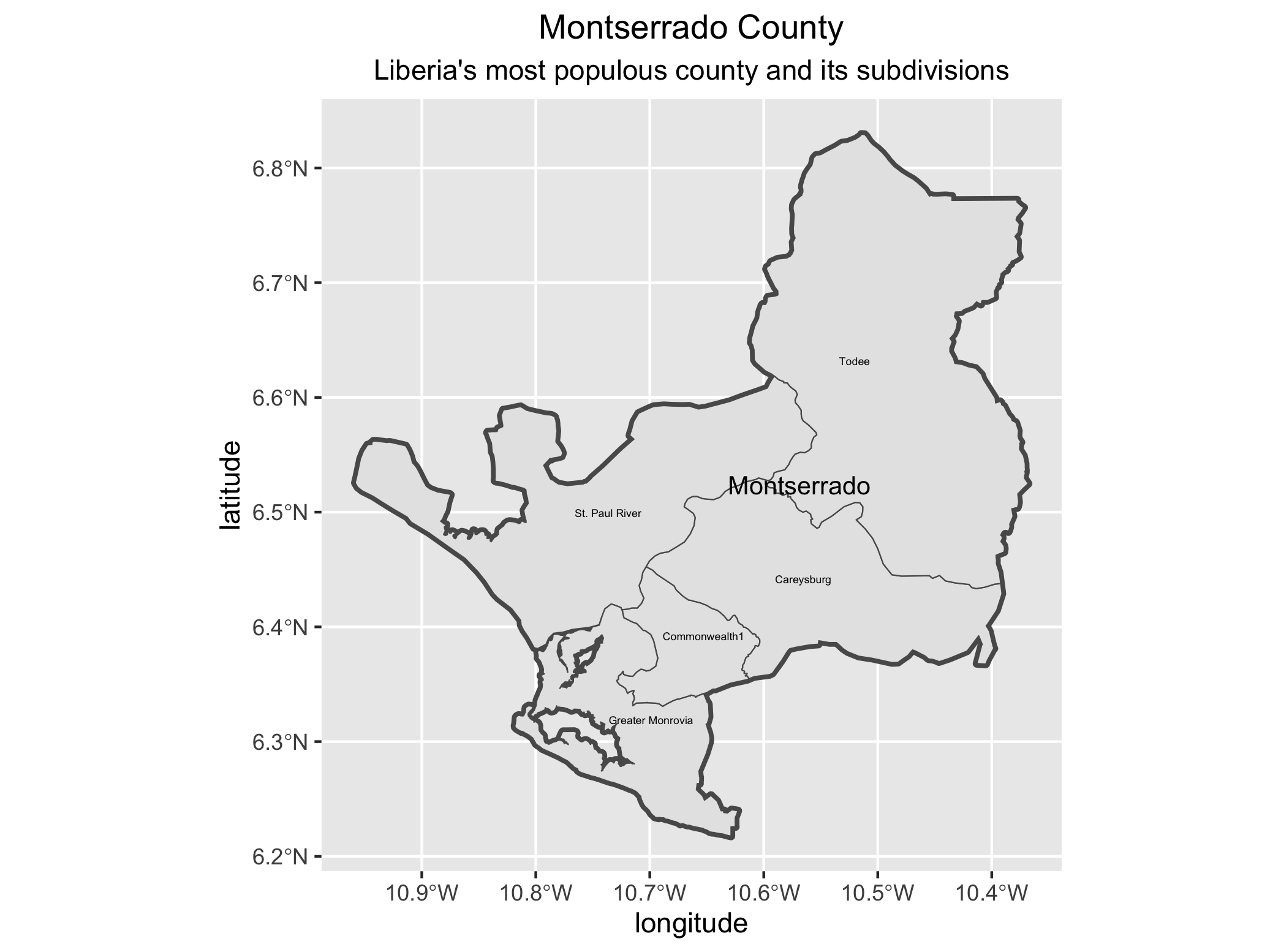
Now identify the most populous urban area within your LMIC and use ggplot() + to plot the first and second level administrative subdivisions where it is located.
Stretch Goal 3
Produce detailed maps of your more densely populated areas and include them in your final product. Use the geom_rect() + command to identify the area of increased scale. Also use the annotation_custom() + command to arrange each plot within a larger graphical layout. The following is a fully working example for Liberia. Translate the script to your LMIC. You may need to install and load the package ggsflabel.
### Create Larger Map of Liberia with Rectangles identifying area of Detailed Maps

plot1 <- ggplot() +
  geom_sf(data = lbr_adm1,
          size = 0.5,
          color = "gray50",
          fill = "gold3",
          alpha = 0.5) +
  geom_sf(data = lbr_int,
          size = 2.0,
          alpha = 0) +
  geom_rect(data = lbr_adm1, xmin = -10.95, xmax = -10.3, ymin = 6.2, ymax = 6.9,
            fill = NA, colour = "green", size = 2) +
  geom_rect(data = lbr_adm1, xmin = -8.80, xmax = -7.35, ymin = 4.3, ymax = 5.65,
            fill = NA, colour = "blue", size = 2) +
  geom_sf_text(data = lbr_adm1,
               aes(label = admin1name),
               size = 3) +
  geom_sf_text(data = lbr_adm1,
               aes(x = -10.60, y = 6.05, label = "Detail A"),
               size = 5,
               color = "green") +
  geom_sf_text(data = lbr_adm1,
               aes(x = -9.10, y = 4.6, label = "Detail B"),
               size = 5,
               color = "blue") +
  xlab("longitude") + ylab("latitude") +
  ggtitle("Liberia", subtitle = "Details A & B") +
  theme(plot.title = element_text(hjust = 0.5), plot.subtitle = element_text(hjust = 0.5),
        panel.background = element_rect(fill = "azure"),
        panel.border = element_rect(fill = NA))

### Create Detail A Map

mont_cnty <- lbr_adm1 %>%
  filter(admin1name == "Montserrado")

plot2 <- lbr_adm2 %>%
  filter(admin1Name == "Montserrado") %>%
  ggplot() +
  geom_sf(size = .15) +
  geom_sf_text(aes(label = admin2Name),
               size = 1.75) +
  geom_sf(data = mont_cnty,
          size = .5,
          alpha = 0) +
  geom_sf_text(data = mont_cnty,
               aes(label = admin1name),
               size = 3.75,
               alpha = .5) +
  xlab("longitude") + ylab("latitude") +
  ggtitle("Detail A", subtitle = "Montserrado County") +
  theme(plot.title = element_text(hjust = 0.5), plot.subtitle = element_text(hjust = 0.5),
        panel.background = element_rect(fill = "azure"),
        panel.border = element_rect(fill = NA))


### Create Detail B Map

east_cnties <- lbr_adm1 %>%
  filter(admin1name == "Grand Kru" | admin1name == "Maryland" | admin1name == "River Gee")

plot3 <- lbr_adm2 %>%
  filter(admin1Name == "Grand Kru" | admin1Name == "Maryland" | admin1Name == "River Gee") %>%
  ggplot() +
  geom_sf(size = .15) +

  geom_sf_text(aes(label = admin2Name),
               size = 1.75) +
  geom_sf(data = east_cnties,
          size = .5,
          alpha = 0) +
  geom_sf_text(data = east_cnties,
               aes(label = admin1name),
               size = 3.75,
               alpha = .5) +
  xlab("longitude") + ylab("latitude") +
  ggtitle("Detail B", subtitle = "River Gee, Grand Kru & Maryland Counties") +
  theme(plot.title = element_text(hjust = 0.5), plot.subtitle = element_text(hjust = 0.5),
        panel.background = element_rect(fill = "azure"),
        panel.border = element_rect(fill = NA))


ggplot() +
  coord_equal(xlim = c(0, 6.0), ylim = c(0, 4), expand = FALSE) +
  annotation_custom(ggplotGrob(plot1), xmin = 0.0, xmax = 4.0, ymin = 0,
                    ymax = 4.0) +
  annotation_custom(ggplotGrob(plot3), xmin = 4.0, xmax = 6.0, ymin = 0,
                    ymax = 2.0) +
  annotation_custom(ggplotGrob(plot2), xmin = 4.0, xmax = 6.0, ymin = 2.0,
                    ymax = 4.0) +
  theme_void()

ggsave("details.png")
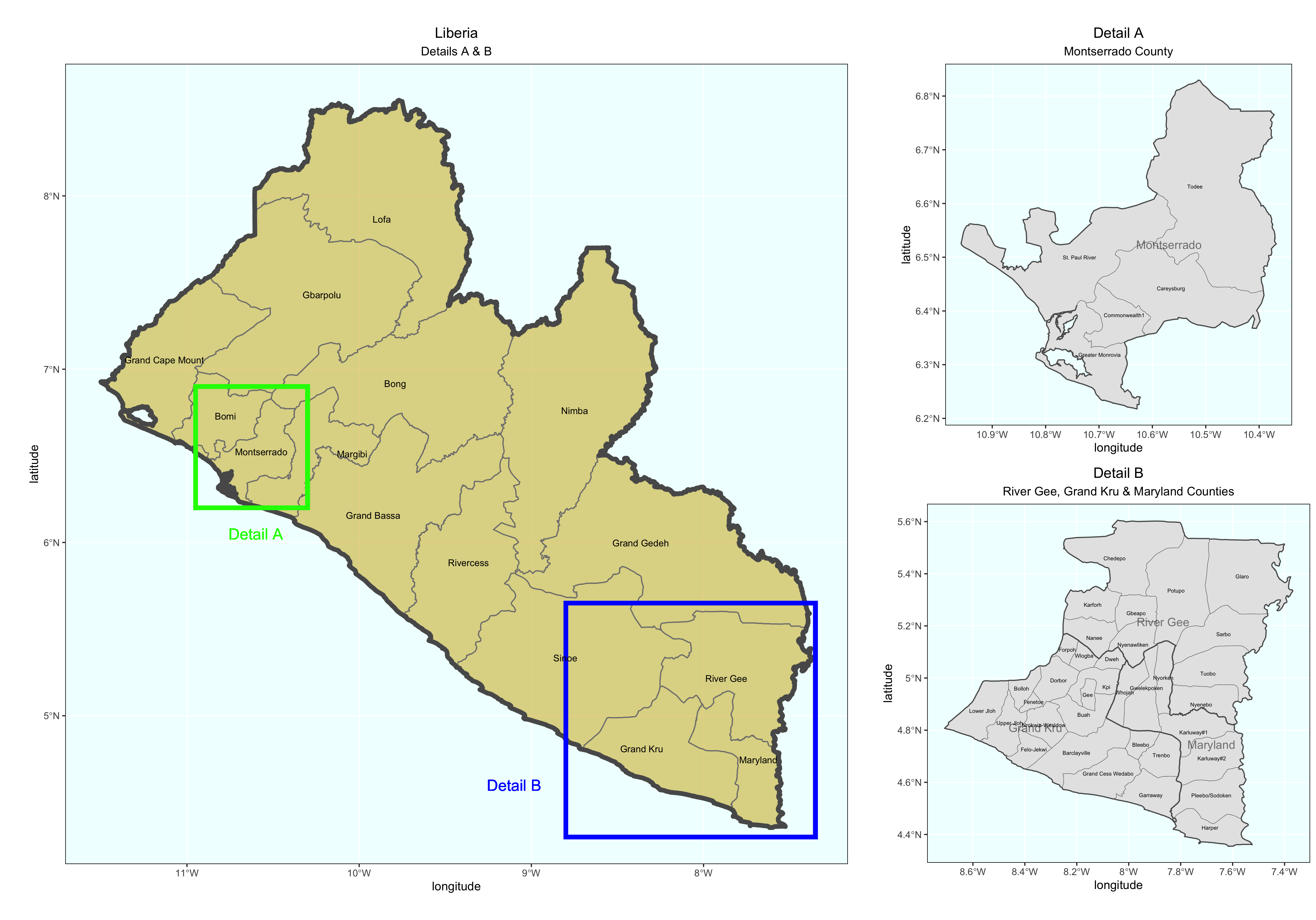
Extracting Populations from a Raster and Aggregating to each Unit
Now that you have selected your LMIC and produced a basic geospatial description of that country at both the adm1 and adm2 levels of government, you are now set to join some data to each of those units and begin conducting a basic descriptive analysis. Start by going back to the WorldPop website, click on the population tab under the data pull down menu, search individual countries and type the name of your selected LMIC. Click on the 2019 data and resources tab for your country and then select the download button in order to obtain the spatial distribution of population for your selected LMIC. For Liberia the downloaded file is named lbr_ppp_2019.tif. Move the file to the data folder within your working directory.
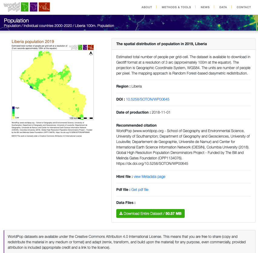
You may need to right click or two finger click and choose the download linked file option in order to initiate the process of downloading the .tif file into your downloads folder. Sometimes your web browser may be set to try and display the image file directly within the browser itself. You should still be able to save the file directly to your downloads folder by right clicking on it and saving it.
After you have succesfully downloaded the file, go to your project folder that you previously used as your working directory and create a new folder within the /data folder that will be dedicated to raw data from worldpop. I have made a subdirectory within my data folder named world_pop to further categorize and organize my source data.
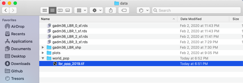
Once you have your .tif file located within a subdirectory of the data folder, you can go ahead and open up RStudio. Create a new, R Script file, and save it in your scripts folder. Add the rm(list=ls(all=TRUE)) at the beginning of your code and then load the tidyverse and sf libraries. Following your libraries, be sure to set your working directory.
rm(list=ls(all=TRUE))

# install.packages("tidyverse", dependencies = TRUE)
# install.packages("sf", dependencies = TRUE)

library(tidyverse)
library(sf)

setwd("~/path/to_my/working/directory/")
For this exercise, we will install a new package and then load its library of functions. Use the install.packages() to install the raster:: package. Be sure to set the dependencies = TRUE argument within your command. After you have successfully installed the raster:: package, use the library() function to load raster:: and make its set of commands available as part of your current RStudio work session.
The first command we will use from the raster:: package shares the same name as the library itself. We use the raster() function to import our .tif file from its location within our data subdirectory to the current RStudio work session. Keep in mind, if you set your working directory to the /data folder, but then also created a subfolder named /world_pop you will need to include the subdirectory path, as well as the full name of the .tif within the raster() command.
myLMIC_raster_pop19 <- add_command_here("add_folder_name_here/add_file_name_here.tif")
Once you have created your new raster object, by using the raster() function, you should notice a new Formal class RasterLayer data object appear in the top right data pane. In order to find out some basic information about my newly created raster object, I will type the name of my object directly into the console.
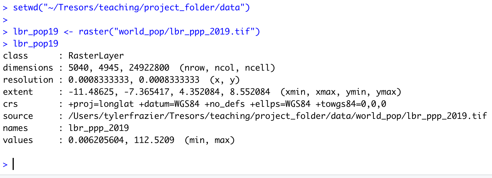
The name of my raster class object is lbr_pop19 and by typing the objects name directly into the console, R informs me of the class of the object, dimensions, resolution, extent, coordinate reference system as well as the minimum and maximum values. The information about the objects dimensions can be useful, since it is informing us of how many rows of gridcells by how many columns of gridcells are contained within the object. In the case of the WorldPop raster layer describing Liberia's population in 2019, the object contains 24,922,800 gridcells of equal size, each one with a value describing how many people live in that location. Resolution informs us of the size of each grid cell, which in this case is defined in terms of decimal degress. We can also, obtain additional information about the projection of the raster layer from the crs row, which is in longitude and latitude (decimal degrees) while using the WGS84 datum. We will want to confirm that our shapefiles also are using the WGS84 datum in their projection.
You'll want to note the number of gridcells that your raster layer contains. If your country contains too many gridcells the computational expense required to execute calculations may be too time intensive. As noted above, Liberia has about 25 million gridcells, while quite large, most modern desktop and laptop computers should be able to handle this data within a reasonable amount of time. Comparatively, Ghana has about 41 million, Syria has about 48 million while Cuba has about 53 million total gridcells. While a bit larger in size than Liberia as well as the computational power that will be demanded in order to execute calculations over those raster files, countries of this approximate size (40 to 50 million gridcells) should also be manageable. Raster files containing more than 50 million gridcells will begin to become exorbitantly more time intensive. For example, South Sudan with 140 million, Madagascar with 143 million, Morocco with 144 million, or Vietnam with 156 million gridcells per raster will all likely be computationally very expensive in terms of the time it will take to execute commands using the raster files.
If your country has a very large number of gridcells within the population raster, there are two recommendations for how to proceed. First you are welcome to reselect your LMIC by choosing one that is smaller in terms of area and number of gridcells. Second, you are also welcome to select a subdivision of your LMIC and then subset your country to include only that administrative area. A good example of how to subset your LMIC to include one or more of its subdivisions was provided in project 1, part 1, individual stretch goal 2 (lines 1 & 2 of the code). If you want to subset a larger country and raster, please ask me, and I'll share some example code with you.
As we did in the previous exercise, we will again import our shapefiles using the read_sf() command from the sf:: library of functions. Let's start out by importing the adm1 shapefile for your selected LMIC.
myLMIC_sf_adm1 <- add_command_here("add_folder_here/add_file_name_here.shp")
In a manner similar to how we retrieved a basic description of our raster file, we can simply type the name of our simple features class object into the console.
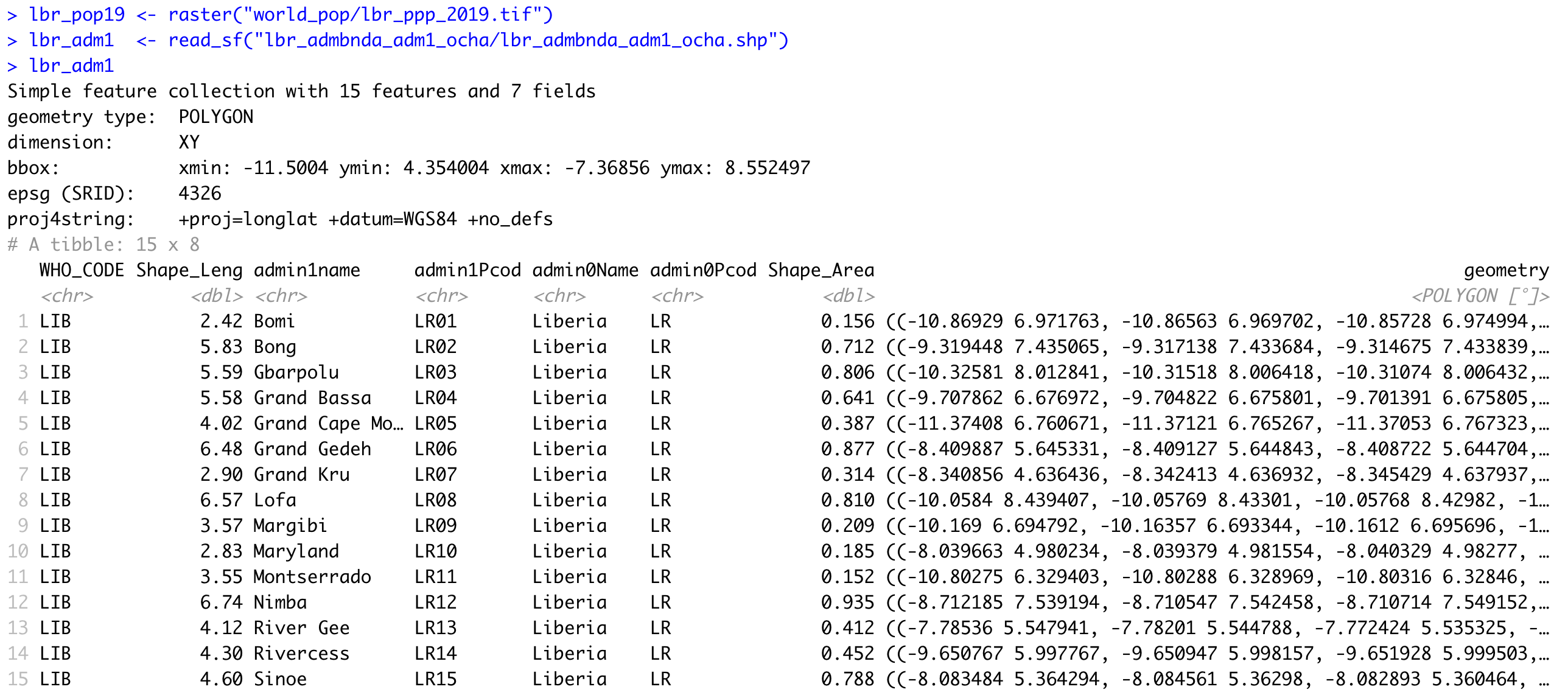
R informs us that our simple feature collection has 15 features, each one with 7 fields (or variables). R also provides us with the bounding box for our collection of polygons in terms of the minimum and maximum longitude and latitude values. Additionally, we are able to confirm that the source shapefile used to important our sf object also used the WGS84 datum for projection.
You also may notice that below the proj4string row, R describes the object as a tibble: 15 x 8. A tibble is a new object class for data that is commonly used with the tidyverse syntax. Tidyverse syntax is sometimes referred to as tidyR and is different from the baseR syntax. While tidyR is fully capable of calling variables from data frames using either the $ operator or the [ ] subscripting operators, it is a more advanced design in its approach to data that can include multiple dimensions, and thus %>% pipe operators can be very effective. For now, all you need to know is that a tibble is a kind of data object, and tidyR is a new kind of data science syntax for R.
Since both our raster and sf objects are similarly projected, we should be able to plot both and confirm they have the same bounaries. Start by plotting the raster object. Follow that on the next line, by also plotting your sf object. You will want to nest the name of your sf object within the st_geometry() command in order to plot just the geometry for all 15 polygon features. Finally, also include the add = TRUE argument to the command, in order to add the ploygon features to the already plotted raster layer.
plot(your_raster_object)
plot(st_geometry(your_adm1_sf_obj), add = TRUE)
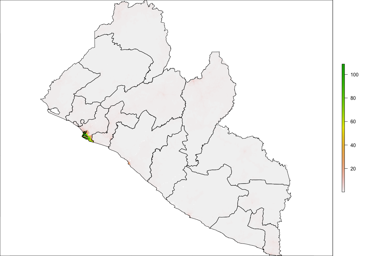
We can see that we now have a scale on the right hand side of the plot that is using a color scale to coorespond with all continuous values between a minimum and maximum (from about 0 to a little more than 112). We can also begin to identify the locations throughout Liberia where people have settled. Clearly there is a large clump of green and yellow gridcells located along the southern coast (this is the location of Liberia's capital city Monrovia). As we move away from the centrally populated coastal urban area, inland to the north-east we also notice some less densely populated areas along the outskirts of Monrovia, which have pinkish colored gridcells. There are also a few, less populated urban areas further to the south as well as along the northern border with Guinea. In fact, if we looked at all 24,922,800 gridcells that indivually comprise this map, each one would have a value and cooresponding color that indicates its population.
We can confirm that our raster and sf objects have almost coterminous boundaries (not exactly, but fairly close). Now we will use a function from the raster:: package that will evaluate each gridcell according to its location, which will be one of the 15 counties. Since we have 24,922,800 gridcells to evaluate in accordance with one of 15 different locations, we can imagine this could very well be a computationally expensive task. Before executing your extract command, it is a good idea to close all applications and processes that you may have running on your desktop or laptop. It is also a good idea to connect your computer to a power supply cable that is plugged into a 110V wall jack. Restarting your computer from a cold boot and confirming that no superfluous processes automatically begin during start-up, will also help to maximize your potential computational power for RStudio.
In order to optimize the efficiency of your computer, we are also going to do something called parallel processing by sending streams of data to available cores found in the central processing unit of your computer. To do this, we will need to add two new packages in your script. Go back to the top of your script and add a line of code beneath the other lines where you executed the install.packages() command. This time, install two new packages, doParallel:: and snow::. Add the dependencies = TRUE argument to inform RStudio to include any other packages that doParallel::and snow:: may depend upon in order to properly function. After you have sucessfully installed both packages (always observe their installation and watch to see if any errors pop up), then use the library() command in order to load each packages' associated library of functions. Don't forget to comment off the install.packages() lines of code after they have finished.
Once you have successfully made both of these new packages available, move back to after the last lines of code you wrote, where you plotted your raster layer with the sf layer on top. First, check to see how many cores are available on your computer. To do this use, enter the detectCores() command directly into the console. When running parallel processes on your computer, you should always save at least one core for system operations, thus we will create an object that is equal to the number of cores on your computer - 1.
In the next steps that follow, do not execute any of the following four lines of code until you have first properly specified them in your script (I'll indicate when to run them further below). Start by creating an object that designates the number of cores you will use once you begun parallel processing. Follow the creation of your ncores object with the beginCluster() command, which will inform RStudio to start parallel processing.
ncores <- detectCores() - 1
beginCluster(ncores)
Once parallel processing has been engaged, we will add the command from the raster:: package that will evaluate all of the gridcells and assign a number to each one that cooresponds to its location as being within one of the 15 counties. This command is called extract(). The extract() command will need two objects, the first will be our raster layer object while the second will be our simple features class object. In addition to adding the extract() command itself to the script, I will also further specify the raster:: library in the command to make certain, RStudio doesn't attempt to execute a different extract() command from another library. Do not run this command yet, just write it in your script after beginCluster().
pop_vals_adm1 <- raster::extract(your_raster_obj, your_sf_obj, df = TRUE)
Also add the df = TRUE argument at the end of the command to create the new object as a data frame. Following the extract() command, add the endCluster() command, to inform RStudio that you will no longer need to use additional cores for parallel processing. This snippet of code should appear as follows. Select all four lines and run them at the same time.
ncores <- detectCores() - 1
beginCluster(ncores)
pop_vals_adm1 <- raster::extract(lbr_pop19, lbr_adm1, df = TRUE)
endCluster()
Depending on your computer, the size of the raster file as well as the size of your sf file, running the above 4 lines of code could take a few minutes. You will want to be patient and wait for the extract() command to complete its evaluation of every grid cell. If you would like to monitor the progress of your comptuer you could go to the activity monitor on a Mac or the task manager on a Windows machine.

For example on this particular Mac, you will see that 7 processes have been allocated to R in order to evaluate the location of all ~25 million gridcells. You will also notice the CPU load has increased considerable, to almost 90% in the above case. With 7 i7 cores, it took about 1 minute and 10 seconds to extract the values of all 4 million persons distributed across the 25 million gridcells throughout Liberia. Your case could be faster or slower depending on the size of the data, the speed of your machine, and how much computational power you have reserved for the given task.
After your raster::extract() has finished, you should have a new data frame object in your top right data pane that is populated with probably hundreds of thousands if not millions of rows (observations), and two columns (variables). Each row will have a number between 1 and 15 in the above case (each number corresponding to each of Liberia's counties) and then a following column that provides the WorldPop estimate for how many people occupy each individual gridcell. You may notice that all of the observational values have fractions and even quite a large number are likely to be a fraction less than 1. While not an ideal outcome, these fractions are a result of the current methodology and essentially is still state of the art for dasymmetric population distribution. In the future, I expect new methodologies will discretize intervals and over come this "zero cell problem" by some means other than adding these small values across the entire space that essentially amount to "noise."
Since this newly created data frame is quite large, and it would be better if you didn't have to run the extract() command everytime you opened and ran this script, it is a good idea to go ahead and save the data frame as a .RData file. You can save data using the save() command, and then you can also later load data using the load() command. Once you have executed the save() command, you can then comment it off, thus only needing to load() the data.
# ncores <- detectCores() - 1
# beginCluster(ncores)
# pop_vals_adm1 <- raster::extract(lbr_pop19, lbr_adm1, df = TRUE)
# endCluster()
# save(pop_vals_adm1, file = "pop_vals_adm1.RData")

load("pop_vals_adm1.RData")
We have assigned a cooresponding ID for each gridcell according to its county, and now we will sum the totals all gridcells by ID. Start with the data frame that you created with your extract() command. For my Liberia example, I have called the data frame object pop_vals_adm1. Follolw your object with the %>% pipe operator. You will use the group_by() command in order to group all of the observations within our data frame according to its ID. Follow the group_by() command again with another %>% pipe operator. Now specify that you will group each row according to its ID and also summarize all of the rows with the same ID according to the lbr_ppp_2019 variable, which contains the estimate of how many persons live within each gridcell. Finally, be sure to add the na.rm = TRUE argument to your command, which will remove from the calculation all grid cells that do not have a value (generally designated in R as NA).
totals_adm1 <- pop_vals_adm1 %>%
  group_by(add_ID_variable_here) %>%
  summarize(name_of_newly_created_var = sum(add_pop_var_here, na.rm = TRUE))
Grouping the data frame we produced with the extract() function, by ID while also summing together all gridcell values that share that same ID will produce the following estimated population totals for every county in Liberia.
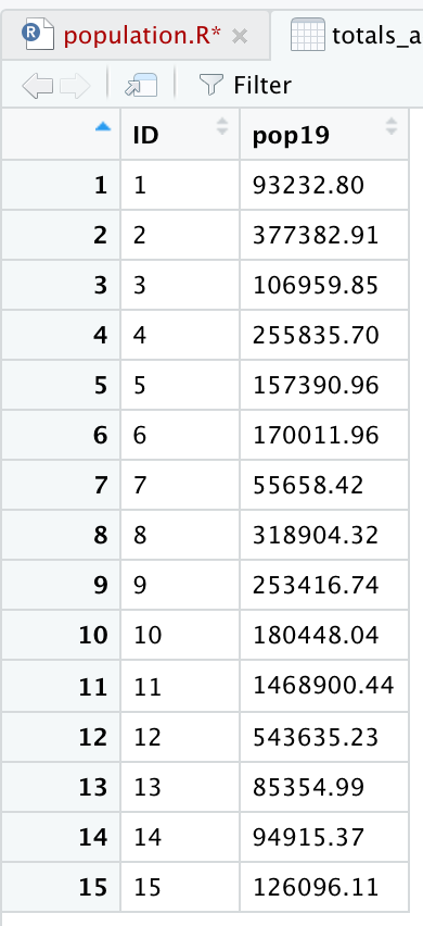
Review the sum totals to see if they are realistic. Execute the equivalent of sum(totals_adm1$pop19) directly in the console, and consider the total returned. In the above example, R returns a total of 4,288,144 total persons living in 15 different counties across Liberia during the year 2019. What does R return for your LMIC? Is the sum total realistic? Research the population of your LMIC in 2019 and confirm your returned value is realistic.
Now that we have the total population for each county, we need to add it to our sf class object so that we can spatially describe the population of our LMIC. You can do this with the %>% pipe operator and the add_column() command. In the argument of the add_column() command first specify the name of the column you will be creating in your sf adm1 object and then set that = to the name of the data frame and variable where those population totals exist. In our example case pop19 = totals_adm1$pop19. Also notice how I simply write over my existing sf object by assigning the newly created object the exact same name lbr_adm1 <- lbr_adm1 %>%.
myLMIC_adm1 <- myLMIC_adm1 %>%
  add_column(pop19 = totals_adm1$name_of_newly_created_var)
After running the above code, look in the data pane in the top right corner of RStudio and find your modified adm1 simple features object. Click on the small grid off to the right of the object to view the data in the top left pane (scripts pane). Scroll all the way to the right in the data, and you should notice a new column named pop19 that has the population counts for every adm1 subdivision in your country.
Now that we have totals for each county, it is finally time to plot our results. Since we are only going to call one object in the first example, we can start our ggplot() command by automatically specifying the object we will be using in our plot. Within the geom_sf() command, use the aes(fill = ) argument to identify the variable that will be used to spatially describe the continuous values of population totals for each of Liberia's counties. Also add the scale_fill_gradient() command with the low = and high = arguments to desginate a color that will coorespond to the low and high ends of the value range. A heatmap typically sets the color yellow to coorespond with the minimum value and red as the maximum value.
ggplot(myLMIC_adm1) +
  geom_sf(aes(fill = pop19)) +
  geom_sf_text(aes(label = admin1name),
               color = "color",
               size = size) +
  scale_fill_gradient(low = "color", high = "color")

  ggsave("lbr_pop19.png")
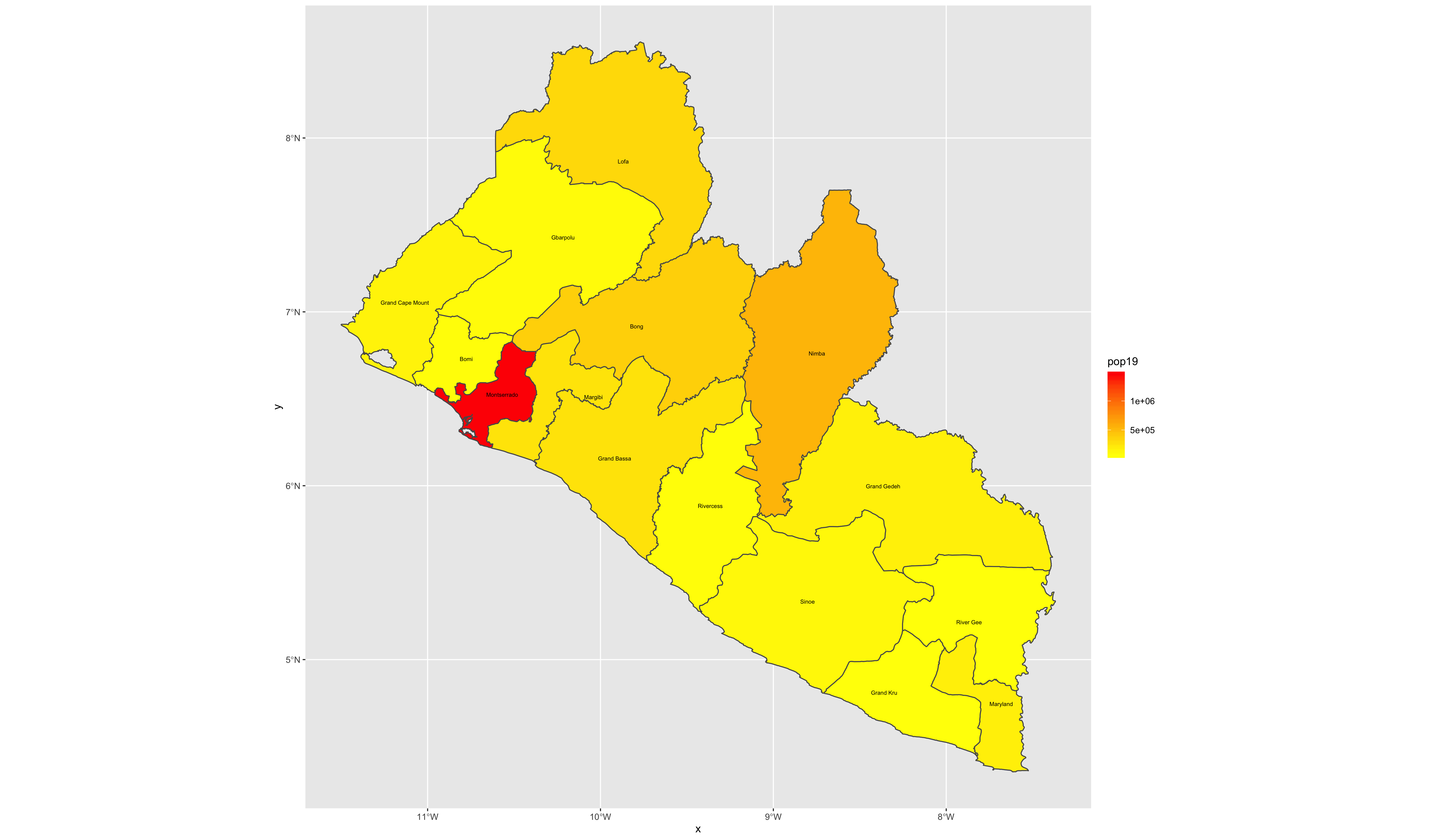
Challenge Question
Follow the steps from above that you used to produce your plot of Liberia, but instead each team member should use their own selected LMIC country. Go back to the HDX website and find the population totals for the LMIC country you have selected.
Meet with your group and prepare to present the two best plots for the Friday informal group presentation. Then as a group, upload all 5 team members plots to #data100_igps (informal group presentations) by Sunday night.
Stretch Goal 1
Go back and replicate the step by step instructions from above, but instead of extracting and plotting the values for your LMIC's adm1 subdivisions, do it for adm2. Set the fill = argument by making it equal to the log transformation of your population variable log(variable_name).
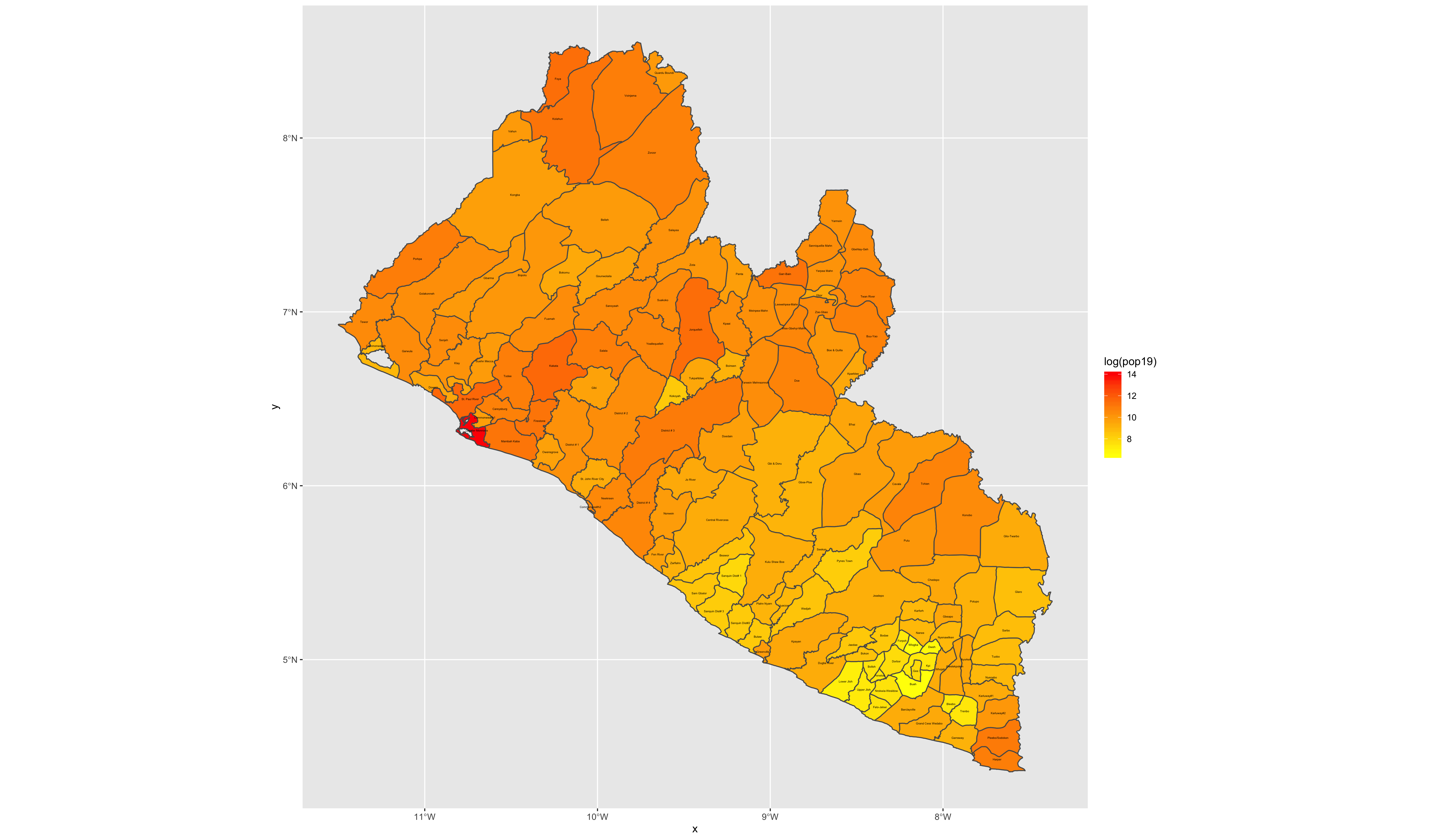
Stretch Goal 2
Take your spatial description of population at the district level from above and add the adm1 boundaries, such that you can determine where each district is located. Be sure to add the data = argument where you specify both your adm1 and adm2 sf class object for each geom_sf() function within the ggplot() object you are creating. Set the size = argument for the adm1 object as much smaller than the lines width for the adm2 (in my plot below they are .1 and .65 respectively. Also be sure to set the alpha = 0 for the adm1 object, in order to be able to see the districts.
Again, include the data = argument when using the geom_sf_text() command in order to add the labels for both the districts and counties. District labels can be relatively small, perhaps size = 1.0 while they should be considerable larger for the county labels, possibly along the order of size = 2.5. In your geom_sf_text() argument for the county lables, set the alpha = .35, such that the labels are transparent enough to interpret whats beneath them, while still discenable enough to read.
Change your scale_fill_gradient() command to scale_fill_gradient2() in order to add a third color and midpoint to the colors mapped to each contiuous value. Look at the value from the previous scale. What is the midpoint?
scale_fill_gradient2(low = "blue", mid="yellow", high="red", midpoint = add_value_here)
Add other descriptive elements to your plot, such as labels for axes, title and panel background.
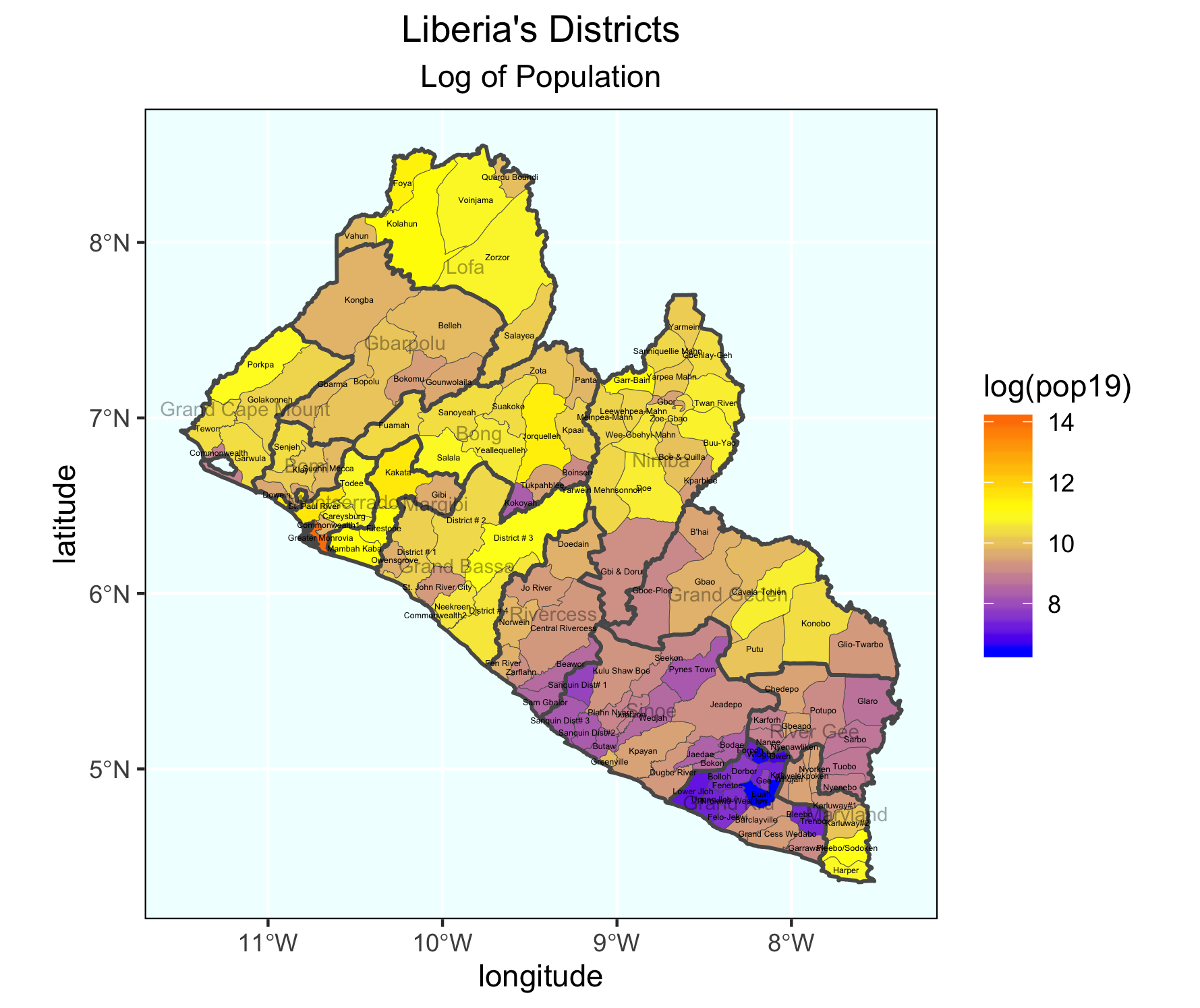
Stretch Goal 3
Install the package rayshader:: from Tyler Morgan Wall's github repository.
remotes::install_github("tylermorganwall/rayshader", dependencies = TRUE)
Once it has been installed (it might take a few minutes), use the library(rayshader) command to load the library of functions. Create a simple ggplot() of adm2 values without any annotations or other descriptive details. Keep either the scale_fill_gradient() or scale_fill_gradient2() . Notice how assign my ggplot() object to a new object named gglbr_adm2. I used the following code for Liberia.
gglbr_adm2 <- ggplot(lbr_adm2) +
  geom_sf(aes(fill = log(pop19))) +
  scale_fill_gradient2(low = "blue", mid="yellow", high="red", midpoint = 11.0)
Finally, create a three dimension plot of all log of density population values by district. Notice the name of the ggplot object I created above is the same object used in the plot_gg() command from the rayshader:: package.
plot_gg(gglbr_adm2, multicore = TRUE, width = 6 ,height=2.7, fov = 70)

Creating a Geometric Bar Plot with your Simple Feature object
In the previous exercise, you extracted population data from a raster, and then aggregated these totals to the first level administrative area of your selected LMIC. You then added this new column describing the population of each first level administrative subdivision to your simple feature object. Now we are going to use that newly created column as the basis for generating a geometric bar plot of population, share of population and density by first level adminsitrative subdivision.
Rerun the code you used to create your adm1 sf class object in R, including the newly added population column. Click on the View() grid symbol to the right of the data object in the top right, RStudio pane under the environment tab. When the data viewer appears in the top left pane (beside your script tab), it should look something like the following.
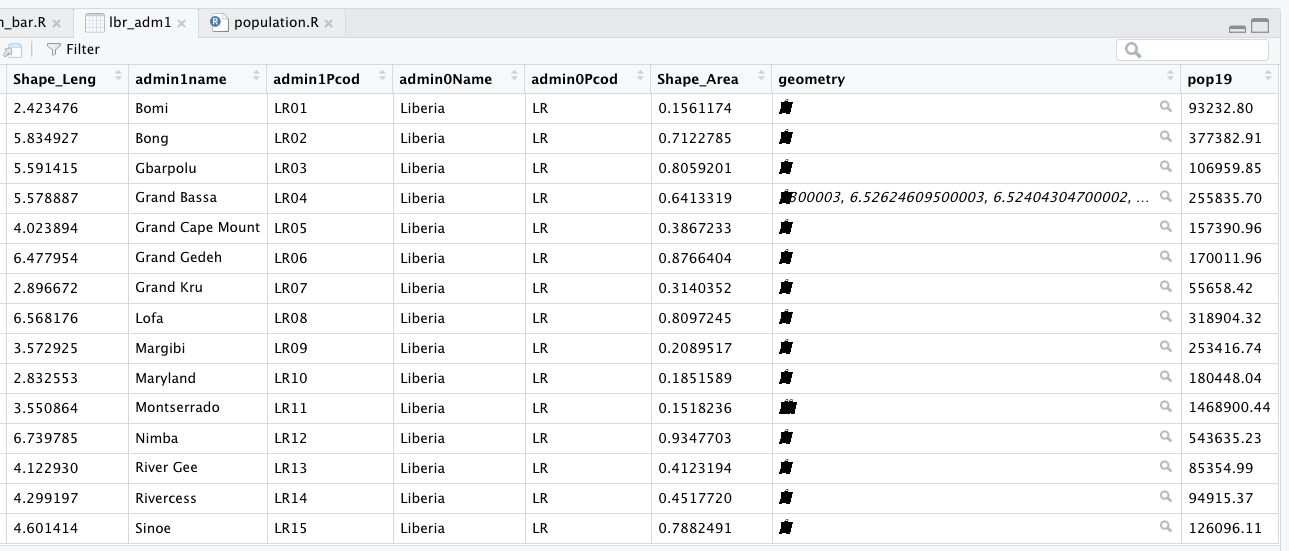
Confirm that your sf object has the name of each first level administrative subdivision as well as the population data you calculated and introduced. Then use the save() command to save your sf object to your working directory.
save(your_adm1_obj, file = "name_of_the_file_you_save.RData")
Once you have run the save() command you should be able to find your newly created .RData file in your working directory. Please keep in mind that this .RData file will be different from the one you previously saved that contained the results from your extract() , therefore be certain to name it differently, or else you may write over your previous saved .RData file, and effectively erasing it. Save the .RData file containing your sf class object. Create and name a new script in RStudio, while saving it to your working directory.
As you have done with your prior scripts, start with the rm() command to clean the workspace, followed with install.packages() which are normally all commented off with the # at the beginning of each line and then the library() command, in order to load your needed libraries of commands.
rm(list=ls(all=TRUE))

# install.packages("tidyverse", dependencies = TRUE)
# install.packages("sf", dependencies = TRUE)

library(tidyverse)
library(sf)

setwd("~/your/working/directory/for_data")
Open the tidyverse:: and sf:: libraries and set your working directory. Use the load() command to import the sf object contained within your .RData file into your workspace.
load("name_of_the_file_you_saved.RData")
After you have executed the above command, you should notice your adm1 sf object reappear in the top right pane under the environment tab. Confirm the newly created pop19 variable is present in your sf class object by using the View() command or data viewer.
Add two new columns to your adm1 object. First will be a column that provides us with the area of each first level administrative subdivision unit in square kilometers, while the second column will describe density of your LMIC. In order to add these two columns, we will use the %>% operator followed by the mutate() function. The mutate() command is part of the tidyverse syntax and is used to create a new variable which is calculated from data found in another variable. As part of the argument within the mutate() command, you will give the new column that you are creating a name.
Start with the name of your adm1 object followed by the pipe operator, which you will assign to the same named adm1 object, thus writing over and replacing it with the newly incorporated and created columns. The first newly created column will be named area. In order to calculate this newly created column, we will also use a new command from the sf library of functions called st_area().
yourLMIC_adm1 <- yourLMIC_adm1 %>%
  mutate(area = sf::new_command_here(yourLMIC_adm1))
After you execute this command, view the data associated with yout adm1 object and confirm that you have a new column named area.
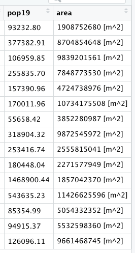
While these area calculations are accurate, to describe a country in square meters is probably not the most useful unit to select. Instead of meters squared, we will convert our unit of measurement to square kilometers. In order to do this, we must first install a new library of functions for use in RStudio. Install the units:: package and use the library() command in order to make it available for use.
The command we need from the units:: package is set_units(), although this time we will nest our command within a %>% to modify the units of measurement from m^2 to km^2. Notice how the last parenthesis doesn't coorespond with the new command from the units:: library but rather with the parenthesis from the prior line. We specify our syntax in this manner since we are applying the set_units() command to the results which have been piped from the st_area() command.
yourLMIC_adm1 <- yourLMIC_adm1 %>%
  mutate(area = sf::new_command_here(yourLMIC_adm1) %>%
           units::new_command_here(new_units))
The second step in creating our two new columns is to use the area variable on the fly to calculate a column named density . This second new column will be the result of our area column divided by the pop19 variable (which we created in the last exercise).
yourLMIC_adm1 <- yourLMIC_adm1 %>%
  mutate(area = sf::new_command_here(yourLMIC_adm1) %>%
           units::new_command_here(new_units)) %>%
  mutate(density = numerator_variable / denominator_variable)
Since we have modfied the units, you should notice both the variables area and density being described in units of persons per square kilometer.
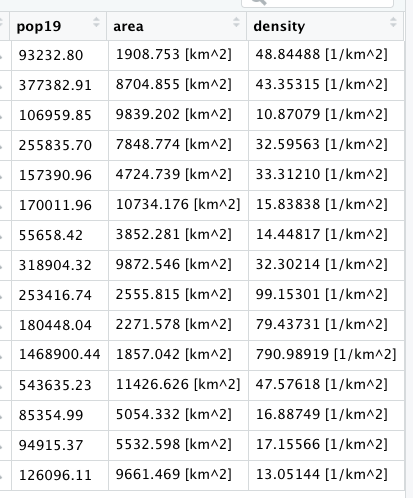
That is all the data we need for now. Start the creation of your geometric bar plot by first piping %>% your adm1 object to a newly specified ggplot object. Add the aesthetics to your ggplot object using the ggplot() command and specifying the x and y variables from your sf class object. These x and y objects will be used to plot the values using the x and y axes (although we will flip the horizontal to the verticle and vice-versa in a moment).
Since we are generating a bar plot, we will use the geom_bar() + command. Include the stat = "identity" argument to plot the values of individual units of observation, in this case the population of each first level administrative subdivision from your LMIC. Also add a color = argument to your geom_bar() command and set the width of each bar. Following the geom_bar() command, use the coord_flip() to flip the county names along the xaxis and give them a verticle disposition.
yourLMIC_adm1 %>%
  ggplot(aes(x=your_adm1_names, y=pop19)) +
  geom_bar(stat="identity", color="color", width=value) +
  coord_flip() +
  xlab("label") + ylab("label")

Let's order our counties in accordance with population size from largest to smallest in order to more easily associate the descriptive statistics presented in our bar plot with the spatial descriptive statistics we previously created with our map. Add a second %>% after your adm1 object, where you will reorder the adm1 names based on the variable pop19. Use the mutate() command again to write over the existing variable for adm1 names. The key command you are adding within the mutate() argument is fct_reorder() which will change the order of the first named variable (in this case admin1name) based on the descending rank order of the second variable (pop19). While I am using the raw population counts to change the county order listed along the vertical axis, you could use also the area or density variables.
yourLMIC_adm1 %>%
  mutate(admin1name = fct_reorder(admin1name, pop19)) %>%
  ggplot(aes(x=your_adm1_names, y=pop19)) +
  geom_bar(stat="identity", color="color", width=value) +
  coord_flip() +
  xlab("label") + ylab("label")
In addition to changing the order of the adm1 names, also add an annotation to each bar that indicates the share of the total population located within that subdivision. Use the geom_text() command to add labels to your bar plot and set the label = argument within the aes() parameter in order to calculate each administrative units share of the total population. Divide the sum() of pop19 variable in the denominator by the raw pop19 counts as the numerator. Place the division of these values within the percentage() command from the scales:: library (you'll need to install this new package).
Place the value that describes each administrative unit's share of the total population within the center of each bar using the position = . Set it using the position_stack(vjust = 0.5) command with a vertical adjust to the center of the bar (half the total width). Also, decrease the size of the text annotations.
  geom_text(aes(label=percent(pop19/sum(pop19))),
            position = position_stack(vjust = 0.5),
            size=2.0)
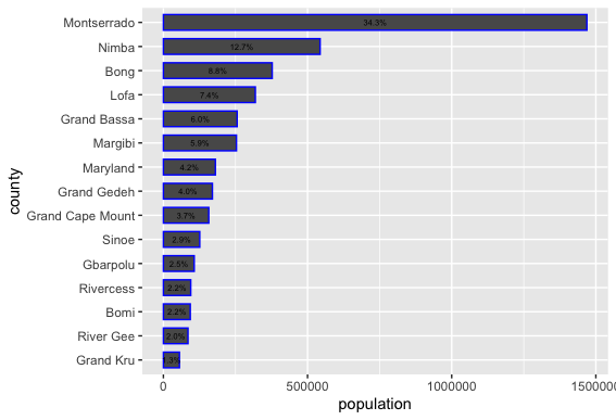
The last step of creating our geometric bar plot is to add a fill = argument to the ggplot(aes()) command that will be used to map a color to each counties population total, based on its place along the continuous scale from maximum to minimum. As we did with our spatial description of population, also add the scale_fill_gradient() command to define colors that will correspond to the low = and high = values. Use your assignment operator to create a new ggplot object that will be plotted with spatial description of your LMIC.
yourLMIC_bplt <- yourLMIC_adm1 %>%
  mutate(admin1name = fct_reorder(admin1name, pop19)) %>%
  ggplot(aes(x=admin1name, y=pop19, fill = pop19)) +
  geom_bar(stat="identity", color="color", width=value) +
  coord_flip() +
  xlab("label") + ylab("label") +
  geom_text(aes(label=percent(pop19/sum(pop19))),
            position = position_stack(vjust = 0.5),
            color="black", size=2.0) +
  scale_fill_gradient(low = "yellow", high = "red")

Return to the spatial plot that you created in the last exercise. Copy the snippet of code that you used with the geom_sf(aes(fill = pop19)) command in order to plot the population of every first level administrative subdivision along a continuous scale for your LMIC. Paste this snippet into your new script. Add a new line to the snippet where you use the geom_sf_text() command to set plot the density of each individual adm1 object beneath its name. Use the aes(label=command(variable,2) argument to add the density values. Also, use the round() command, so the values from this variable are limited to two decimal points. Nudge the density values, so they appear beneath each label, while also modifying their size and color.
  geom_sf_text(aes(label=round(add_variable_here, 2)),
            color="color", size=add_size, nudge_y = add_value) +
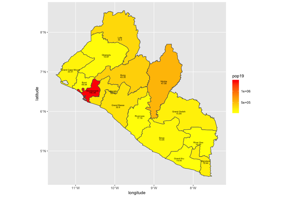
Finally, install the package ggpubr and use the command ggarrange() to arrange your two plots together side by side.
liberia <- ggarrange(your_spatial_plot, your_bar_plot, nrow = 1, widths = c(2.25,2))
Use the ggtitle() command to title each plot, and then also use the annotate_figure() command to set a common title for the combination of the two descriptive results.
annotate_figure(liberia, top = text_grob("Liberia", color = "black", face = "bold", size = 26))
To save your two plots together, use the ggsave() command. Modify the width = and the height = commands to set the dimensions for your combined spatial and bar plot. Use the dpi = command to set the number of dots per inch, or effectively increase the resolution.
ggsave("liberia.png", width = 20, height = 10, dpi = 200)
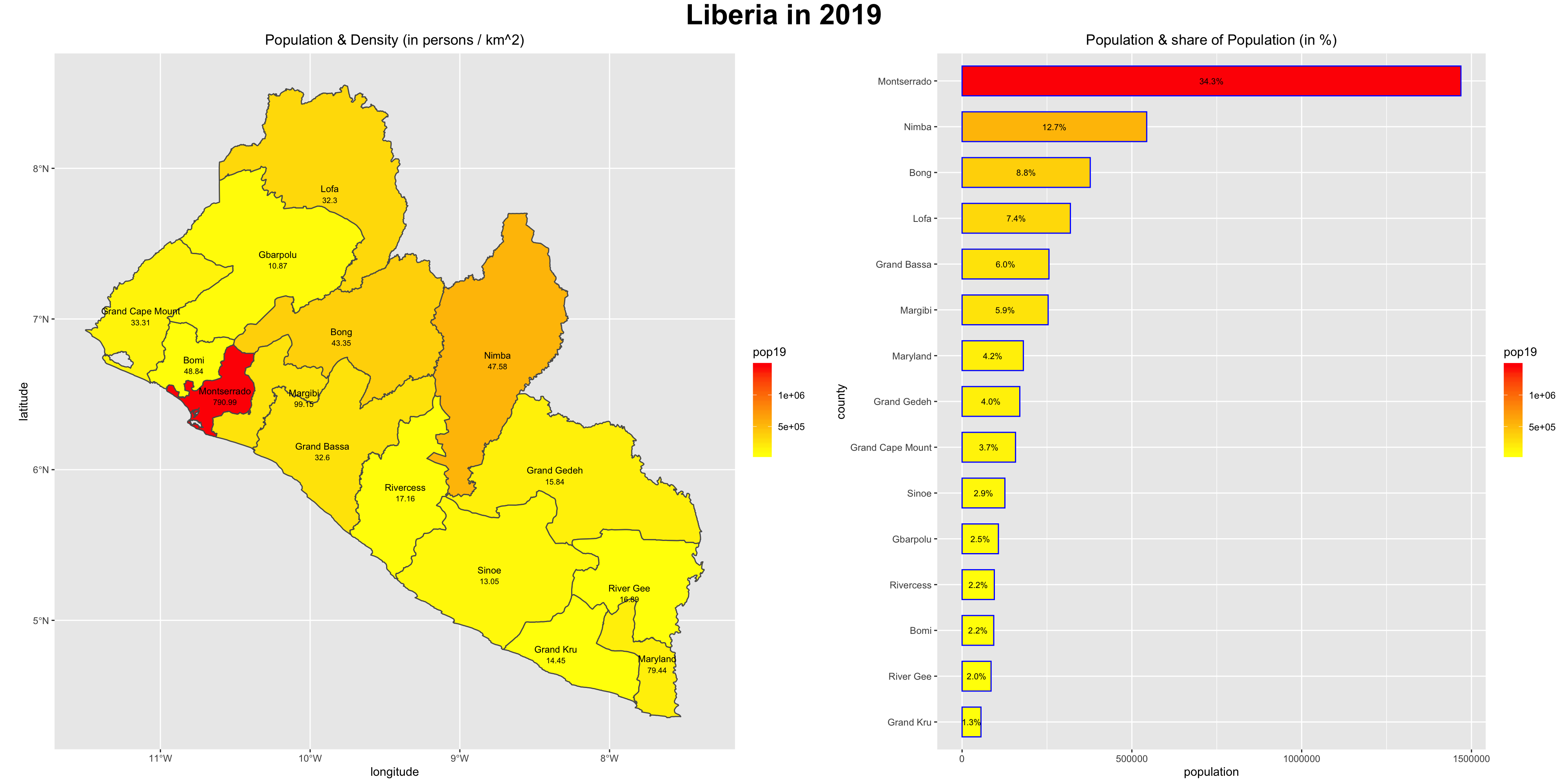
Project 1. Deliverable
Upload the combined spatial description and geometric bar plot of your selected LMIC to your GitHub repository. Create a link in your README.md file that connects to a webpage that presents your results. Describe your plot, how you produced it, and any modifications you needed to make. If you produced any of the stretch goals, include those in your Project 1 individual deliverable. What observations are you able to make about the spatial description of your LMIC's population?
Share a link to your Project 1 webpage on the slack channel #data100_project1 no later than 11:59PM on Saturday, September 28th.
Stretch Goal 1
Again create a combined spatial description and geometric bar plot of your LMIC, but this time use the adm2 sf object you created in part 2, stretch goal 2. Use the save() and load() commands as you did before to import your adm2 object that also includes the newly created poulation column. Also, again use the mutate() command to create new variables that describe area and density , but this time as new columns in your adm2 object. Modify the following script to produce the subsequent geometric bar plot based on your own adm2 sf class object.
lbr_adm2 %>%
  ggplot(aes(x=admin1Name, y=pop19, weight = pop19, fill = admin2Name)) +
  geom_bar(stat="identity", color="blue", width=.75) +
  coord_flip() +
  theme(legend.position = "none") +
  geom_text_repel(aes(label = admin2Name),
                  position = position_stack(vjust = 0.5),
                  force = 0.0005,
                  direction = "y",
                  size = 1.35,
                  segment.size = .2,
                  segment.alpha = .4)

ggsave("lbr_adm2_bp.png", width = 20, height = 15, dpi = 300)
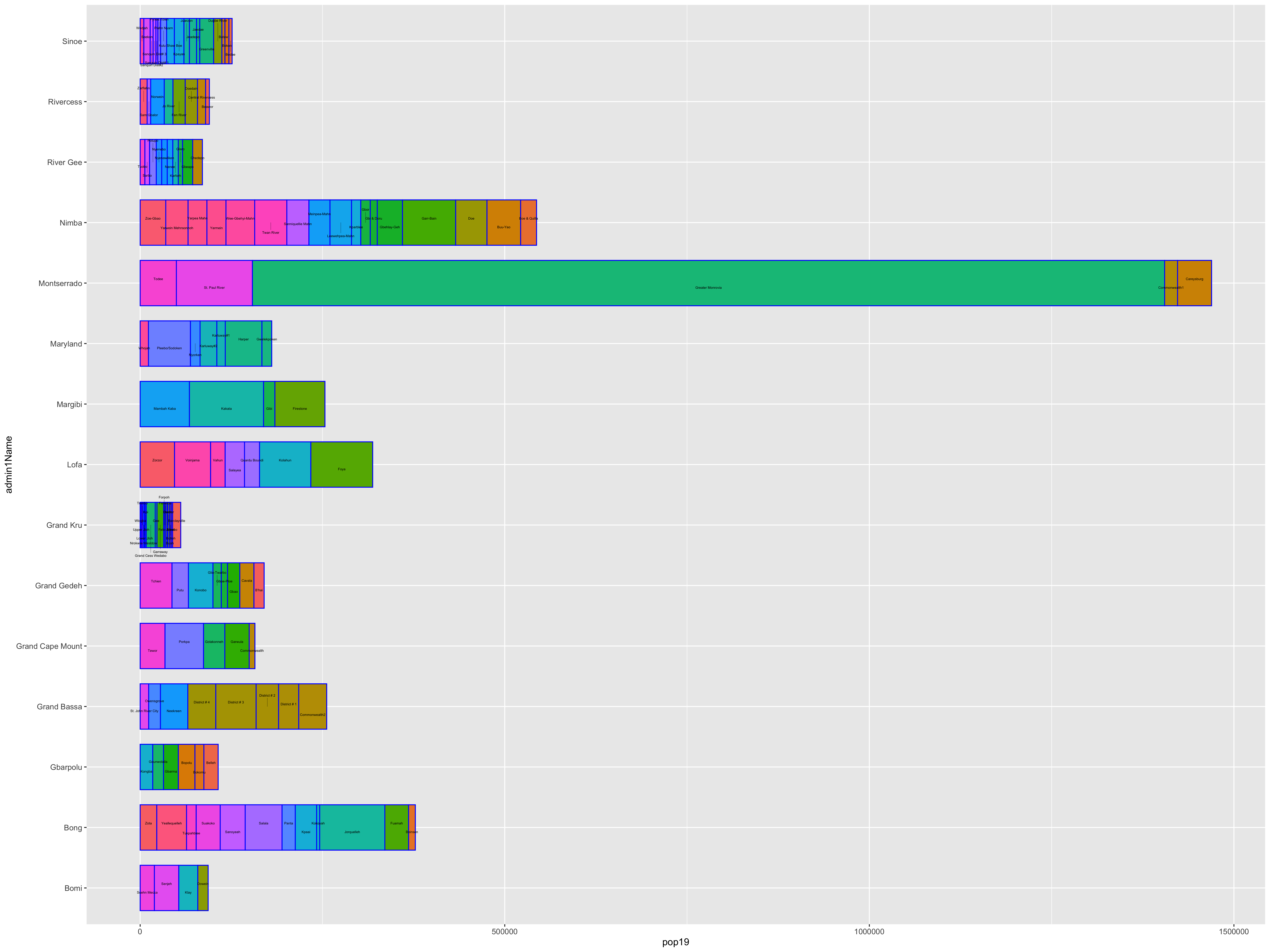
Include this with your deliverable posted to #data100_project1.
Stretch Goal 2
Use the render_movie("liberia.mp4") command to create an orbitting video of the three dimension spatial plot you created in part 2, stretch goal 3. Also, include this with your deliverable posted to #data100_project1.
Acquiring, Modifying and Describing the Data
For the next lab you will use land use and land cover data to describe and analyze your LMIC as well as to model relationships between different large area, geospatial attributes. To start, create a new folder within your project data folder. This will be the location where you will store a number of different raster files, or geospatial coveriates, that you will use to begin describing and analyzing your LMIC. I have called my subfolder lulc which stands for land use and land cover.
Once you have created your lulc folder within your data folder, open google and search for the 3 digit ISO code for your seleted low or middle income country. I simply type ISO code Liberia and hit return in google and the result LBR. Once you have determined your 3 digit ISO code, copy the following webaddress and paste it into your internet browser, BUT modify the last part of the path (i.e. /ISO/) and replace it with your LMIC's ISO code.
ftp://ftp.worldpop.org.uk/GIS/Covariates/Global_2000_2020/
After entering the path into your browser, you may be asked to enter your name and password in order to access the file transfer protocal (ftp) site at ftp.worldpop.uk.org. Choose guest and then attempt to connect.

After connecting as a guest you should gain access to the folder at worldpop containing the geospatial covariates, either though the finder, file explorer, or possibly directly through your browser. My connection protocal in OS X forwards to my finder and opens a new folder from the worldpop server. This folder on my computer is a kind of window to the WorldPop server location where the geospatial covariates for Liberia are located.
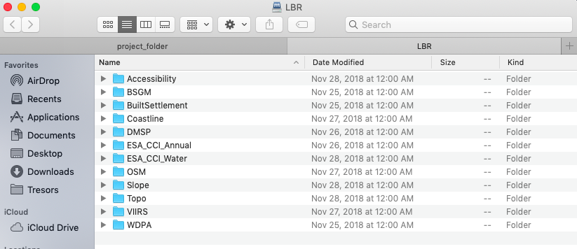
Each of these different folders contains sets of geospatial covariates or raster files that you will need to copy and paste into your lulc folder. To start, open the ESA_CCI_Annual folder. There should be several years within the folder; select the folder with the 2015 data. Copy all of the files from the ESA_CCI_Annual folder to your lulc folder. There will be several, each one being some megabytes to tens of megabytes in size, so be patient when copying the data. Also keep in mind, it is likely that the WorldPop server will be overloaded with all of your classmates trying to access the data at the same time. After you have copied the ESA_CCI_Annual raster data for 2015, do likewise for the ESA_CCI_Water raster that is found within the DST folder (which stands for distance). Following the water geospatial covariate layer, continue to the folders that contain topographical and slope data. Finally, open the VIIRS folder and copy the .tif file into your lulc folder that has the night time lights values for your LMIC. After you have finished copying all of the files to your lulc folder, your data structure should appear similar to the following, except each of your files will begin with the ISO code for your LMIC.

Visit the ESA-CCI Viewer at https://maps.elie.ucl.ac.be/CCI/viewer/ and have a look at the ESA-CCI data you just copied into your data subdirectory. In the bottom left hand corner of the viewer you will find a legend for the map. Open the legend and consider the values in the left hand column as well as each one's corresponding label. Each value cooresponds to the three digit code found within the raster files your just copied into your lulc folder. For example, the file lbr_esaccilc_dst150_100m_2015.tif is the geospatial covariate layer for Sparse vegetation (tree, shrub, herbaceous cover) (<15%) since the third part of the file name dst150 cooresponds to the 150 value in the legend. As before, the dst part of the filename again stands for distance, since each gridcell will provide a distance measure. Save the legend to your data folder for reference, since it is likely you will need it again later.
Once all the data is properly situated in your folder, open RStudio and create a new script. Use the library() command to load the raster,sf,tidyverse, doParallel and snow libraries of functions just as we did before. Set your working dirctory to your data folder. Also, be sure to load() the sf files you previously created for your LMIC's adm1 & adm2, each one with the population data variable you created.
rm(list=ls(all=TRUE))

# install.packages("raster", dependencies = TRUE)
# install.packages("sf", dependencies = TRUE)
# install.packages("tidyverse", dependencies = TRUE)
# install.packages("doParallel", dependencies = TRUE)
# install.packages("snow", dependencies = TRUE)

library(sf)
library(raster)
library(tidyverse)
library(doParallel)
library(snow)

setwd("/the_path/to_your/project_folder/with_data/")

### Import Administrative Boundaries ###

load("lbr_adms.RData")
With your working directory set to the lulc folder where your geospatial covariate rasters are located, you will write a command that imports all of the esaccilc_dst files into your R workspace, at the same time, while also stacking each rasters on top of one another, until you have formed what is called a RasterStack. To do this first start with the list.files() command and create an object named f that will contain the names of all of the esaccilc_dst files in your lulc folder. It's probably possible to import ALL of your raster files from the lulc folder by identifying a common pattern to ALL the geospatial covariate files, but for now we will start with just the files containing the esaccilc_dst .tif pattern in their file name. The recursive = TRUE argument will enable the list.files() command to search not only in the parent lulc directory, but also in any child subdirectories.
f <- list.files(pattern="add_file_name_pattern_here", recursive=TRUE)
After properly executing the above command, you should notice the object f appear in your top right pane. It is also possible to check the contents of f which should be the names of all the esaccilc_dst files.

The object f is needed to identify all of the raster objects you will stack one on top of another until you have created your RasterStack. You may recall in project 1 using the raster() command to import a .tif into RStudio. This time you will use both the raster() command on the inside of a function as well as the stack() command on the outside of the function. In combination with the lapply() command (which stands for list apply), the raster() command will iterate through your f object, identifying the name of each .tif file from your lulc folder, until each one has been imported, and then with the stack() command, stack each raster one by one, until your formal RasterStack class object has been created. The function(i) part of the argument is used to indicate which function will be used to iterate the number of times as objects in your i argument, which in this case is equal to the number of rows in f.
lulc <- your_outside_cmd(lapply(f, function(i) your_inside_cmd(i, band=1)))
Once you have executed your stack() command to create your RasterStack object in your workspace, check to confirm the contents of your lulc object.

You will notice that the RasterStack object not only is comprised of nearly 25 million gridcells in this instance, there is also a new dimension to the object named nlayers, which is 9. Within this RasterStack is the names identifier, with each name representing one of the files we copied from the WorldPop website into your lulc data folder and then imported into RStudio. While the name of each layer is provided on the names row having been directly assigned from each file name, specifically the names themselves are very long and confusing. Rename each layer, by again identifying patterns from the object f we created, and replacing the superfluous parts with an empty space or "". You will need to retain the part of each file name that begins with dst and is then followed by three digits. For example, with the file name lbr_esaccilc_dst040_100m_2015.tif you will need to retain everything BUT the dst040 part of the name. To do this, you will first want to replace the common pattern from the last part of the file name sequence with a "". Then you will want to replace the first part of the common pattern from the file name sequence with a "". You will do this by nesting the two commands within each other.
nms <- sub("last_part.tif", "", sub("first_part_", "", object_with_the_file_names))
Type nms directly into the console to confirm you have correctly created this new object that contains the truncated form of each raster layer name you plan to assign.
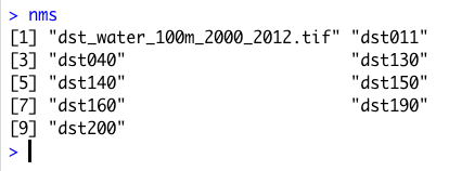
The first file that contains the distance to water layer had a slightly different naming pattern, but don't worry about it just yet. Go ahead and assign it as is, but keep in mind you will also replace that layer's name momentarily.
Once you have created your nms object that contains each layer's name, use the names() command with your lulc object as the object and simply assign the names using nms.
add_command_here(your_RasterStack_obj) <- object_with_truncated_names
Confirm you have correctly used the names() command with your lulc object to rename each layer by viewing the RasterStack in the console. You should notice that there are several new names listed for each layer in your RasterStack.

There are still three more raster .tif files in your lulc data folder that need to be imported and added as new layers to your lulc RasterStack object. Import the topography, slope and night time lights layers into R by using the raster() command as you have done in the past.
topo <- raster("lbr_srtm_topo_100m.tif")
slope <- raster("lbr_srtm_slope_100m.tif")
ntl <- raster("lbr_viirs_100m_2015.tif")
Once you have those three new raster class objects in your R workspace, use the addLayer() command to combine all twelve layers into a single RasterStack. To add these three layers to your existing RasterStack with 9 layers first specify your existing object, then follow it with the three newly imported geospatial covariate rasters you plan to stack on top of the existing nine.
lulc <- command(existing_stack, new_raster1, new_raster2, new_raster3)
Manually update the names for the water layer as well as each of the three newly stacked rasters. Again use the names() command with your RasterStack object, but this time specify which layers will have their names modified and updated. In this case you want to update the names of the first layer as well as layers ten through twelve. Using the [] subscripting operators with the c() combine command is a powerful way to traverse an object in order to pinpoint your specified command. In this case it is important that the number of names being modified (as specified by the 1, 10, 11 & 12 on the left hand side inside the subscripting operators) is the same length as the number of names being assigned (specified by the names water, topo, slope and ntl within the combine command on the right hand side).
add_command_here(object_name)[c(1,10:12)] <- c("water","topo","slope", "ntl")
With all of the geospatial covariates in place as separate layers within your RasterStack , you are now able to plot each one. Have a look at a few of the different layers using the plot() command with the [[layer_number]] double subscripting operators. Using the [[]] double subscripting operator will identify entire lists, rather than rows, objects and/or observations from within a data.frame. Try adding the adm1 or adm2 sf object to your plot. Also use the contour() command to add contour lines to your topographic map.
plot(lulc[[12]])

plot(lulc[[8]])
plot(st_geometry(lbr_adm1), add = TRUE)

plot(lulc[[10]])
contour(lulc[[10]], add = TRUE)

Extracting Land Use and Land Cover Data for Description
Now that you have your lulc RasterStack in place, use the extract() command to assign the adm2 ID to each gridcell. Just as you did before, save() your data.frame object so you don't have to unnecessarily rerun the computationally expensive extract() command again and again.
ncores <- detectCores() - 1
beginCluster(ncores)
lulc_vals_adm2 <- raster::extract(lulc, lbr_adm2, df = TRUE)
endCluster()
save(lulc_vals_adm2, file = "lulc_vals_adm2.RData")
Comment off these 5 lines using the #, once the extract() has finished, and then add the load("name_of_you_data_file.RData") command to reload the data the next time you run your script.
Use the sum() command with the summarize_all() command to sum all of the values within each adm2 subdivision for each of the twelve different raster layers. The summarize_all() command is different than the one used in the previous project, since you will summarize all of the geospatial covariates at once rather than specifying each one at a time (although it is still possible, it would just take a lot more typing).
lulc_ttls_adm2 <- lulc_vals_adm2 %>%
  group_by(add_column_name) %>%
  summarize_all(sum, na.rm = TRUE)
Your object lulc_ttls_adm2 should have the same number of rows as your adm2 sf object as well as thirteen variables, one for each of the geospatial covariates obtained from WorldPop and the ID column. You will notice that the names of each column in your lulc_ttls_adm2 object will correspond with the names of each layer from your RasterStack.
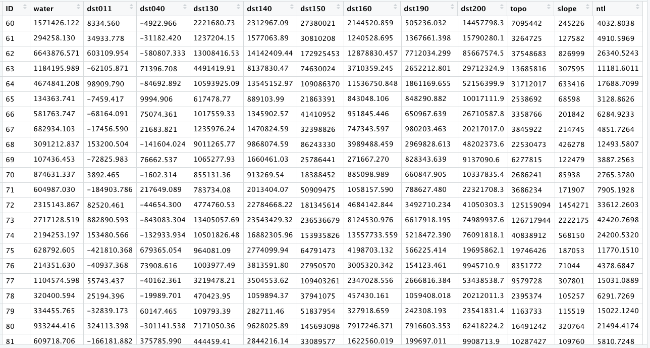
Now use the bind_cols() command to bind each of these thirteen rows to the eleven existing variables in your adm2 object.
lbr_adm2 <- add_command_here(lbr_adm2, lulc_ttls_adm2)
Your adm2 sf object should now have something on the order of 24 variables. To start with your description and analysis of the land use and land cover data, consider first the pop19 variable you created in the last project. Use ggplot() to produce a histogram using the geom_histogram() + command.
ggplot(lbr_adm2, aes(pop19)) +
  geom_histogram()
Compare how the histogram plot changes after adding the log() command to the pop19 variable within the aes() argument.
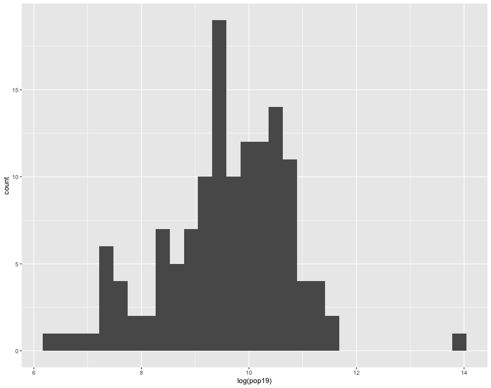
Likewise, do the same with the geom_density() + command, also adding the log() command by wrapping the pop19 variable within it.
ggplot(lbr_adm2, aes(pop19)) +
  geom_density()

You will notice that the density plot has a similar profile as the histogram. We can compare the two by overlapping the histogram with the density plot or probability density function (pdf). In order to transform a histogram into a density plot, the density function uses somethings called a kernel and bandwidth to smooth the data over the space. A good analogy for thinking about how a histogram transforms into a pdf is to think of each verticle bar as stacked, square pieces of chocolate, and then you took a hairdryer to warm the chocolate squares until they melted and smoothed out over the space. While there are statistical methods that can be used to modify the shape and profile of the pdf function, essentially the area of the histogram and the density plot should be nearly the same.
ggplot(lbr_adm2, aes(pop19)) +
  geom_histogram(aes(y = ..density..), color = "black", fill = "white") +
  geom_density(alpha = 0.2, fill = "#FF6666") +
  theme_minimal()
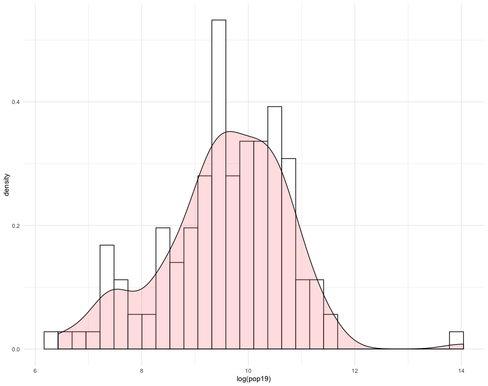
Create another histogram with the pdf overlapping, but this time use a different variable. For example in the following plot, I have used the ntl variable, without the log() function added.
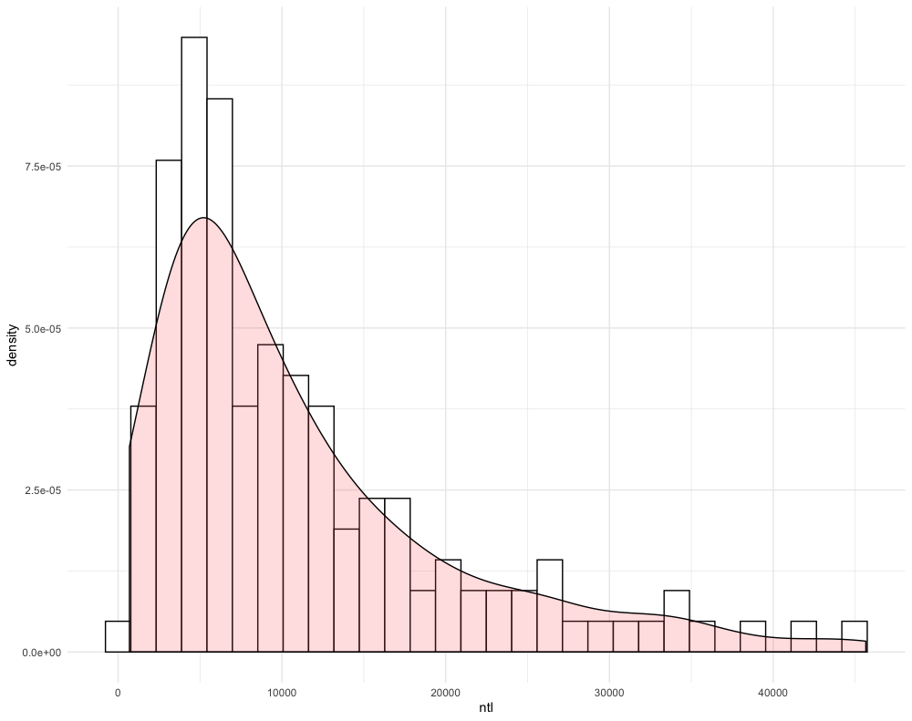
Challenge Question
Follow the steps from above used to produce the plots describing Liberia, but instead each team member should use their own selected LMIC country. Produce two combined histogram with density plots that describe the correlationship between population at the adm2 level as a dependent variable and two of the other land use land cover variables you added. You are also welcome to use density as a variable.
Regress the data from two variables against each other and examine the coorelationship that is being described by the two variables. Use the geom_point() command to add the points for your two variables as well as the geom_smooth() command to add the regression line (as well as the confidence interval).
ggplot(lbr_adm2, aes(pop19, ntl)) +
  geom_point(size = .1, color = "red") +
  geom_smooth()
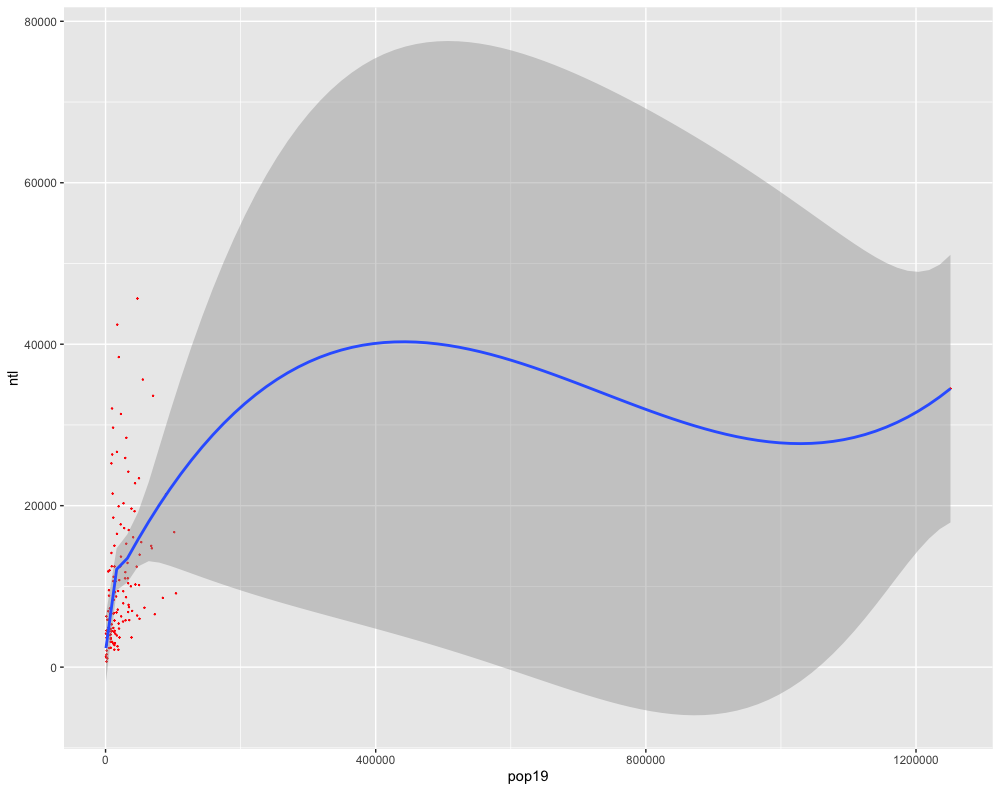
Estimate the parameters of your model using the lm() command and then return a summary() to find out more information regarding the model's fit and capacity to explain the coorelationship between your two selected variables.
fit <- lm(pop19 ~ ntl, data=lbr_adm2)
summary(fit)

Add a few more variables to the lm() command. For example in the following plot I have estimated a regression model where the population of Liberia in 2019 is the dependent variable (response), while night time lights (ntl), urban cover (dst190), and bare cover (dst200) are the independent variables (predictors).
ggplot(lm(pop19 ~ ntl + dst190 + dst200, data=lbr_adm2)) +
  geom_point(aes(x=.fitted, y=.resid), size = .1) +
  geom_smooth(aes(x=.fitted, y=.resid))

Again estimate the model and check the fit.
fit <- lm(pop19 ~ ntl + dst190 + dst200, data=lbr_adm2)
summary(fit)

Finally, add all of the variables to your regression model. Compare the results.
ggplot(lm(pop19 ~ water + dst011 + dst040 + dst130 + dst140 + dst150 + dst160 + dst190 + dst200 + topo + slope + ntl, data=lbr_adm2)) +
  geom_point(aes(x=.fitted, y=.resid), size = .1) +
  geom_smooth(aes(x=.fitted, y=.resid))

fit <- lm(pop19 ~ water + dst011 + dst040 + dst130 + dst140 + dst150 + dst160 + dst190 + dst200 + topo + slope + ntl, data=lbr_adm2)
summary(fit)

Team Challenge Question
Also use ggplot() to plot two linear models. Use the fit() and summary() commands to describe your models. Are you able to definitively identify coorelation between population and any of the other or combination of other land use and land cover geospatial covariates? How about density?
Meet with your group and prepare four different plots from at least three different countries (or team members) for the Friday informal group presentation. Then as a group, upload all 5 team members plots to #data100_igps (informal group presentations) by Sunday night. Each member should upload at least two combined histogram / density plots as well as two linear model plots.
Individual Stretch Goal 1
Manually recreate the ggplot() model of your regression from above. First identify the fitted.values as a variable in the model you named fit. Use the $ operator to identify the variable within the model object and return all of the values.
name_of_model$variable.with.fitted.values
Send this object$variable directly to the console and review the results. You should have the same number of fitted values as subdivisions within your adm2. Each individual fitted value is calculated by multiplying each variables' estimate (or coefficient) by the actual value for that observation (or row) and then summating the total of those products.
Likewise, manually calculate each individual model residual by subtracting all of the values for the dependent or response variable, pop19, from each cooresponding calculated, fitted value. The difference of these two outcomes are the model residuals.
your_adm2$pop19 - name_of_model$variable.with.fitted.values
Plot the two variables as a ggplot object. First create a data.frame using the cbind.data.frame() command. Name each of the new columns within your data frame accordingly.
model_data <- cbind.data.frame(fitted = name_of_model$variable.with.fitted.values, residuals = your_adm2$pop19 - name_of_model$variable.with.fitted.values)
Use ggplot() to plot your model.
ggplot(data = you_data_frame, aes(x = variable, y = variable)) +
  geom_point(size = 0.25) +
  geom_smooth(size = 0.5)
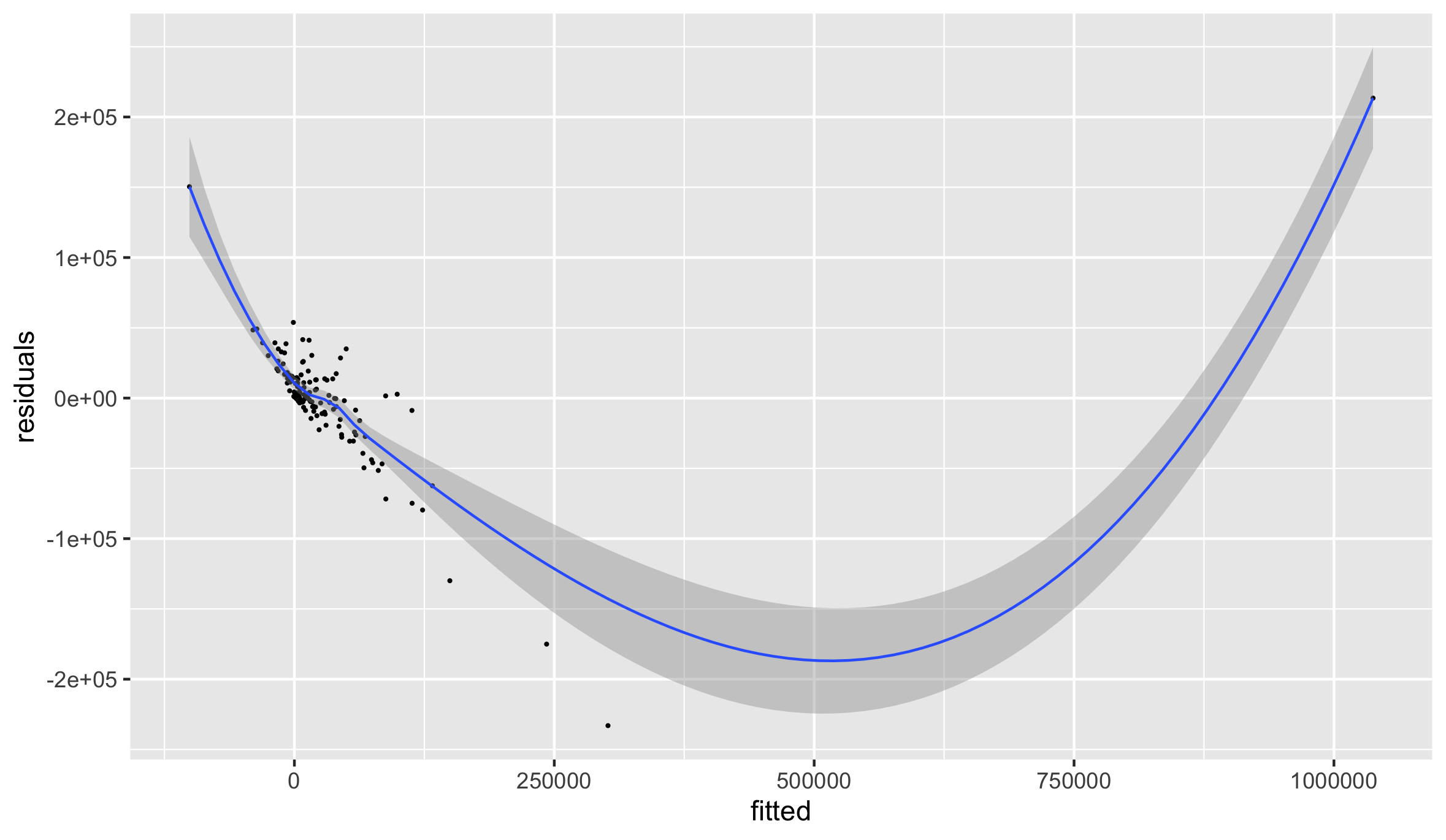
The three observations beneath the curve before it begins to rise seem to evidence the final contributions to the model before it transitions towards the observation for Monrovia. Add labels to these four points, by using the subset() command and creating a new object that you will use to annotate each of those four observations.
text <- subset(model_data, fitted > add_value_here)
Use this new object to plot the names of these four observations from the data.
ggplot(data = your_data, aes(x = variable, y = variable)) +
  geom_point(size = 0.25) +
  geom_smooth(size = 0.5) +
  geom_text(data = your_data,
            aes(x = variable,
                y = variable,
                label = name),
            size = 2,
            nudge_y = value)

Likewise manually calculate residual standard error.
#How to calculate Residual Standard error (Like Standard Deviation)
k <- length(fit$coefficients)-1 #Subtract one to ignore intercept
SSE <- sum(fit$residuals^2)
n <- length(fit$residuals)
#Residual Standard Error
sqrt(SSE/(n-(1+k)))
Also, manually calculate multiple R^2.
#Multiple R-Squared (Coefficient of Determination)
SSyy <- sum((lbr_adm2$pop19 - mean(lbr_adm2$pop19))^2)
SSE <- sum(fit$residuals^2)
(SSyy-SSE)/SSyy
#Alternatively
1-SSE/SSyy
Calculate adjusted R^2.
#Adjusted R-Squared
n <- length(lbr_adm2$pop19)
k <- length(fit$coefficients)-1
SSE <- sum(fit$residuals^2)
SSyy = sum((lbr_adm2$pop19 - mean(lbr_adm2$pop19))^2)
1-(SSE/SSyy)*(n-1)/(n-(k+1))
Calculate the F-statistic.
#F-Statistic
((SSyy-SSE)/k) / (SSE/(n-(k+1)))
Finally, manually add the adjusted R^2 and F-statistic as labels to your plot.
ggplot(data = model_data, aes(x = fitted, y = residuals)) +
  geom_point(size = 0.25) +
  geom_smooth(size = 0.5) +
  geom_text(data = text,
            aes(x = fitted,
                y = residuals,
                label = adm1),
            size = 2,
            nudge_y = 7500) +
  geom_text(aes(x = 500000,
                y = 25000,
                label = "Adjusted R-Squared")) +
  geom_text(aes(x = 500000,
                y = 0,
                label = round(as.numeric(summary(fit)[9]), 4))) +
  geom_text(aes(x = 500000,
                y = -40000,
                label = "F-statistic")) +
  geom_text(aes(x = 500000,
                y = -65000,
                label = round(as.numeric(summary(fit)[[10]][1]), 4)))
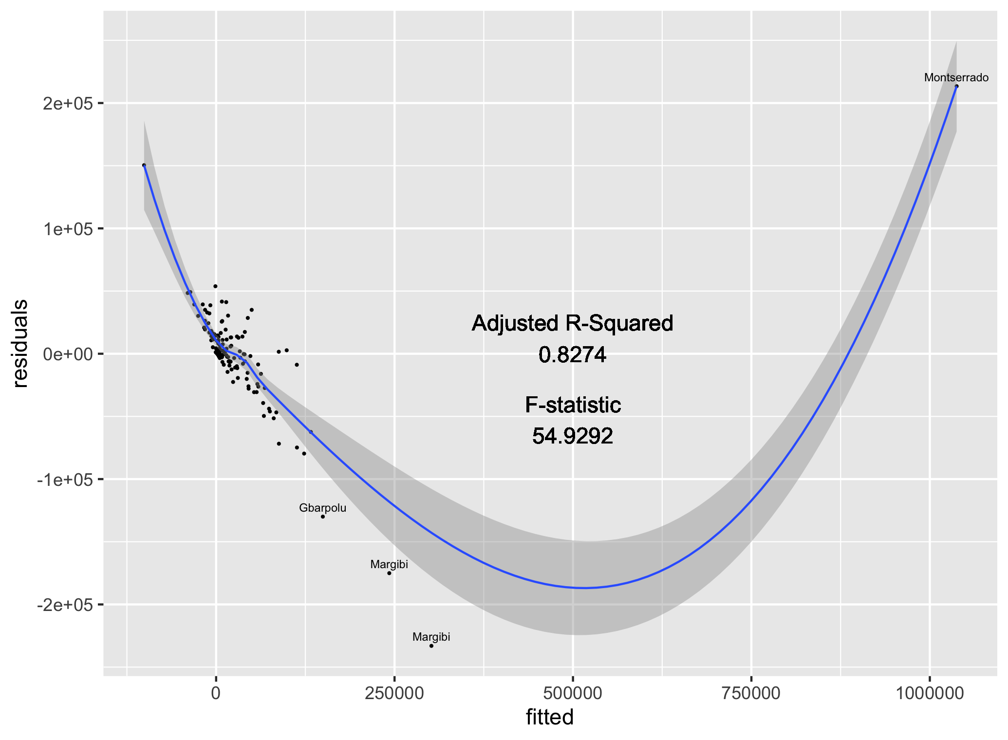
Modeling & Predicting Spatial Values
In this lab, you will use the model parameters your previously estimated in order to predict spatial values across the landscape of your selected LMIC. To do this create a new script, install and load needed packages and libraries, and set your working directory. Once you have your script set up with sf:: , raster::, tidyverse::, doParallel::, and snow:: all in place, again load your RasterStack into your RStudio workspace. I named my 12 layer RasterStack that describes land use and land cover throughout Liberia, lulc, and just as before it displays the following summary characteristics.

Also, load the adm0 (or international boundary), adm1 and adm2 for your LMIC. If you don't have your international boundary, go back to GADM, HDX or also look on Geoboundaries for the shapefile in order to import to your RStudio work session.
{% embed url="https://www.gadm.org" caption="Link to GADM" %}
{% embed url="https://data.humdata.org" caption="Link to HDX" %}
{% embed url="http://www.geoboundaries.org/data/1_3_3/zip/shapefile/" caption="Geoboundaries subdirectory with shapefiles by ISO code" %}
For this exercise, I will retrieve my international border shapefile from the Geoboundaries subdirectory and then use the read_sf() command to import the data as an object I named lbr_int.
You will also need the WorldPop raster later in the exercise in order to calculate a basic estimate of spatial error. To improve upon the predictive capability of the model, I have gone back and retrieved the 2015 WorldPop raster file of persons per pixel (ppp) for Liberia, rather than the 2019 population counts we previously used. It is probably not going to have a huge impact, but if you want to try for the best results, the date value of your response variable should be the same as the date value of your geospatial covariates.
lbr_pop15 <- raster("lbr_ppp_2015.tif")
You may have noticed when reviewing the characteristics of your RasterStack that many of the layers had ? as the value for both the min values and max values. The reason this occurred is because each of the layers within the raster is presenting values outside of the boundaries of our LMIC. For example, with Liberia, you will notice that there is a large portion of the area within the plot but outside of the national border that has some assigned value (likely NA). These values are not part of our analytical area and should be omitted. In order to fix this problem, we need to use the mask() command to remove all of the gridcells that are not explicitly within the international border of our LMIC.
yourRasterStack <- add_command_here(yourRasterStack, yourLMIC_intlborder)
It might take a few minutes to run the mask() command. On a MBAir using the mask() command on a 12 layer RasterStack (each layer having about 25 million gridcells) it takes about 10 minutes. Once the command is completed, you should now notice min values and max values when retrieving a summary of what has now been transformed from a RasterStack to a RasterBrick.

As in the previous exercise, estimate your linear model using the pop15 variable as your response (dependent variable) and all of the covariates from your adm2 sf object as the predictors (independent variables).
model <- add_command_here(depvar ~ ind1 + ... + indN, data=your_adm2_sf)
Once you have estimated your model, use the summary() command to review a summary of its characteristics.

Confirm that each variable in your lulc object has a corresponding variable in the linear model you just estimated. You will use these estimates with the 12 different geospatial coverariate layers within your RasterBrick to predict the population at each gridcell across your LMIC. Use the predict() function from the raster:: package with your lulc object as well as your model to predict the population value of every gridcell within the borders of your LMIC.
predicted_values <- library::function(RasterBrick, your_model, progress="window")
Adding the progress="window" argument at the end of the command should force a progress window to appear on main desktop that informs you of how many steps are needed to completely execute the command as well as how many have been completed. The progress="window" argument is purely optional.
The resulting object predicted_values should be a single RasterLayer with the same number of gridcells as each layer within your RasterBrick. Type the name of the RasterLayer into the console to review its summary output, while also noting the minimum and maximum values across all gridcells.
Use the cellStats(predicted_values, sum) command to calculate the sum of all the values in every gridcell throughout your newly created RasterLayer. With the model estimated for Liberia, the sum total of all predicted values is 113413402375(113 billion). Compared with the output from sum(your_adm2$pop15) (which is 4039128for Liberia) your will very likely that your model has massively overestimated population values (in this case by an order of about 28,000 times).
While these predicted values are no where near the real population count at each gridcell, they do nonetheless provide a spatial description of the proportion of persons as distributed across the landscape of your LMIC. In fact, if we execute some basic raster algebra and subtract the minimium value from my predicted_values RasterLayer and then sum the values of all gridcells, we will find that while the total population predicted is still very likely a gross overestimation, it is getting closer to our best estimate of the real value (in the case of Liberia, now an order of 15 times pop15).
base <- predicted_values - minValue(predicted_values)
cellStats(base, sum)
We will proceed with the RasterLayer by using the extract()command to assign the ID from each adm2 object to each gridcell containing a predicted value from our linear model using the lulc geospatial covariates as indenpendent variables. To effectively use the extract() command, set ncores object to one less than your total and then also execute the beginCluster() command as you have done in previous exercises. In this case, since it is only one layer, the extract command should take less time to execute (about 10 to 15 minutes on an MBAir).
ncores <- detectCores() - 1
beginCluster(ncores)
pred_vals_adm2 <- raster::extract(your_pred_vals_raster, your_adm2, df=TRUE)
endCluster()
Once you have assigned the ID to each gridcell according to its adm2 location, aggregate the values. This time we will use a slightly different command to sum the values by adm2 unit, although either way could work. Also, bind this new column to your adm2 sf object.
pred_ttls_adm2 <- aggregate(. ~ ID, pred_vals_adm2, sum)
lbr_adm2 <- bind_cols(lbr_adm2, pred_ttls_adm2)
Your sf object now has a new column named layer that has the sum of all predicted values for each adm2 subdivision of the LMIC. Assign the value for layer to each gridcell according to its adm2 subdivision. Use the rasterize() command with your adm2 object and your predicted_values raster in order to create a new raster that has the predicted totals of every adm2 assigned to each gridcell according to its location. The raster object used in the argument (in this case predicted_values) is the base template for the new raster produced as a result of the command.
new_raster <- command(adm2, template_raster, field = "layer")
Create a new raster that represents each gridcells proportion of the total within its adm2 subdivision.
another_new_raster <- raster_1 / raster_2
Again use the rasterize() command to assign a value to every gridcell according to its adm2 location, but this time use the pop15 variable.
yet_another_new_raster <- command(adm2, template_raster, field = "pop15")
Distribute the adm2 populatoin totals across each gridcell according to its fractional proportion of summed predicted population (also at adm2), multiply the proportion by the totals.
population <- gridcell_proportions * population_adm2
Confirm your results by evaluating the totals.
cellStats(population, sum)

[1] 4039128
R should return the same total previously used when you calcualte sum(your_adm2$pop15).
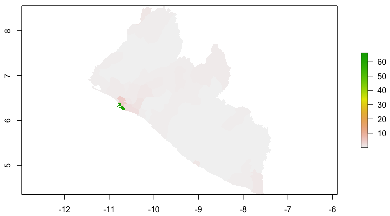
Investigate Margins of Error
Our model is serving to allocate population totals across all gridcells, but how accurate is it? To start we can calculate the different of our predicted values - the worldpop values and sum the totals.
diff <- population - lbr_pop15
In order to establish a basis for comparing total error across your LMIC take the absolute value of the differences and sum them to arrive a term that represnts total error.
cellStats(abs(diff), sum)
Taking the hist(diff) will also inform you of the magnitude and direction of error in your predicted values. Use the plot(diff) command to have a look at the resulting raster.
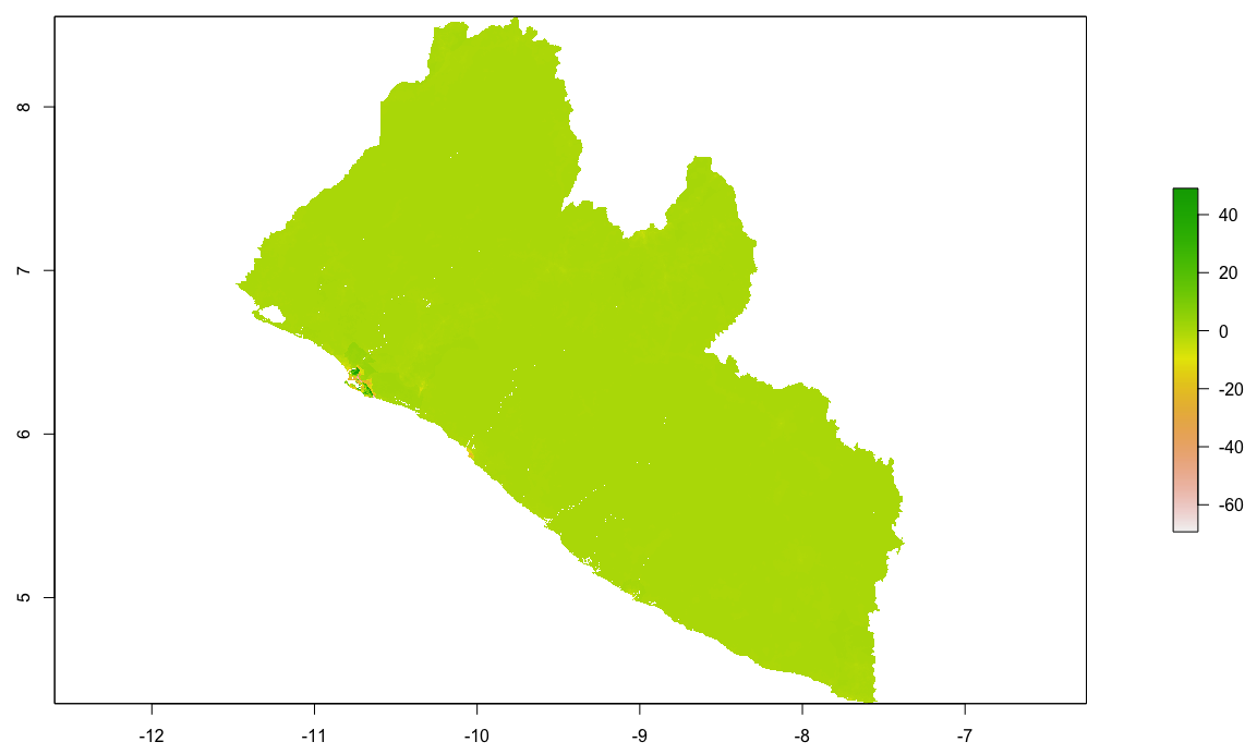
By looking at the histogram and the above difference of predicted value from worldpop raster it appears that most of the error is slightly above or below 0, and is also distributed fairly evenly across the entire space. Looking closely though, the area close to the southwest coast appears to exhibit a different phenomenon. This is the capital of Liberia, Monrovia. For your investigation, select the primary urban area and conduct the same analysis as follows.
First subset your adm2 by using the name of the administrative subdivision.
new_name <- your_adm2 %>%
  filter(name_var == "Add Name Here")
Use the mask() command with this newly created sf object to focus your analysis on the primate city within your LMIC.
urban_diff <- mask(diff, urban_adm2)
urban_pop <- mask(population, urban_adm2)
Create an object the defines the boundaries of your identified urban area. The bounding box used in your crop() command should be defined according the following order.
c(western_most_longitude, eastern_most_longitude, southern_most_latitude, northern_most_latitude)
Following is the bounding box and crop() command used for Monrovia, Liberia.
extGMN <- c(-10.83, -10.64, 6.20, 6.42)
gmonrovia_diff <- crop(gmonrovia_diff, extGMN)
gmonrovia_pop <- crop(gmonrovia_pop, extGMN)
Plot your Monrovia rasters.
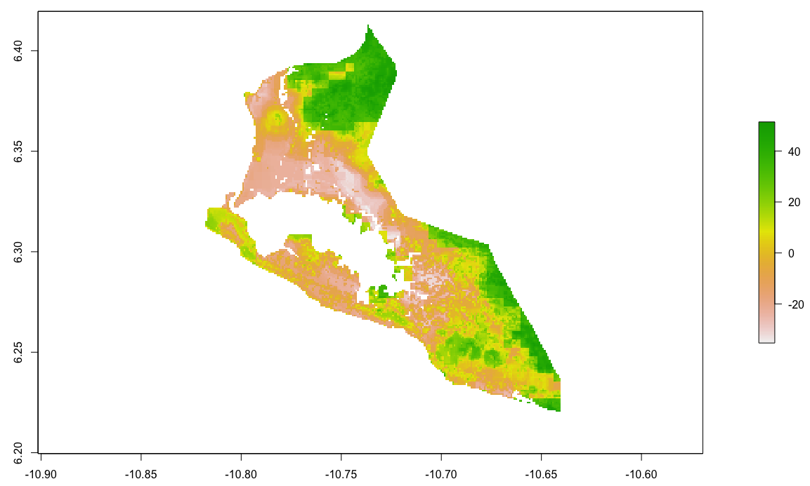
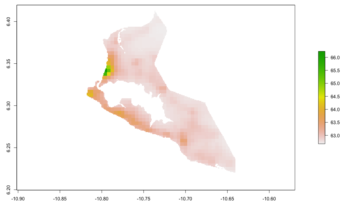
Finally, plot a three dimension map of the values, to gauge exactly how much variation was exhibited in the predicted values. Install and load the rgl:: and rasterVis:: libraries in order to execute the following command.
rasterVis::plot3D(gmonrovia_pop)
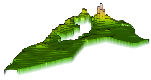
Finally, add the tmap:: library and overlay your differences plot.
mapview::mapview(gmonrovia_diff, alpha = .5)
Do you identify a geospatial trend associated with the error resulting from your predicted values?
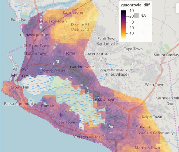
Team Challenge Question
Follow the steps from above used to produce the plots describing Liberia, but instead each team member should use their own selected LMIC country. Investigate the results from your model at different scales and locations across your selected LMIC. How effective was your model? Do you identify any trends? Produce a variety of plots that investigate, describe and analyze your dasymmetric population allocation using a linear model with land use and land cover geospatial covariates. Investigate at least two different locations and two different scales. Use adm1, adm2 or adm3 units of analysis, either in combination or alone to define the boundaries of your analysis.
Meet with your group and prepare to present three different plots from at least three different countries (or team members) for the Friday informal group presentation. You are welcome to combine output from the previous Project 2 exercise (part 1) as you wish. Then as a group, upload all 5 team members plots to #data100_igps (informal group presentations) by Sunday night. Each member should upload at least four plots that describe at least two different locations of differing scales within your LMIC.
Investigating and Comparing Results
Load all of your covariates, import your adm0 (international boundary) to crop() and mask() your RasterBrick and then use writeRaster() to save it. Later, use the brick() function to import your RasterBrick to your RStudio work session as needed. Make sure the layers in your RasterBrick are named after using the brick() command. Use the names() command to name your layers.
f <- list.files(pattern="lbr_esaccilc_dst", recursive=TRUE)
lulc <- stack(lapply(f, function(i) raster(i, band=1)))
nms <- sub("_100m_2015.tif", "", sub("lbr_esaccilc_", "", f))
names(lulc) <- nms
topo <- raster("lbr_srtm_topo_100m.tif")
slope <- raster("lbr_srtm_slope_100m.tif")
ntl <- raster("lbr_viirs_100m_2015.tif")
lulc <- addLayer(lulc, topo, slope, ntl)
names(lulc)[c(1,10:12)] <- c("water","topo","slope", "ntl")

lbr_adm0  <- read_sf("gadm36_LBR_0.shp")

lulc <- crop(lulc, lbr_adm0)
lulc <- mask(lulc, lbr_adm0)

writeRaster(lulc, filename = "lulc.tif", overwrite = TRUE)
# lulc <- stack("lulc.tif")
lulc <- brick("lulc.tif")

names(lulc) <- c("water", "dst011" , "dst040", "dst130", "dst140", "dst150",
                 "dst160", "dst190", "dst200", "topo", "slope", "ntl")
Obtain the 2015 WorldPop persons per pixel file for your LMIC. Make sure your adm sf object has the total population per subdivision as well as its area and density. Summarize all twelve geospatial covariates in adm groups by sum and by mean. Modify the following code to create your adm2 or adm3 object (you only have to select one, in the following example I have selected adm3 for Liberia).
lbr_pop15 <- raster("lbr_ppp_2015.tif")
# lbr_adm1  <- read_sf("gadm36_LBR_1.shp")
# lbr_adm2  <- read_sf("gadm36_LBR_2.shp")
lbr_adm3  <- read_sf("gadm36_LBR_3.shp")

# ncores <- detectCores() - 1
# beginCluster(ncores)
# pop_vals_adm1 <- raster::extract(lbr_pop15, lbr_adm1, df = TRUE)
# pop_vals_adm2 <- raster::extract(lbr_pop15, lbr_adm2, df = TRUE)
# pop_vals_adm3 <- raster::extract(lbr_pop15, lbr_adm3, df = TRUE)
# endCluster()
# save(pop_vals_adm1, pop_vals_adm2, pop_vals_adm3, file = "lbr_pop_vals.RData")

load("lbr_pop_vals.RData")

# totals_adm1 <- pop_vals_adm1 %>%
#   group_by(ID) %>%
#   summarize(pop15 = sum(lbr_ppp_2015, na.rm = TRUE))
#
# lbr_adm1 <- lbr_adm1 %>%
#   add_column(pop15 = totals_adm1$pop15)
#
# lbr_adm1 <- lbr_adm1 %>%
#   mutate(area = st_area(lbr_adm1) %>%
#            set_units(km^2)) %>%
#   mutate(density = pop15 / area)

# totals_adm2 <- pop_vals_adm2 %>%
#   group_by(ID) %>%
#   summarize(pop15 = sum(lbr_ppp_2015, na.rm = TRUE))
#
# lbr_adm2 <- lbr_adm2 %>%
#   add_column(pop15 = totals_adm2$pop15)
#
# lbr_adm2 <- lbr_adm2 %>%
#   mutate(area = st_area(lbr_adm2) %>%
#            set_units(km^2)) %>%
#   mutate(density = pop15 / area)

totals_adm3 <- pop_vals_adm3 %>%
  group_by(ID) %>%
  summarize(pop15 = sum(lbr_ppp_2015, na.rm = TRUE))

lbr_adm3 <- lbr_adm3 %>%
  add_column(pop15 = totals_adm3$pop15)

lbr_adm3 <- lbr_adm3 %>%
  mutate(area = st_area(lbr_adm3) %>%
           set_units(km^2)) %>%
  mutate(density = pop15 / area)

#save(lbr_adm1, lbr_adm2, lbr_adm3, file = "lbr_adms.RData")

# lulc <- brick("lulc.tif")

# names(lulc) <- c("water", "dst011" , "dst040", "dst130", "dst140", "dst150",
#                 "dst160", "dst190", "dst200", "topo", "slope", "ntl")

# ncores <- detectCores() - 1
# beginCluster(ncores)
# lulc_vals_adm1 <- raster::extract(lulc, lbr_adm1, df = TRUE)
# lulc_vals_adm2 <- raster::extract(lulc, lbr_adm2, df = TRUE)
# lulc_vals_adm3 <- raster::extract(lulc, lbr_adm3, df = TRUE)
# endCluster()
# save(lulc_vals_adm1, lulc_vals_adm2, lulc_vals_adm3, file = "lulc_vals_adms.RData")

load("lulc_vals_adms.RData")

# lulc_ttls_adm1 <- lulc_vals_adm1 %>%
#   group_by(ID) %>%
#   summarize_all(sum, na.rm = TRUE)

# lulc_ttls_adm2 <- lulc_vals_adm2 %>%
#   group_by(ID) %>%
#   summarize_all(sum, na.rm = TRUE)

lulc_ttls_adm3 <- lulc_vals_adm3 %>%
  group_by(ID) %>%
  summarize_all(sum, na.rm = TRUE)

lulc_means_adm3 <- lulc_vals_adm3 %>%
  group_by(ID) %>%
  summarize_all(mean, na.rm = TRUE)

# lbr_adm1 <- bind_cols(lbr_adm1, lulc_ttls_adm1)
# lbr_adm2 <- bind_cols(lbr_adm2, lulc_ttls_adm2)

lbr_adm3 <- bind_cols(lbr_adm3, lulc_ttls_adm3, lulc_means_adm3)

save(lbr_adm3, file = "lbr_adm3.RData")
Load your geospatial covariate RasterBrick of land use and land cover lulc, your 2015 WorldPop raster and your adm sf object. View your adm sf object and notice that you now have two summary sets of columns that describe each of your twelve geospatial covariates. The first set of columns describes the sum of all values per adm while the second set describes the mean of all values per adm. Also notice that in the second set, each variable has had the number 1 added to its name to differentiate it from the first series.
Use the lm() function to estimate three models. First use pop15 as the response variable and the sum of each geospatial covariate per adm as the predictors. Second, again use pop15 as the response variable but this time instead use the mean of each geospatial covariate per adm as the predictors. Third, use the logarithm of 2015 population log(pop15) as the response and the mean of each geospatial covariate per adm as the predictors. Notice I created a new variable named logpop15 but you could just as easily have specified log(pop15) within the call of your model.
model.sums <- lm(pop15 ~ water + dst011 + dst040 + dst130 + dst140 + dst150 + dst160 + dst190 + dst200 + topo + slope + ntl, data=lbr_adm3)
model.means <- lm(pop15 ~ water1 + dst0111 + dst0401 + dst1301 + dst1401 + dst1501 + dst1601 + dst1901 + dst2001 + topo1 + slope1 + ntl1, data=lbr_adm3)

lbr_adm3$logpop15 <- log(lbr_adm3$pop15)
model.logpop15 <- lm(logpop15 ~ water1 + dst0111 + dst0401 + dst1301 + dst1401 + dst1501 + dst1601 + dst1901 + dst2001 + topo1 + slope1 + ntl1, data=lbr_adm3)
Check the summary output from each model.
summary(model.sums)
summary(model.means)
summary(model.logpop15)
Make sure the names of each layer in your RasterBrick matches the names of the independent variables in each of your models. Notice how the second two models use the mean of each geospatial covarariate and the layer names are modified accordingly to match.
names(lulc) <- c("water", "dst011" , "dst040", "dst130", "dst140", "dst150", "dst160", "dst190", "dst200", "topo", "slope", "ntl")
lulc1 <- lulc
names(lulc1) <- c("water1", "dst0111" , "dst0401", "dst1301", "dst1401", "dst1501", "dst1601", "dst1901", "dst2001", "topo1", "slope1", "ntl1")
Use the predict() function from the raster:: package with the appropriate RasterBrick and model to predict each gridcells value. Use the save() and then the load() command in order to reduce computation time after restarting your work session.
predicted_values_sums <- raster::predict(lulc, model.sums)
predicted_values_means <- raster::predict(lulc1, model.means)
predicted_values_logpop15 <- raster::predict(lulc1, model.logpop15)

#save(predicted_values_sums, predicted_values_means, predicted_values_logpop15, file = "predicted_values.RData")
Use the extract() function from the raster:: package to assign the adm ID to each gridcell. Again use the save() and load() commands to reduce computation time.
ncores <- detectCores() - 1
beginCluster(ncores)
pred_vals_adm3_sums <- raster::extract(predicted_values_sums, lbr_adm3, df=TRUE)
pred_vals_adm3_means <- raster::extract(predicted_values_means, lbr_adm3, df=TRUE)
pred_vals_adm3_logpop15 <- raster::extract(predicted_values_logpop15, lbr_adm3, df=TRUE)
endCluster()

#save(pred_vals_adm3_sums, pred_vals_adm3_means, pred_vals_adm3_logpop15, file = "predicted_values_adm3s.RData")
Aggregate all values.
pred_ttls_adm3_sums <- aggregate(. ~ ID, pred_vals_adm3_sums, sum)
pred_ttls_adm3_means <- aggregate(. ~ ID, pred_vals_adm3_means, sum)
pred_ttls_adm3_logpop15 <- aggregate(. ~ ID, pred_vals_adm3_logpop15, sum)
Create a new data frame that contains the aggregate sums from each model's predictions.
ttls <- cbind.data.frame(preds_sums = pred_ttls_adm3_sums$layer,
                         preds_means = pred_ttls_adm3_means$layer,
                         resp_logpop = pred_ttls_adm3_logpop15$layer)
Bind the new values as columns within your adm. Notice I assigned a name to each column.
lbr_adm3 <- bind_cols(lbr_adm3, ttls)
Use the rasterize() command to create a new RasterLayer containing the predicted values from each of your models. The second object in your rasterize() command is the raster that is used as the template to produce the new raster. The values of the template raster are not used in the calculation, instead the values in the column of your adm sf object that identify the sum of predicted values from your model is used.
predicted_totals_sums <- rasterize(lbr_adm3, predicted_values_sums, field = "preds_sums")
predicted_totals_means <- rasterize(lbr_adm3, predicted_values_sums, field = "preds_means")
predicted_totals_logpop <- rasterize(lbr_adm3, predicted_values_sums, field = "resp_logpop")
Calculate the gridcell proportions for each result.
gridcell_proportions_sums  <- predicted_values_sums / predicted_totals_sums
gridcell_proportions_means  <- predicted_values_means / predicted_totals_means
gridcell_proportions_logpop  <- predicted_values_logpop15 / predicted_totals_logpop
Check the cellStats() to confirm that the sum of each objects proportions is equal to the number of adms in your sf object.
cellStats(gridcell_proportions_sums, sum)
cellStats(gridcell_proportions_means, sum)
cellStats(gridcell_proportions_logpop, sum)
Produce a raster object that contains the WorldPop values we will use as our comparison spatial data set for validation.
population_adm3 <- rasterize(lbr_adm3, predicted_values_sums, field = "pop15")
Calculate the final predicted value for each gridcell according to the output from each of the three models.
population_sums <- gridcell_proportions_sums * population_adm3
population_means <- gridcell_proportions_means * population_adm3
population_logpop <- gridcell_proportions_logpop * population_adm3
Check cellStats() to verify that total population matches the initial value used in this dasymmetric allocation.
cellStats(population_sums, sum)
cellStats(population_means, sum)
cellStats(population_logpop, sum)

sum(lbr_adm3$pop15)
Calculate the difference between each RasterLayer and the WorldPop RasterLayer.
diff_sums <- population_sums - lbr_pop15
diff_means <- population_means - lbr_pop15
diff_logpop <- population_logpop - lbr_pop15
Finally, produce a raster plot of each model's predicted output as well as the differences and a 3D plot to visualize the results.
plot(population_sums)
plot(diff_sums)
rasterVis::plot3D(diff_sums)
cellStats(abs(diff_sums), sum)

plot(population_means)
plot(diff_means)
rasterVis::plot3D(diff_means)
cellStats(abs(diff_means), sum)

plot(population_logpop)
plot(diff_logpop)
rasterVis::plot3D(diff_logpop)
cellStats(abs(diff_logpop), sum)

plot(lbr_pop15)

rgl.snapshot("diff", fmt = "png", top = TRUE )
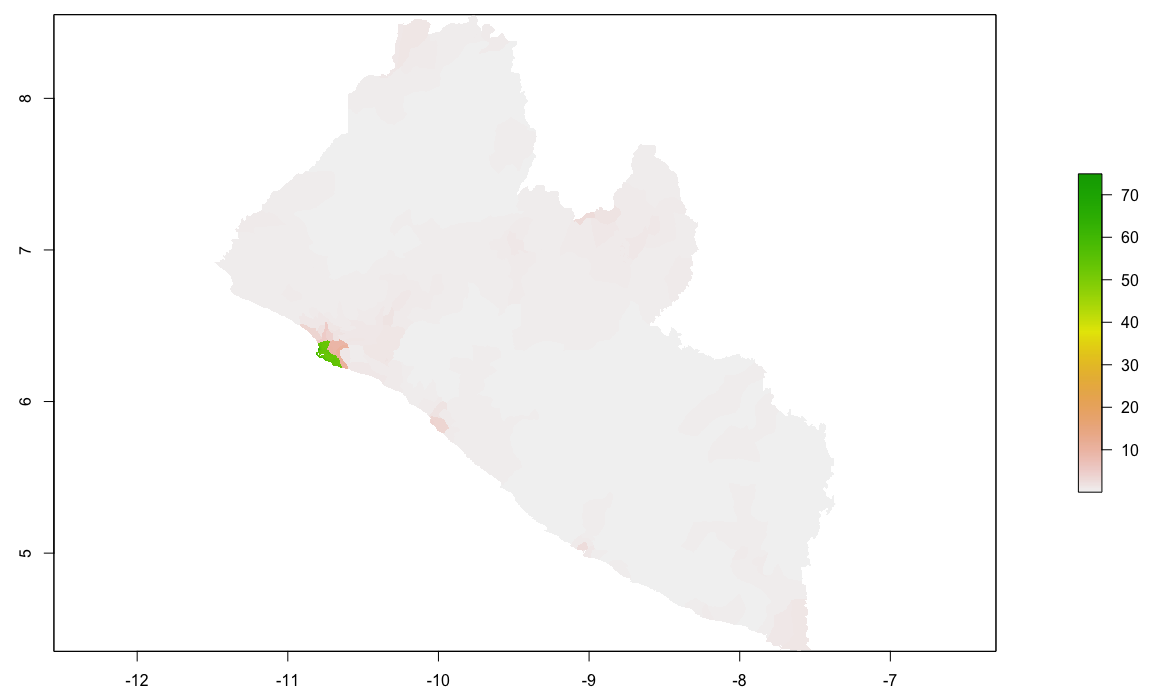
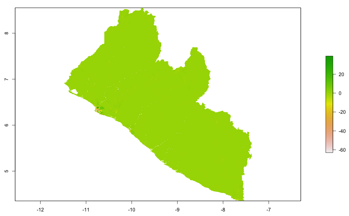
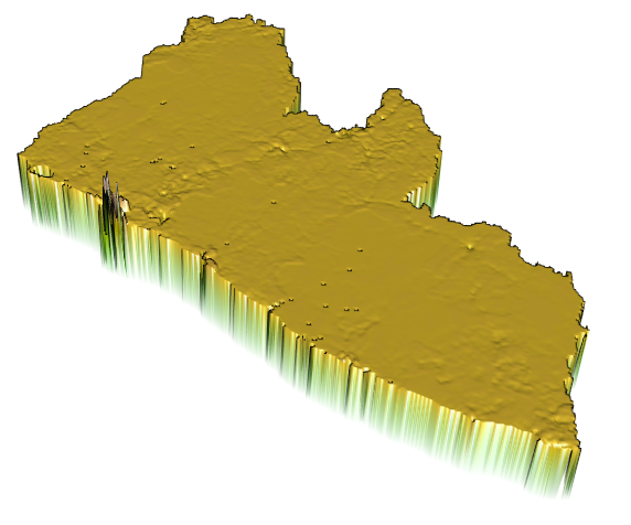
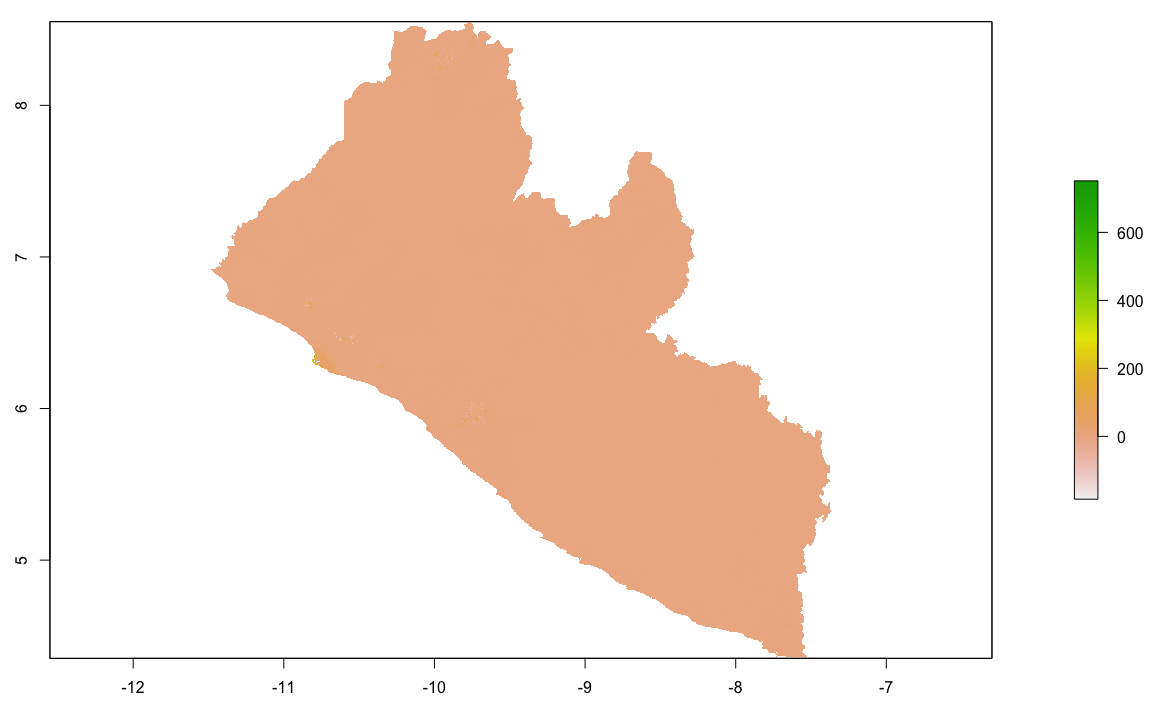
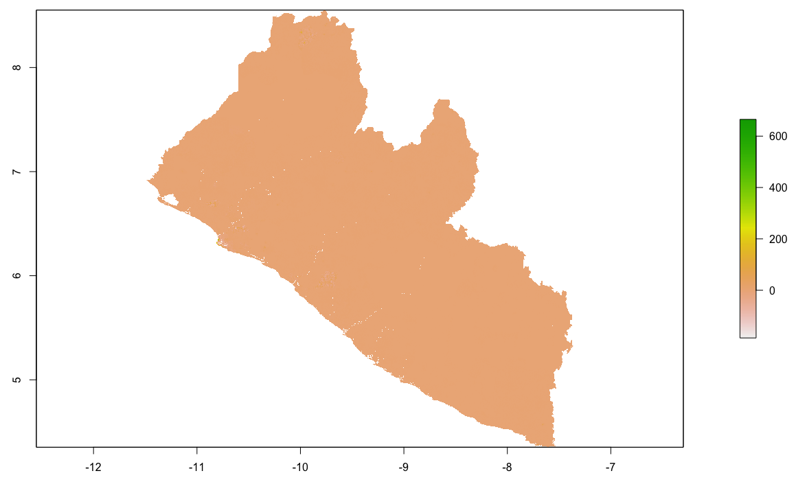
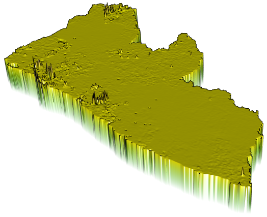
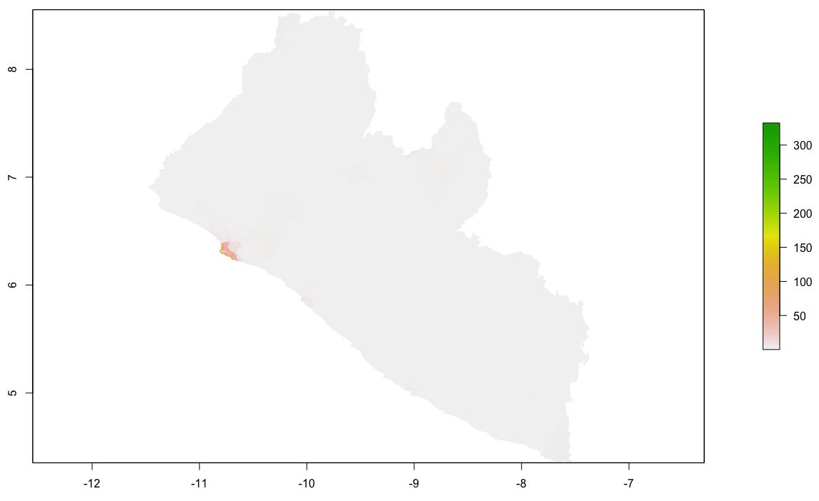
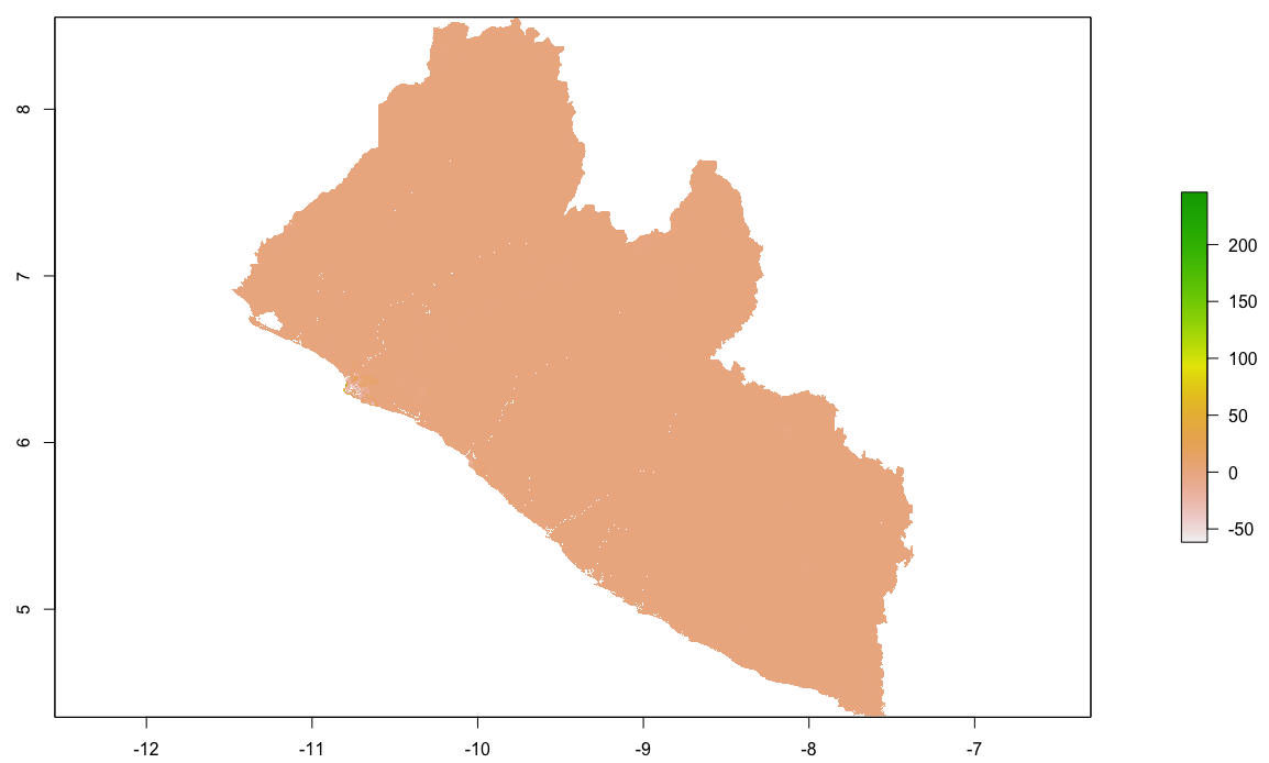
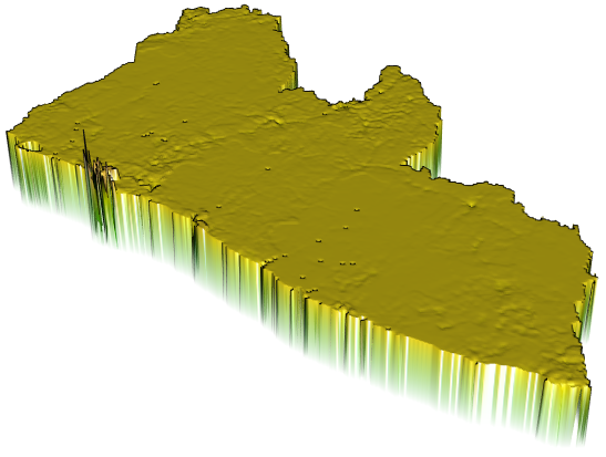
Project 2. Individual Deliverable
Upload three sets of spatial plots that describe the predicted population of your selected LMIC using each of the three models.
- Response variable is population and the predictors are sum of covariates
- Response variable is population and the predictors are mean of covariates
- Reponse variable is log of population and the predictors are mean of covariates
Each of the three sets of plots should also have three plots.
- A plot that describes the predicted population of your LMIC using the model
- A plot that describes the difference between your predicted results and the WorldPop estimates for 2015
- A three dimension plot that visualizes the population or difference
Accompany your series of plots with a written statement that identifies which of the three models produced the best results. Justify your assessment.
Upload your deliverable to the slack channel #data100_project2 no later than 11:59PM on Sunday, October 20th.
Individual Stretch Goal 1
Conduct the same analysis as above at an increased scale, analyzing one of your LMIC's largest or most significant urban areas or cities. Subset your adm using the %>% operator and the | as needed.
mts_bomi <- lbr_adm3 %>%
 filter(NAME_1 == "Montserrado" | NAME_1 == "Bomi")
Use the mapview() command to identify trends and provide further support for your assessment of each model as you did in the previous execise.
mapview::mapview(gmonrovia_diff, alpha = .5)
Again compare the results. Are you able to identify any trends?
Individual Stretch Goal 2
Estimate a random forest model using the same data you previously used. Use the mean values of all grid cells within each adm as the predictors (independent variable) and the log of population as the response (dependent variable). Start by loading the World Pop raster you will use to validate your resuts against first. Then load your adm0 to use in your crop() and mask() commands. Load your adm3 that has all of your variables needed to estimate your random forest model. Also be sure to load the land use and land cover variables you will use to predict the population of each individual grid cell.
rm(list=ls(all=TRUE))

# install.packages("raster", dependencies = TRUE)
# install.packages("sf", dependencies = TRUE)
# install.packages("tidyverse", dependencies = TRUE)
# install.packages("doParallel", dependencies = TRUE)
# install.packages("snow", dependencies = TRUE)
# install.packages("randomForest", dependencies = TRUE)

#library(sp)
library(sf)
library(raster)
library(tidyverse)
library(doParallel)
library(snow)
library(randomForest)

### Import Administrative Boundaries ###

setwd("~/Tresors/teaching/project_folder/data/")

lbr_pop15 <- raster("lbr_ppp_2015.tif")

lbr_adm0  <- read_sf("gadm36_LBR_0.shp")
load("lbr_adm3.RData")

lulc <- brick("lulc.tif")

lulc <- crop(lulc, lbr_adm0)
lulc <- mask(lulc, lbr_adm0)
Simplify your adm3 by extracting only the needed columns. Remove the geometry from the object by using the st_geometry() command and assigning it as NULL. Add the log of population as a variable to your newly created data set. Simply the class of your data set by rewriting it as a data.frame.
model_data <- lbr_adm3[ ,c(18:20, 35:46)]
st_geometry(model_data) <- NULL
model_data$logpop15 <- as.numeric(log(model_data$pop15))
model_data <- as.data.frame(model_data)
Your object model_data should have the following structure.
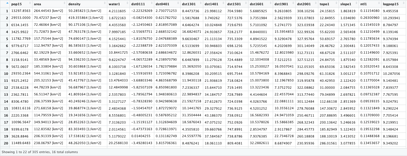
Simplify the objects you will use as the predictors and response by creating two new objects. The x_data object are your predictors and coorespond to the mean values of each lulc variable at each adm. The y_data is your response variable, in this case log of population.
x_data <- model_data[ ,4:15]
y_data <- model_data[ ,16]
First, tune your random forest model in order to determine which of the variables are important. The ntreeTry = argument specifies how many trees the model will estimate at the tuning step. The mtryStart = argument specifies how many variables will be tried at each split. Other arguments are also important, but you can simply follow the following chunk of code to start.
init_fit <- tuneRF(x = x_data,
                   y = y_data,
                   plot = TRUE,
                   mtryStart = length(x_data)/3,
                   ntreeTry = length(y_data)/20,
                   imrpove = 0.0001,
                   stepFactor = 1.20,
                   trace = TRUE,
                   doBest = TRUE,
                   nodesize = length(y_data)/1000,
                   na.action = na.omit,
                   importance = TRUE,
                   proximity = TRUE,
                   sampsize = min(c(length(y_data), 1000)),
                   replace = TRUE)
After you get a result from your tuning step, check the importance scores from your model. Use importance(init_fit) to have RStudio return measures for each variable. Assign those scores to a vector and then subset using subscripting operators all variables that have a positive value. Retain only those variables that have a positive importance score.
importance_scores <- importance(init_fit)
pos_importance <- rownames(importance_scores)[importance_scores[ ,1] > 0]
pos_importance

x_data <- x_data[pos_importance]
After respecifying your random forest model, estimate it again.
pop_fit <- tuneRF(x = x_data,
                  y = y_data,
                  plot = TRUE,
                  mtryStart = length(x_data)/3,
                  ntreeTry = length(y_data)/20,
                  imrpove = 0.0001,
                  stepFactor = 1.20,
                  trace = TRUE,
                  doBest = TRUE,
                  nodesize = length(y_data)/1000,
                  na.action = na.omit,
                  importance = TRUE,
                  proximity = TRUE,
                  sampsize = min(c(length(y_data), 1000)),
                  replace = TRUE)
Finally, use several of the parameters from pop_fit in the arguments of your final model.
model <- randomForest(x = x_data,
                      y = y_data,
                      mtry=pop_fit$mtry,
                      ntree = pop_fit$ntree,
                      nodesize = length(y_data)/1000,
                      importance = TRUE,
                      proximity = TRUE,
                      do.trace = FALSE)
Check the output from your model.
print(model)
plot(model)
varImpPlot(model)

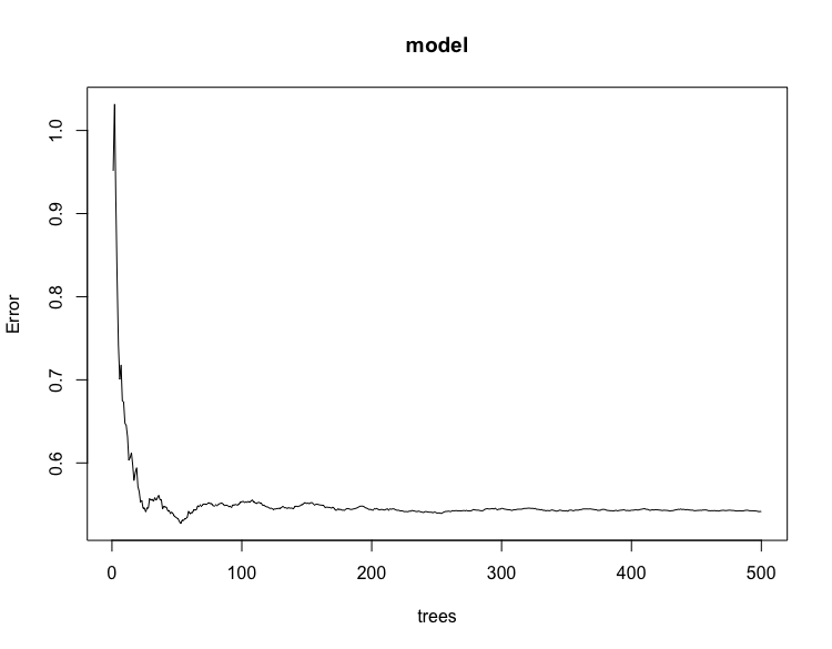
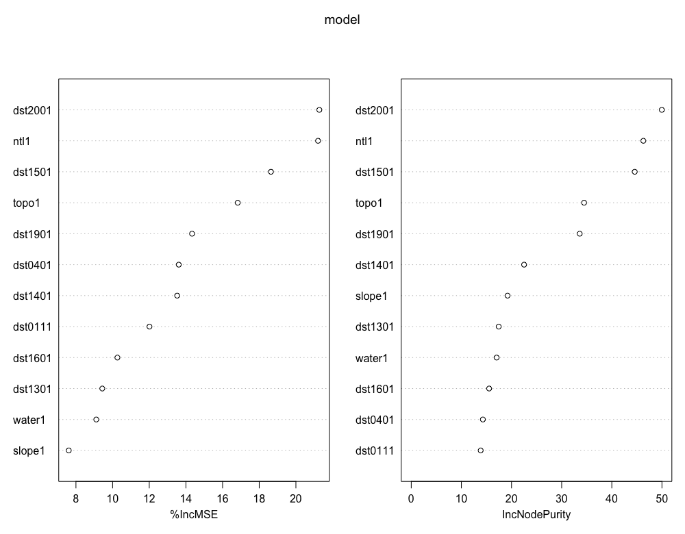
Confirm that the names in your random forest model match those found in your rasterBrick.
names(lulc) <- c("water1", "dst0111" , "dst0401", "dst1301", "dst1401", "dst1501", "dst1601", "dst1901", "dst2001", "topo1", "slope1", "ntl1")
Now predict your population values using the model with the 12 different geospatial covariate layers.
preds_rf <- raster::predict(lulc, model)
After you have predicted your population values for each gridcell, back transform the log of population to its original estimate.
preds_rf_exp <- exp(preds_rf)
Next, extract all of the predicted values by assigning the ID for each adm unit where it is located.
ncores <- detectCores() - 1
beginCluster(ncores)
preds_ttls_rf <- raster::extract(preds_rf_exp, lbr_adm3, df=TRUE)
endCluster()
Aggregate all of the values by adm ID and sum.
preds_area_totals_rf <- aggregate(. ~ ID, preds_ttls_rf, sum)
Bind the columns.
lbr_adm3 <- bind_cols(lbr_adm3, preds_area_totals_rf)
Finally, rasterize() the value of the total estimates per adm and then calculate the gridcell proportionate share across the entire LMIC. Confirm that cellStats() returns a value equal to the number of adms in your LMIC.
preds_ttls <- rasterize(lbr_adm3, preds_rf, field = "layer")
props  <- preds_rf_exp / preds_ttls
cellStats(props, sum)
Again, rasterize() population values and then multiply the gridcell proportions by the population values to estimate each gridcells proportion of the total population per gridcell.
pops <- rasterize(lbr_adm3, preds_rf, field = "pop15")
gridcell_pops <- props * pops
cellStats(gridcell_pops, sum)
Check cellStats() to confirm your totals match population values calculated from the WorldPop persons per pixel raster layer.
Finally, subtract the raster layer with predicted values from your random forest model from the WorldPop ppp raster layer. Calculate the sum of absolute value of differences between the two rasters.
diff <- gridcell_pops - lbr_pop15
cellStats(abs(diff), sum)

rasterVis::plot3D(gridcell_pops)
rasterVis::plot3D(diff)
What can you surmise? Have you improved your predictive power by applying a machine learning approach?
De facto description of human settlements and urban areas
For project 3, instead of starting with your LMIC at the scale of its international boundary, this time you will increase the scale of your focus area to an adm2 or adm3 within your country. You will then use the probability distribution from your population raster as the basis for distributing of all persons within your adm2. Then you will identify the de facto boundaries of all urban areas based on the density of identified human settlements, instead of the typically used administrative boundaries, which are politically defined and do not necessarily represent the spatial continuity of urbanization. Finally, you will use those organically derived boundaries to extract population totals for each de facto city, town and village.
To begin, load the typical packages that we have been using in our previous labs. Additionally, we will add two new packages maptools and spatstat. Set your working directory, use the raster() command to load your worldpop ppp raster, and also use the read_sf() command to load your adm2 or adm3. If you haven't been using the GADM shapefiles, be sure to make the switch at the beginning of this lab, as they have demonstrated over the course of this semester to be more reliable and better maintained than HDX adm shapefiles.
rm(list=ls(all=TRUE))

# install.packages("raster", dependencies = TRUE)
# install.packages("sf", dependencies = TRUE)
# install.packages("tidyverse", dependencies = TRUE)
# install.packages("maptools", dependencies = TRUE)
# install.packages("spatstat", dependencies = TRUE)

library(raster)
library(sf)
library(tidyverse)
library(maptools)
library(spatstat)

setwd("~/path_to/your/working_directory/")

your_pop15 <- raster("your_ppp_2015.tif")

your_adm2  <- read_sf("gadm36_YOUR_2.shp")
After reading your adm2 into R as a sf object, view the data and consider the names of the different adm2s that comprise your LMIC. Select one of the adm2s that you think might be interesting to analyze at a higher resolution. You might need to google the name of the adm2 within your country in order to find out more information about it, in particular its population. For my analysis, I am considering an administrative subdivision in Liberia that is located in the county Nimba near the northern border with Guinea, named Sanniquelleh-Mahn.

I enter the name of my prospective district into google and search for its population, which returns an estimate of about 125,000 persons inhabiting the district. This is a good size to work with for this lab, although you could possibly select a district or area that is slightly larger, to start, try to keep the population under 200,000. I will then use the %>% pipe operator and filter() command to subset the Sanniquelleh-Mahn district from my adm2 sf object. If your adm2s are too large, you are also welcome to use an adm3 from within your LMIC. If you country is smaller in size, it might also be best to select an adm1. It just depends on the circumstances.
your_subset_district <- your_adm2 %>%
  filter(NAME_2 == "Name-of-district")
Confirm your subset object exists. You can also have a look at it using the plot(st_geometry(your_adm2)).
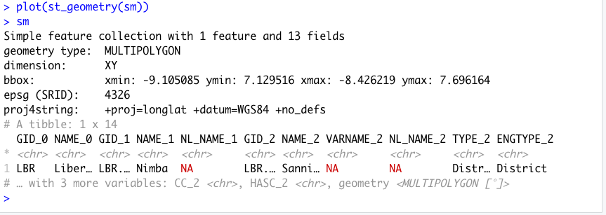
As you have done in previous exercises, use the crop() and mask() function to subset your rasterLayer to just that part that is located within your selected adm2. After cropping and masking your world pop person per pixel raster layer, use the cellStats() command to calculate the total number of people in your adm2 and assign it as a value to an object.
your_adm2_pop15 <- crop(your_LMIC_pop15, your_subset_district)
your_adm2_pop15 <- mask(your_adm2_pop15, your_subset_district)

pop <- floor(cellStats(your_adm2_pop15, 'sum'))
Entering pop into the console in my case returns a value of 124388, which is the estimated population of Sanniquelleh-Mahn in 2015. Also use the pdf() and dev.off() commands to produce a pdf file of your subset raster with the subset sf adm2 object added to the plot.
png("sm_pop15.png", width = 800, height = 800)
plot(your_masked_raster, main = NULL)
plot(st_geometry(your_subset_sf), add = TRUE)
dev.off()
The above script produces the following plot as a pdf file in your working directory. In addition to seeking an adm2 subdivision that is between 100,000 and 200,000 persons, also notice that the area of my selected district is about .7 degree longitude by .6 degrees latitude. Likewise, select an area that is less than 1 degree longitude by 1 degree latitude. If you want to increase the size of the area being analyzed and likewise the population residing within that space, you will have an opportuntity to do that later, but for now, start small.
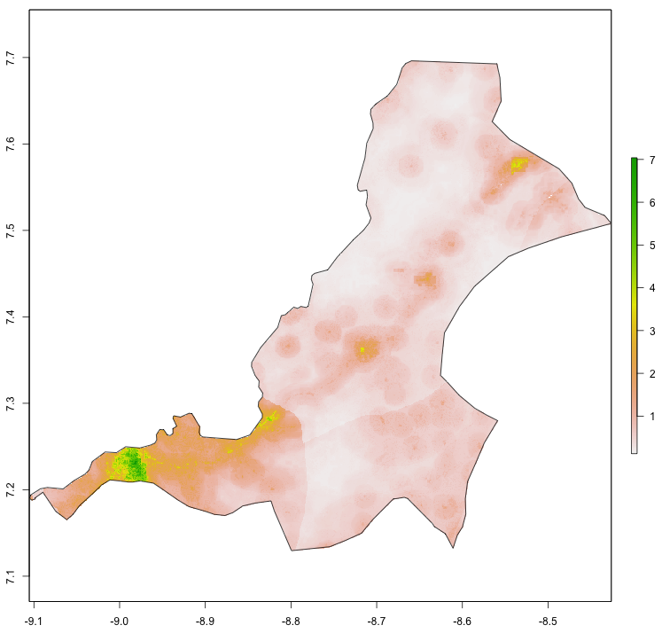
For the next step, you will use a slightly older, but very powerful R package called spatstat, which is used for all kinds of spatial statistics. Spatial statistics typically involves much more than simply descriptive statistics, analytical models, and inference, it typically also involves some description and analysis of points, lines and polygons in that space. For example, one might want to know how to describe a pattern of points that exists throughout a plane, and how it compares to a similarly existing pattern of points that is considered completely spatially randomly dispersed. Additionally, one might also want to know if there is a spatial relationship with certain points within a point pattern and other points within that point pattern based on attributes of those points or other geospatial features. In many ways, spatial statistics is just like traditional statistics, with the exception that an additinal layer of spatial and potentially geospatial complexity has been added.
To start your basic spatial analysis, of your selected adm2, you will need to use the st_write() command to write your sf object as a shapefile back to your working directory, in order to reimport using a command that is compatible with spatstat.
st_write(your_adm2_sf, "name_of_file.shp", delete_dsn=TRUE)
your_adm2_with_mtools <- readShapeSpatial("name_of_file.shp")
The readShapeSpatial() command is from the maptools:: library and will create a SpatialPolygonsDataFrame in your workspace, which I have named above just your_adm2_with_map_tools. You should only briefly need to use this command. After creating your adm2_with_mtools object, use the as(obj, "owin") command to create a window object that will be used with the rpoint() function from the spatstat:: library. You can just call the new object win, and also have a look at it by executing plot(win).
win <- as(your_adm2_with_mtools, "owin")
For the next command, you will use this win object as the window or boundary for locating a number of points equal to the total population of your adm2, and where each point represents one person. In order to determine each persons location, use the spatial probability distribution of population decribed by your masked raster of your adm2.
my_adm2_ppp <- rpoint(pop, f = as.im(my_masked_adm2_raster), win = win)
After creating your point pattern, have a look at it, by typing the name of your object in the R console. You should notice that R recognizes your object that represents the geospatial distribution of all persons throughout your adm2 as a planar point pattern (or .ppp class object) as well as the number of points within that ppp. Plot both the win and ppp objects together as a .png.
png("your_file.pdf", width = add_width, height = add_height)
plot(win, main = NULL)
plot(your_ppp, cex = add_number, add = TRUE)
dev.off()
The following image is one instance from a probability model (based on 2015 data) used to distribute all 124,388 persons geospatially throughout Sanniquelleh-Mahn. I have plotted both my window and planar point patter as a .png graphics object and have set the width = and height = arguments to 2000 each, while the cex = argument is set to 0.15. You will want to test some of the parameters with the output on your own computer to see what produces the best results.
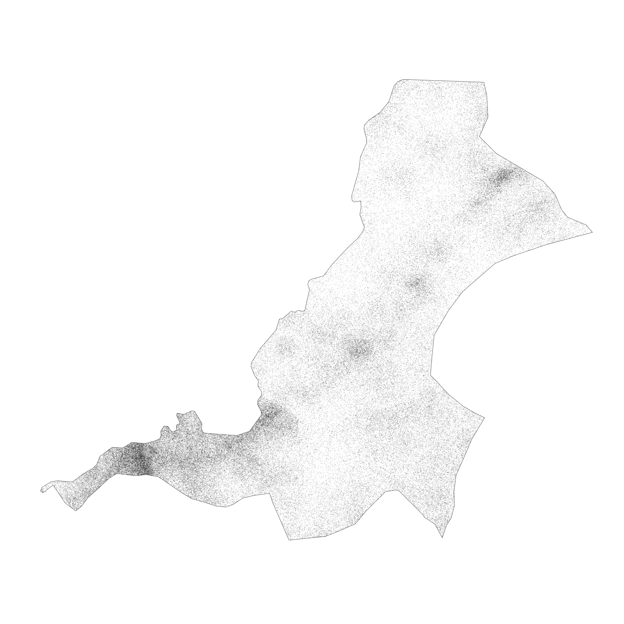
In order to best use this newly created object, we need to estimate a model that describes the spatial probability density function of this planar point pattern. Spatial probability density function or kernel density estimation is a three dimension version of the density plot that we looked at in a previous project. You may recall that the two dimension probability density function created a line or smoothed function that closely followed the histogram of our observations. Now with a three dimension, spatial probability density function, we will estimate a density function that will match histograms of observations in both the x & y directions (or longitude and latitude). The good news is, there is a function to do this for us, but it requires two steps. The first step is to calculate the bandwidth that will be used in the density.ppp() function. While the bandwidth produced will simply be a number, in order to calculate this number, over a three dimensional space, can be fairly computationally intense. Fortunately, we have limited the scope of our study area, as well as the number of points located within that bounary, and it shouldn't take to terribly long. The following command took about 15 minutes on my MacBook Air for the ~125,000 point pattern.
bw <- bw.ppl(your_ppp)
Once you have calculated the value of your bandwidth (in my case "sigma" resulted in a 0.003077435) use the save() and load() commands, so you don't need to rerun bw.ppl() each time.
#bw <- bw.ppl(sm_pipo)
#save(bw, file = "bw.RData")
load("bw.RData")
After you have estimated the value of the bandwidth for your spatial probability density function, then execute the function itself.
your_density_image <- density.ppp(your_ppp, sigma = bw)
The resulting object is a real valued pixel image, which is kind of like a raster layer, and it represents a function that describes the probability of the population density at each pixel throughout the entire space.
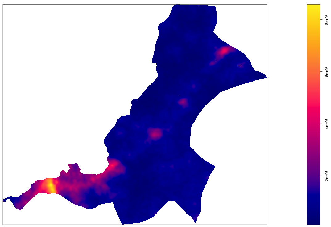
As you may notice, the scale on the right hand side of our density image, provides a representation of where population densities are the highest, or in more common terms, where urbanization has occurred. The goal of this part of the lab is to identify the boundaries of each uniform and continuous urban area and then to assign the summed population value to each of those polygons. To start that process, you will need to convert your density image to a spatial grid, then back to an image, and finally to contour lines that we will use to begin creating our polygons. A key part of the contourLines() command is the levels = argument on line 3 below. In my example, I have set the levels = 1000000, which is the equivalent of the 1000000 density estimate contour line in the plot above. What that means, is that R will produce a line that is equivalent to that contour value across the entire probabilty density function of the population. You will want to modify your levels = arugment to coorespond with the values on your produced density plot. The value you choose will represnt the threshold set that uniformily and continuously differentiates urban areas from non-urban areas. Later you will reassess this threshold after considering each polygon's area as well as its population.
Dsg <- as(your_ppp, "SpatialGridDataFrame")  # convert to spatial grid class
Dim <- as.image.SpatialGridDataFrame(Dsg)  # convert again to an image
Dcl <- contourLines(Dim, levels = 1000000)  # create contour object
SLDF <- ContourLines2SLDF(Dcl, CRS("+proj=longlat +datum=WGS84 +no_defs"))
Once you have your object named SLDF, which is a Spatial Lines Data Frame, convert it back to an sf object using the st_as_sf() command. The resulting object will be a MULTILINESTRING.
sf_multiline_obj <- st_as_sf(SLDF, sf)
By plotting the spatial grid data frame with the newly created multiline object on top, the goal of our exercise will begin to become more readily visible.

You will notice that a number of the contour lines are closed and already prepared for conversion from multiline objects to polygons. This is particularly true in the central areas, where a number of enclosed lines have been created. On the contrary, the more densely populated area represented by the more red, orange and yellow collored gridcells, intersects directly with the edge of our administrative boundary and will present a more difficult challenge in order to create its polygon. In order to create polygons that represent each indiividual urbanized area, we will need to isolate inside area polygons from outside area polygons. First start with the st_polygonize() command to convert all of the closed polylines that are valid for conversion to polygons.
inside_polys <- st_polygonize(SLDFs)
Run plot(st_geometry(inside_polys)) and you should notice a plot produced with only the internal polygons. To recapture the contour lines from our density plot that did not close, use the st_difference() command to isolate these linear elements.
outside_lines <- st_difference(SLDFs, inside_polys)
Use plot(st_geometry(outside_lines)) to view the resulting difference from the two objects and notice that these are the contour lines that did not close since they intersected with the adm2 boundary.
In order to fuse these unenclosed contour lines with the administrative boundary, I will use the st_buffer() command to offset each line, just a little bit, so as to make a cut in the adm2 border, after I intersect the two objects. Also use the st_cast() command to convert the geometric collection of objects into individual polygons, where each one potentially represents one urbanized area.
z <- st_buffer(outside_lines, 0.001)
zz <- st_difference(adm2_sf, z)
zzz <- st_cast(zz, "POLYGON")
You will notice that the resutant polygon, has been subdivided into many different polygons with a very small space where the unenclosed contour lines intersected the adm2 border. While this is helpful in the regard that now we in fact have polygons representing each area, it also presents two subsequent problems. First, we now have a very large polygon that represents all of Sanniquelleh-Mahn that had values below the selected contour line value. Second, there are also polygons that resulted from urbanized areas intersecting and then reintersecting the adm2 border and thus resulting in smaller pockets of areas that also have values below the selected density contour line. We will need to execute two appraoches in resolving these two issues.

The large polygon that represents that entire area of the adm2 that was not within the contour line, is also the largest polygon in the simple feature collection. To remove it, calculate the area of all polygons in the collection using st_area() and then filter() based on the size of the largest feature. To simpify the calculation, set the class of the area variable to numeric when calculating the area.
zzz$area <- as.numeric(st_area(zzz))
Now look at the data for your created sf object (I have named it zzz in the above example) and order the area from largest to smallest.
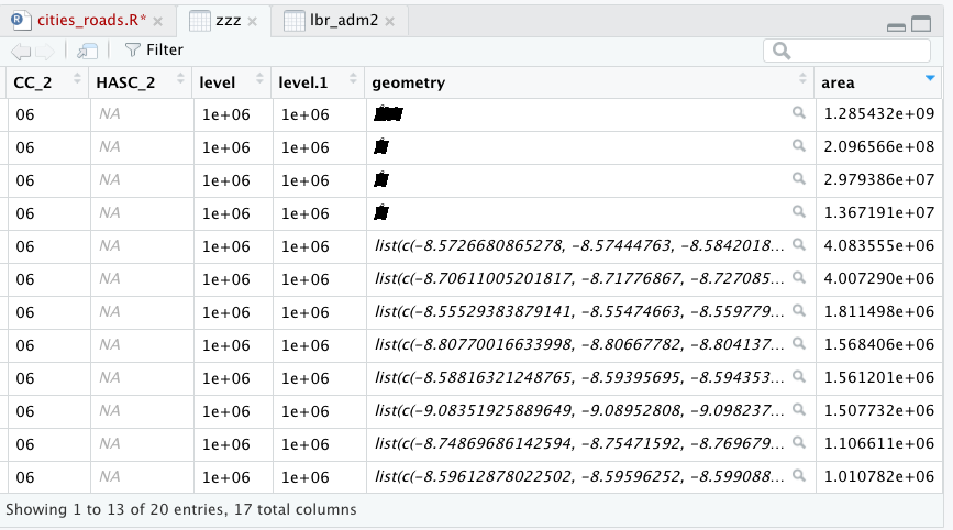
In this example, the largest polygon has an area of about 1.28 x 10^9 m^2. Remove that polygon, but retain the rest.
subpolys <- zzz %>%
  filter(area < 250000000)
To evaluate the remaining polygons that were created from the intersection of the outside lines with your adm2 border, we will use the extracted population for each polygon. First extract() the population values from your adm2 world pop raster and assign each polygons ID to each gridcell. Next, aggregate the extracted values, group by polygon ID while also calculating the sum of all gridcells within each polygon. Finally, add those values to your newly created subpolygon sf object (that represents the intersection of the outside lines with the adm2 border). Since we are using a masked raster of your adm2 area, this single layer extract() command should take significantly less time than with the larger, stacked rasterBrick used in previous projects.
subpolys_extract <- raster::extract(sm_pop15, subpolys, df = TRUE)

subpolys_totals <- subpolys_extract %>%
  group_by(ID) %>%
  summarize(pop15 = sum(lbr_ppp_2015, na.rm = TRUE))

subpolys <- subpolys %>%
  add_column(pop15 = subpolys_totals$pop15)
Have a look at the pop15 value for each polygon in your subpolys object.

Removing the largest polygon was very effective at removing all areas that represented densities below the selected contour line. You may also want to plot the subpolys (over the density function) to consider location and size.
png("subpolys.png", width = 1200, height = 1200)
plot(sm_dens, main = NULL)
plot(st_geometry(subpolys), add = TRUE)
dev.off()
I'm going to use the filter() command to remove only those polygons with populations less than 750 persons. You may want to increase or decrease this value based on your results. A more thorough analysis might involve considering population density in setting this threshold, but for now just use an ad hoc measure.
subpolys_filtered <- subpolys %>%
  filter(pop15 > 750)
You can compare earlier results with the newly produced filtered subpolys.
png("subpolys_filtered.png", width = 1200, height = 1200)
plot(sm_dens, main = NULL)
plot(st_geometry(subpolys_filtered), add = TRUE)
dev.off()
We have evalutated the outside polygons by area and population, now let's likewise evaluate the inside polygons we have already created by population. To transform a geometric collection into individual polygons use the st_geometric_extract() command. Follow that by again extracting population values then aggregating and summing their values by each polygons ID. Finally, add those values as a column to your inside_polys sf object.
inside_polys <- st_collection_extract(inside_polys, "POLYGON")

ips_extract <- raster::extract(sm_pop15, inside_polys, df = TRUE)

ips_totals <- ips_extract %>%
  group_by(ID) %>%
  summarize(pop15 = sum(lbr_ppp_2015, na.rm = TRUE))

inside_polys <- inside_polys %>%
  add_column(pop15 = ips_totals$pop15)
As with the outside polygons, set a value to filter population densities that do not qualify as urbanized.
inside_polys_filtered <- inside_polys %>%
  filter(pop15 > 150)
We finally at the point where we will union the two sets of polygons, extract all population values and designate our de facto human settlements and urbanized areas. First use the st_union() command to combine both sets of polygons into a single sf feature.
uas <- st_union(inside_polys_filtered, subpolys_filtered)
Use the st_cast() command to transform any multipolygons into individual entities.
urban_areas <- st_cast(uas, "POLYGON")
At this point, most of the columns in our urban_areas are nonsensical and can be simply removed. Just be sure to keep the geometry.
urban_areas[ ,1:19] <- NULL
Have a quick look at the urban area polygons and density.

Extract all population values and add them to your urban_areas polygons.
uas_extract <- raster::extract(sm_pop15, urban_areas, df = TRUE)

uas_totals <- uas_extract %>%
  group_by(ID) %>%
  summarize(pop15 = sum(lbr_ppp_2015, na.rm = TRUE))

urban_areas <- urban_areas %>%
  add_column(pop15 = uas_totals$pop15)
Again, look at your sf object urban_areas by entering its name into the console.

Compare the output when controlling for the number of unique polygons in your simple feature object.
urban_areas %>%
  unique()

It seems somehow through the process of spatial modifcations and unions, I captured some repetitive polygons. This might have an impact on plotting, so I will go ahead and assign the unique() set of simple features to the object, by simply overwritting it urban_areas <- urban_areas %>% unique().
Use ggplot() to plot each of your de facto human settlements and urban areas.
ggplot() +
  geom_sf(data = sm,
          size = 0.75,
          color = "gray50",
          fill = "gold3",
          alpha = 0.15) +
  geom_sf(data = urban_areas,
          fill = "lightblue",
          size = 0.45,
          alpha = 0.5)
Use ggsave() to save your plot.
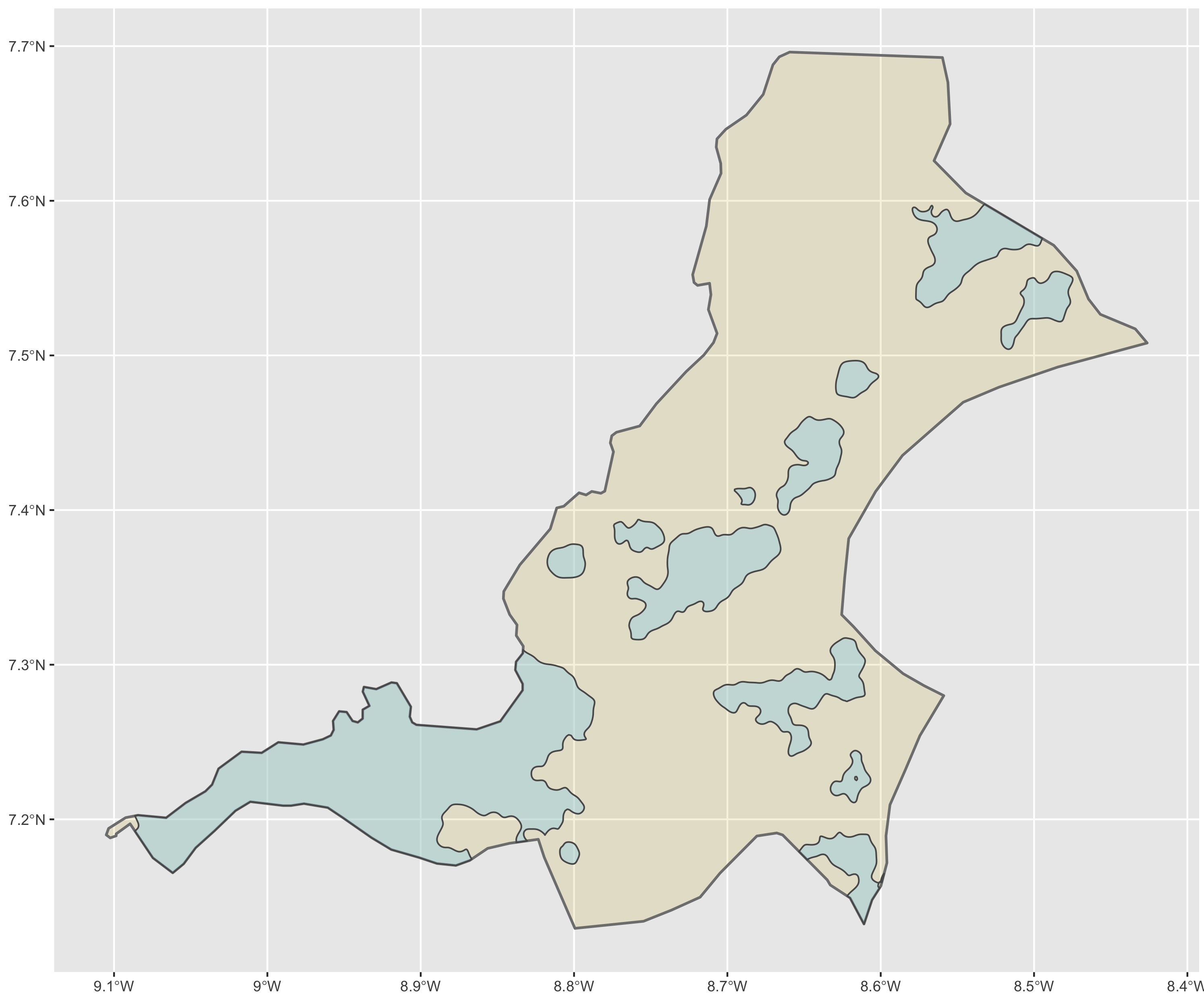
In addition to identifying the urban areas, also describe their population and density. You should already have population as a variable in your urban_areas object, but now also add density. You will recall that we used this same snippet in the previous exercise. Be sure to load the library(units) before using the set_units() command.
your_sf_obj <- your_sf_object %>%
    mutate(add_name_here = st_area(your_sf_object) %>%
             set_units(km^2)) %>%
    mutate(density = as.numeric(pop_variable_here / area_variable_name_here))
Instead of assigning a geometric scale to the actual polygons, use a point that will be sized and assigned a color according to both population and density. First cast() the centroid of each polygon as a new simple features object.
ua_cntr_pts <-  urban_areas %>%
  st_centroid() %>%
  st_cast("MULTIPOINT")
Again, use ggplot() to plot a map of de facto urban areas and human settlements where each uniform and continuous area is statistically described in terms of its population as well as its density.
ggplot() +
  geom_sf(data = adm2_sf,
          size = 0.75,
          color = "gray50",
          fill = "gold3",
          alpha = 0.15) +
  geom_sf(data = urban_areas_sf,
          fill = "lightblue",
          size = 0.25,
          alpha = 0.5) +
  geom_sf(data = cntr_pts_sf,
          aes(size = add_var_here,
              color = add_var_here),
          show.legend = 'point') +
  scale_color_gradient(low = "add_color", high = "add_color")

Team Challenge Question
Follow the steps from above used to produce the plots describing Liberia, but instead each team member should use their own selected LMIC country. Produce a geospatial plot that describes the de facto boundaries of human settlements and urbanization throughout your selected (and subset) administrative area. Represent the continuum of values (using size and color) of two continuous variables, simultaneously.
Meet with your group and prepare two different plots for the Friday informal group presentation (at the end of class). Then as a group, upload all 5 team members plots to #data100_igps (informal group presentations) by Sunday night.
Individual Stretch Goal 1
Go back and plot all of the subdivisions within your adm2, adm3 or adm4 and add their names so you can identify which subdivision is adjacent to the one you have already selected. The following code will filter from my adm2 sf object all of the districts that are located within the county (adm1) named Nimba. You may recall using the filter and plot like during Project 1.
lbr_adm2 %>%
  filter(NAME_1 == "Nimba") %>%
  ggplot() +
  geom_sf(size = .15) +
  geom_sf_text(aes(label = NAME_2),
               size = 2.5)
This will produce the following ggplot output.

The central and most dominant urban area within Sanniquelleh-Mahn was along the south-western border of the district, not only presenting urban densities with the shared international border with Guinnea to the north, but also with the internal Liberian district to the south. The name of this district in my case Saclepea. Choose an adm2 that borders with the original one you selected and then continue to conduct an analysis that defines de facto urbanized areas. Instead of using area and population as the filter() variables, this time we will simply use density.
As before, use the pipe operators to filter your newly selected adm2 district.
sp <- lbr_adm2 %>%
  filter(NAME_2 == "Saclepea")
Again, crop(), mask(), and use cellStats() to define a variable that represents the adm2's population.
sp_pop15 <- crop(lbr_pop15, sp)
sp_pop15 <- mask(sp_pop15, sp)

pop <- floor(cellStats(sp_pop15, 'sum'))
Use the st_write() command from the sf:: package to export your simple features object to your working directory then reimport it using the readShapeSpatial() command frmo the maptools:: package. You may get some warnings from R but use the plot(win) command to confirm your newly created win object plots fine.
st_write(sp, "sp.shp", delete_dsn=TRUE)
sp_mt <- readShapeSpatial("sp.shp")
win <- as(sp_mt, "owin")
Create your planar point pattern object using the random point command from spatstat:: with the newly created sp_pop15 raster object as the basis for the spatial probability distribution and the win object as the window or boundary for those randomly placed points (each one again representing one person).
sp_ppp <- rpoint(pop, f = as.im(sp_pop15), win = win)
Again use the bw.ppl() command to define the value of the bandwidth you will use in the spatial probability function that will describe population density throughout your newly selected adm2. Also, again, use the save() and load() command to expedite your script after running the bw.ppl() command one time.
#bw <- bw.ppl(sp_ppp)
#save(bw, file = "bw_sp.RData")
load("bw_sp.RData")
Use the density.ppp() command to produce a spatial probability density function from the window that serves as the boundary of your planar point pattern and your calculated band width.
sp_dens <- density.ppp(sp_ppp, sigma = bw)
Again, convert your density function to a spatial grid data frame in order to extract the contour line that will be used in your extract. Use the same value in your levels = argument from your previous adm2 object. Convert your spatial lines data frame object to an sf object using the st_as_sf() command.
Dsg <- as(sp_dens, "SpatialGridDataFrame")  # convert to spatial grid class
Dim <- as.image.SpatialGridDataFrame(Dsg)  # convert again to an image
Dcl <- contourLines(Dim, levels = 1000000)  # create contour object
SLDF <- ContourLines2SLDF(Dcl, CRS("+proj=longlat +datum=WGS84 +no_defs"))

SLDFs <- st_as_sf(SLDF, sf)
Check your output by plotting a png() object to your working directory. Don't forget to use dev.off() to close the graphical device after plotting the png.

Create polygons from the enclosed, inside lines using the st_polygonize() command.
inside_polys <- st_polygonize(SLDFs)
Again use the st_difference() command to isolate unenclosed lines that intersect the border of your adm2 or adm3.
outside_lines <- st_difference(SLDFs, inside_polys)
Then buffer, intersect and create new polygons.
outside_buffers <- st_buffer(outside_lines, 0.001)
outside_intersects <- st_difference(sp, outside_buffers)
Use the st_cast() command to convert all of the outside intersecting enclosed areas to polygons.
oi_polys <- st_cast(outside_intersects, "POLYGON")
Use the st_collection_extract() command to convert all internal, enclosed geometric collections to polygons.
in_polys <- st_collection_extract(inside_polys, "POLYGON")
Remove all columns that are not geometries.
in_polys[ ,1] <- NULL
oi_polys[ ,1:15] <- NULL
Use the st_union() command to combine the inside, enclosed polygons with the outside, intersecting polygons.
all_polys <- st_union(in_polys, oi_polys)
Use convert the resulting geometric collection sf object by first extracting and then casting to individual polygons. You will likely have duplicated geometries. Use the unique() command to remove all duplicates from your simple feature object. Uniquely identify your simple feature object to distinguish it from your originally selected adm2 or adm3. In the following example, I have named the sf object all_polys_sp to distinguish Saclepea from Sanniquelleh-Mahn.
all_polys <- st_collection_extract(all_polys, "POLYGON")
all_polys <- st_cast(all_polys, "POLYGON")
all_polys_sp <- all_polys %>%
  unique()
Use the familiar snippet of code to extract your population values and group by each individually defined urban area while also summing the population totals. Add this column to your sf object, while also creating a variable that describes area as well as density.
all_polys_sp_ext <- raster::extract(sp_pop15, all_polys_sp, df = TRUE)

all_polys_sp_ttls <- all_polys_sp_ext %>%
  group_by(ID) %>%
  summarize(pop15 = sum(lbr_ppp_2015, na.rm = TRUE))

all_polys_sp <- all_polys_sp %>%
  add_column(pop15 = all_polys_sp_ttls$pop15) %>%
  mutate(area = as.numeric(st_area(all_polys_sp) %>%
                             set_units(km^2))) %>%
  mutate(density = as.numeric(pop15 / area))
Use the filter() command to remove all polygons that are below urban densities. Order the data based on the density variable and compare each polygons area and population. You may also have some non-sensicial extremely large densities in places where slivers of polygons remained and due to the size exagerrated the density measure. I'm setting my maxium value to 250 but consider your max based on your output. Executing the following filter() command is different from the original adm2 analysis you conducted, where you used both area and population. Using the density variable as a filter will likely be more effective, but be sure to review and interpret your output and confirm it makes sense.
all_polys_sp <- all_polys_sp %>%
  filter(density > 75) %>%
  filter(density < 250)
Again, create your center points for use in your ggplot.
sp_cntr_pts <-  all_polys_sp %>%
  st_centroid() %>%
  st_cast("MULTIPOINT")
Produce your spatial plot that defines all de facto settlements and urban areas.
ggplot() +
  geom_sf(data = sp,
          size = 0.75,
          color = "gray50",
          fill = "gold3",
          alpha = 0.15) +
  geom_sf(data = all_polys_sp,
          fill = "lightblue",
          size = 0.25,
          alpha = 0.5) +
  geom_sf(data = sp_cntr_pts,
          aes(size = pop15,
              color = density),
          show.legend = 'point') +
  scale_color_gradient(low = "yellow", high = "red") +
  xlab("longitude") + ylab("latitude") +
  ggtitle("Urbanized Areas throughout Saclepea, Liberia")
Review the output using ggsave("sp.png", width = 10, height = 10). Return to your analysis and modify the density > or density < arguments as needed.

Finally, combine your earlier output describing your original adm2 with your newly produced spatial description. Start by using the st_union() command to combine the two original sf objects. Use the summarize() command to dissolve the two polygons into one.
combined_adm2s <- sm %>%
  st_union(sp) %>%
  summarize()
Also combine your urban area polygons from both the first adm2 district and the second one you created. Again use the summarize() command to dissolve polygons that share common boundaries into single entities, such as those that share a the border between the two administrative areas. Use st_cast() to covnert all multipolygons into single polygons.
combined_polys <- all_polys_sp %>%
  st_union(all_polys_sm) %>%
  summarize() %>%
  st_cast("POLYGON")
Merge both of your raster objects into a single raster layer.
comb_raster <- merge(sm_pop15, sp_pop15)
Use the sf object that combined the urban area polygons from both administrative subdivisions to extract all values from the merged raster layer.
combined_ext <- raster::extract(comb_raster, combined_polys, df = TRUE)
Sum population totals by polygon.
combined_ttls <- combined_ext %>%
  group_by(ID) %>%
  summarize(pop15 = sum(layer, na.rm = TRUE))
Add the totals as a column to your sf object and also create the area and density variables.
combined_polys <- combined_polys %>%
  add_column(pop15 = combined_ttls$pop15) %>%
  mutate(area = as.numeric(st_area(combined_polys) %>%
                             set_units(km^2))) %>%
  mutate(density = as.numeric(pop15 / area))
Filter polygons based on density, area or population as needed.
combined_polys <- combined_polys %>%
  filter(density > 80) %>%
  filter(density < 175)
Create the center points
combined_pts <-  combined_polys %>%
  st_centroid() %>%
  st_cast("MULTIPOINT")
Use ggplot to produce your spatial description of all human settlements and urban areas throughout your two adm2s or adm3s.
ggplot() +
  geom_sf(data = combined_adm2s,
          size = 0.75,
          color = "gray50",
          fill = "gold3",
          alpha = 0.15) +
  geom_sf(data = combined_polys,
          fill = "lightblue",
          size = 0.25,
          alpha = 0.5) +
  geom_sf(data = combined_pts,
          aes(size = pop15,
              color = density),
          show.legend = 'point') +
  scale_color_gradient(low = "yellow", high = "red") +
  xlab("longitude") + ylab("latitude") +
  ggtitle("Urbanized Areas throughout Sanniquelleh-Mahn & Saclepea, Liberia")
Review the output using ggsave("combined.png", width = 12, height = 12). Modify the density > or density < arguments as needed.

Individual Stretch Goal 2
Apply Zipf's Law to your de facto human settlements. Is a power law in effect?
Adding transportation facilities & health care services
To start the final part of project 3, head back to the HDX website that we used all the way back during the first few weeks of the semester and enter the name of your selected LMIC. Again, I will select Liberia and begin to browse through the available data. Identify the road network dataset for your LMIC and then select it. Select the download button on the subsequent webpage and obtain the available data. Move the folder you just downloaded (including the shapefile and all of its other associated files) to your working directory.
Import the roads shapefile into RStudio using the read_sf() command.
LMIC_roads <- add_command_here("data_folder/LMIC_roads.shp")
Using the polygon you created at the end of the previous exercise use the st_crop() command to crop your LMIC_roads object to just those roadways that are located within the adm2 or adm3 previously selected.
adm2_roads <- add_command_here(LMIC_roads, unioned_adm2_borders)
Use the table() command to review the different classifications of roads that populate your adm2. Most likely the variable you will be interested in producing a table that describes the different discrete values is named CATEGORY.
add_command_here(object$variable)
Take each of these different discrete outcomes within your roads sf object and use the filter() command to subset based on each different classification.
primary <- adm2_roads %>%
  add_command_here(VARIABLE == "Primary Routes")

secondary <- adm2_roads %>%
  add_command_here(VARIABLE == "Paved")

tertiary <- adm2_roads %>%
  add_command_here(VARIABLE == "Tracks")
Use ggplot() to produce a plot that describes the location of all urban areas as well as the transportation network throughout your selected adm2.
ggplot() +
  geom_sf(data = combined_adm2s_border,
          size = 0.75,
          color = "gray50",
          fill = "gold3",
          alpha = 0.15) +
  geom_sf(data = combined_urban_areas,
          size = 0.75,
          color = "gray50",
          fill = "gold3",
          alpha = 0.15) +
  geom_sf(data = primary_roads,
          size = set_size,
          color = "color") +
  geom_sf(data = seondary_roads,
          size = set_size,
          color = "color") +
  geom_sf(data = tertiary_roads,
          size = set_size,
          color = "color") +
  xlab("longitude") + ylab("latitude") +
  ggtitle("Roadways throughout your selected adminitrative units")
The previous code will produce the following plot for the two Liberian administrative subdivisions that were previously selected and unioned into a single sf object.
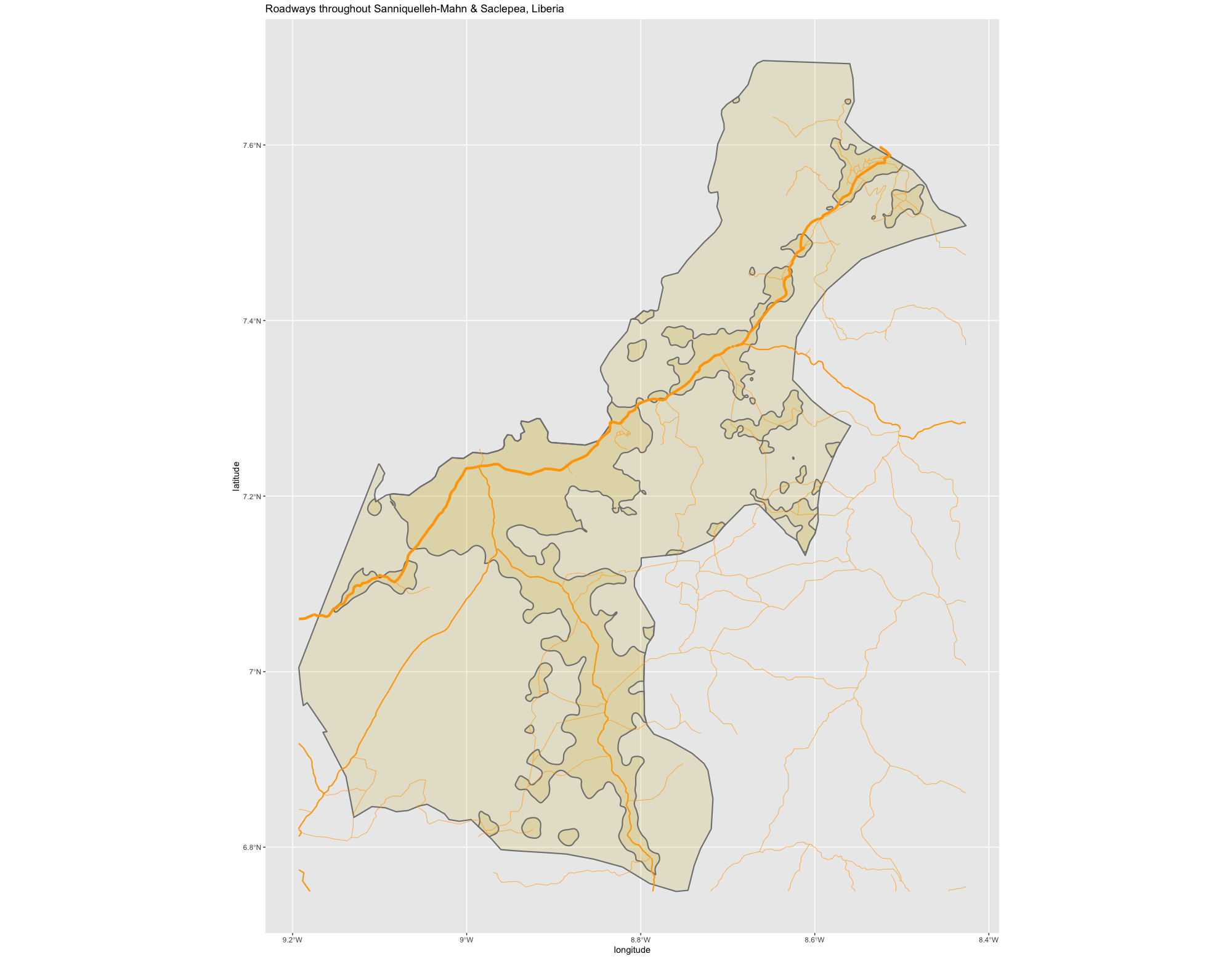
Go back to the HDX website for your LMIC and download the data that describes health care facilities. Use the read_sf() command to load the data into RStudio. Use st_crop() to crop the health care facilities to your selected adm2 or adm3 area. Use table() to identify all of the different types of health care facilities. Subset each of the health care facility types in the same manner you previously subset transportation facility classifications.
hospitals <- adm_hcf %>%
  add_command_here(add_variable_here == "hospital")

clinics <- adm_hcf %>%
  add_command_here(add_variable_here == "clinic")

other_hcfs <- adm_hcf %>%
  add_command_here(add_variable_here == "doctors" | add_variable_here == "dentist" | add_variable_here == "pharmacy")
Add each health care facility type to your plot.
ggplot() +

...

  geom_sf(data = hospital,
          size = add_size,
          color = "color") +
  geom_sf(data = clinic,
          size = add_size,
          color = "color") +
  geom_sf(data = ohcf,
          size = add_size,
          color = "color") +

  ...

  ggtitle("Access to Health Care Serivces throughout Sanniquelleh-Mahn & Saclepea, Liberia")
The previous plot will produce the following output.

Finally, add the scale that describes the size and density of each urban area. Produce the plot that describes access to health care services via transportation facilities throughout your selected and combined adm2 areas.
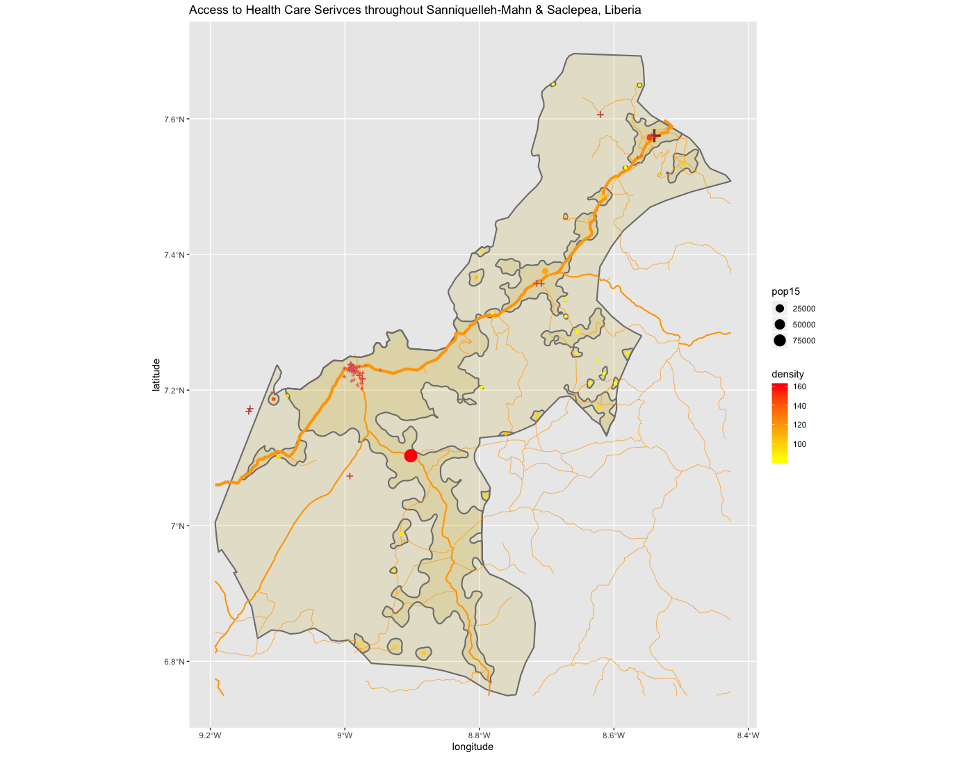
Project 3. Individual Deliverable
Upload the spatial plot that describes the de facto location of human settlements and urban areas, the center lines of classified roadways and the location of health care facilities by type throughout your selected and combined adm2, adm3 or adm4 areas.
Accompany your plot with a written statement that provides answers to the following information.
- Total population of selected and combined adm2, adm3 or adm4 areas and the total number of distinctly defined human settlements or urban areas
- A description of the distribution of sizes and densities of all human settlements and urban areas throughout your selected and combined adm2, adm3 or adm4 areas
- A description of the roadways and your estimate of the transportation networks level of service in comparison to the spatial distriubtion of human settlements and urban areas
- A description of health care facilities and your estimate of service accessibility in comparison to the spatial distriubtion of human settlements and urban areas
Each team member should be prepared to present their final draft results on Friday, November 15th during the informal group presentations. Upload your finished product to the slack channel #data100_project3 no later than 11:59PM on Sunday, November 17th.
Rendering Topography
In this last project, you will revist the de facto urban areas you defined as well as the transportation infrastructure and health care facilites you spatially located. Using your combined adm2 or adm3, you will intersect those land use, transport and health care geographies with the topography of your selected adm2 or adm3. You may recall that we used the rayshader:: package back in project 1, which we will use again, but this time will focus on its application with rasters rather than starting with a sf object.
To start, be certain you have the raster::,sf:: and tidyverse:: library of functions available for your current R worksession. Also, install and load the rayshader:: and rayrender:: packages.
#install.packages("rayshader", dependencies = TRUE)

library(raster)
library(sf)
library(tidyverse)

library(rayshader)
library(rayrender)
Use the setwd() command to make certain your working directory is set to the data folder where you saved your raster and shapefiles. Read your raster file that describes the topography throughout your LMIC into RStudio. Also read the shapefile of your adm2 or adm3s as a simple features object into RStudio. Following are my examples for Liberia.
lbr_topo <- raster("lbr_srtm_topo_100m.tif")
lbr_adm2  <- read_sf("gadm36_LBR_2.shp")
With the polygon you previously created by unioning the two adm2s or adm3s you selected, use the crop() command to crop the raster describing the topography of your LMIC. You could also mask() the topographical raster, but I am going to forego that step in favor of retaining the area within the bounding box used by the sf from my combined adm2.
combined_topo <- crop(lbr_topo, combined_adm2s)
Next you will convert your cropped raster into a matrix using the raster_to_matrix() command from the rayshader:: library of functions. When executing this function, R will return the dimensions of the matrix created. Take note of these dimensions, since you will later need them to specify the width and height, in pixels, of the image you will produce of your urban areas, roads and health care that you will then overlay your topography.

Using the sphere_shade() command from the rayshader:: library, plot your topography. Use the add_water() and detect_water() commands to automatically add water features to your plot. My initial plot is primarily rain forest, and water features aren't readily apparent. Yours may or may not have water features, depending on the location.
combined_matrix %>%
  sphere_shade() %>%
  add_water(detect_water(combined_matrix)) %>%
  plot_map()
The resulting plot is a two dimension relief of the bounding box encompassing your combined adm2 or adm3s.
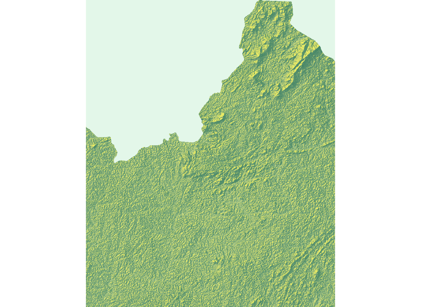
To produce a three-dimension plot of your selected area, first apply the ambient_shade() command to your topography matrix.
ambientshadows <- ambient_shade(combined_matrix)
Producing these shadows may take a few minutes, but once it is complete, you are ready to begin producing your three-dimension topographic plot. There are lots of options you can use to produce your 3D plot. Following is a basic specification.
combined_matrix %>%
  sphere_shade() %>%
  add_water(detect_water(combined_matrix), color = "lightblue") %>%
  add_shadow(ray_shade(combined_matrix, sunaltitude = 3, zscale = 33, lambert = FALSE), max_darken = 0.5) %>%
  add_shadow(lamb_shade(combined_matrix, sunaltitude = 3, zscale = 33), max_darken = 0.7) %>%
  add_shadow(ambientshadows, max_darken = 0.1) %>%
  plot_3d(combined_matrix, zscale = 20,windowsize = c(1000,1000),
          phi = 40, theta = 135, zoom = 0.5,
          background = "grey30", shadowcolor = "grey5",
          soliddepth = -50, shadowdepth = -100)
Using the render_snapshop() command, produce a three dimesnional image similar to the following for your selected and combined adm2s.
render_snapshot(title_text = "Sanniquelleh-Mahn & Saclepea, Liberia",
                title_size = 50,
                title_color = "grey90")

The sphere_shade(texture = ...) command presents other options such as texture = "desert" . To review all of the texture options, type ?sphere_shade in the console. Test each option out to determine which one best matches the physical geography of your selected area.
Return to the plot produced at the end of project 3. Use ggplot() to produce a border of your combined adm2s. Set the size, linetype and color appropriate for a border. Also set the alpha = 0 such that the plot is transparent. Notice at the end I have added several arguments that effectively remove the axes, the gridded background, labels and expands the plot itself to its boundary in order to maximize the total plot area.
ggplot() +
  geom_sf(data = combined_adm2s,
          size = 4.5,
          linetype = "11",
          color = "gold",
          alpha = 0) +
  theme_void() + theme(legend.position="none") +
  scale_x_continuous(expand=c(0,0)) +
  scale_y_continuous(expand=c(0,0)) +
  labs(x=NULL, y=NULL, title=NULL)
Use the script above to produce a similar plot for your selected adm2 within your LMIC.
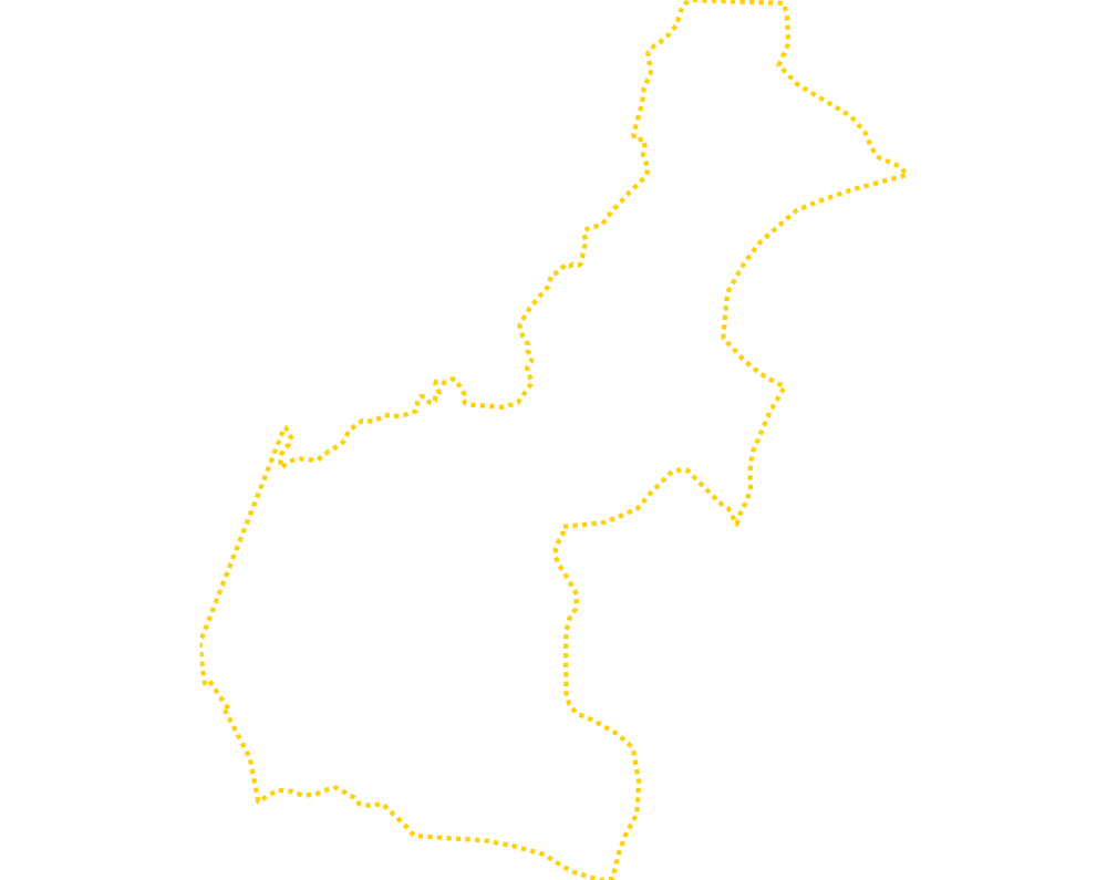
Now, instead of producing the plot in R, modify the first line of the code in order to assign the ggplot to an object.
obj <- ggplot() + ...
Then use the png() command to create your graphic object. Set the width = and height = to the same dimensions previously returned by the raster_to_matrix() command. Set the units = to pixels, and also set the bg = arugment to transparent, so only the lines themselve appear without any background in your .png file.
png("combined.png", width = 920, height = 1136, units = "px", bg = "transparent")
obj
dev.off()
After you have saved your .png graphics file to your working directory, use the readPNG() command from the png:: library and import your image. Once it has been imported to R, add the add_overlay() command, in order to overlay the dashed, gold border of your combined adm2s.
overlay_img <- png::readPNG("combined.png")

combined_matrix %>%
  sphere_shade() %>%
  add_water(detect_water(combined_matrix)) %>%
  add_overlay(overlay_img, alphalayer = 0.95) %>%
  plot_map()
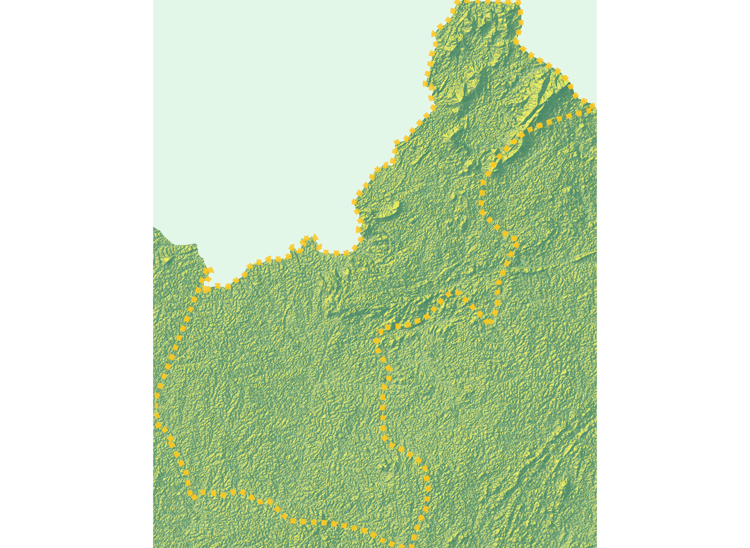
Likewise, add the add_overlay() command when producing your three-dimension plot.
combined_matrix %>%
  sphere_shade() %>%
  add_water(detect_water(combined_matrix), color = "lightblue") %>%
  add_shadow(ray_shade(combined_matrix, sunaltitude = 3, zscale = 33, lambert = FALSE), max_darken = 0.5) %>%
  add_shadow(lamb_shade(combined_matrix, sunaltitude = 3, zscale = 33), max_darken = 0.7) %>%
  add_shadow(ambientshadows, max_darken = 0.1) %>%
  add_overlay(overlay_img, alphalayer = 0.95) %>%
  plot_3d(combined_matrix, zscale = 20,windowsize = c(1000,1000),
          phi = 40, theta = 135, zoom = 0.75,
          background = "grey30", shadowcolor = "grey5",
          soliddepth = -50, shadowdepth = -100)
Modifying the alphalayer = argument will set the transparency of the combined adm2s border. Increasing the zoom = argument will move your perspective in the three-dimension plot further away from your rendered object. Modifying the phi = and theta = parameters will also alter the viewers perspective by orbiting the camera around the scene or changing the angle of the camera above the horizon. Once you plot the image, again use the render_snapshot() to save your image. If you would like to make some changes and replot, first run rgl::rgl.clear() to clear your existing rgl object.
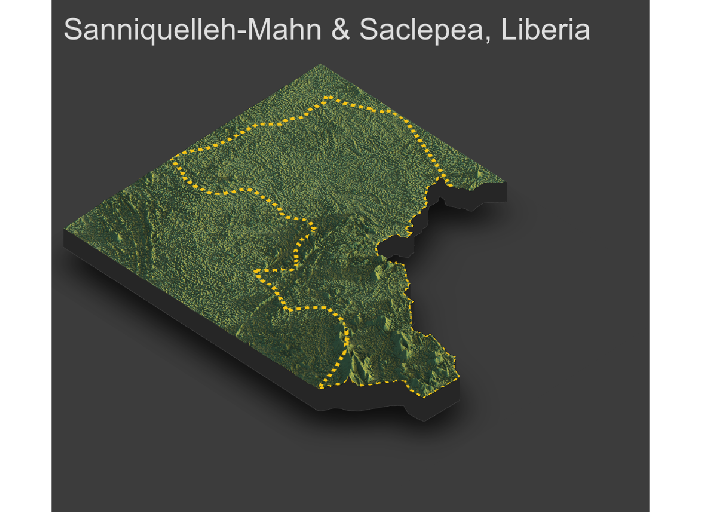
Add the boundaries of your de facto urban areas to your ggplot object and again create your .png file.
obj <- ggplot() +
  geom_sf(data = combined_adm2s,
          size = 5.0,
          linetype = "11",
          color = "gold",
          alpha = 0) +
  geom_sf(data = combined_polys,
          size = 0.75,
          color = "gray50",
          fill = "gold3",
          alpha = 0.5) +
  theme_void() + theme(legend.position="none") +
  scale_x_continuous(expand=c(0,0)) +
  scale_y_continuous(expand=c(0,0)) +
  labs(x=NULL, y=NULL, title=NULL)

png("combined.png", width = 920, height = 1136, units = "px", bg = "transparent")
obj
dev.off()
Again, run the readPNG() command to reimport your .png file as an object.
overlay_img <- png::readPNG("combined.png")
Produce your three-dimensional plot with borders and urban areas.
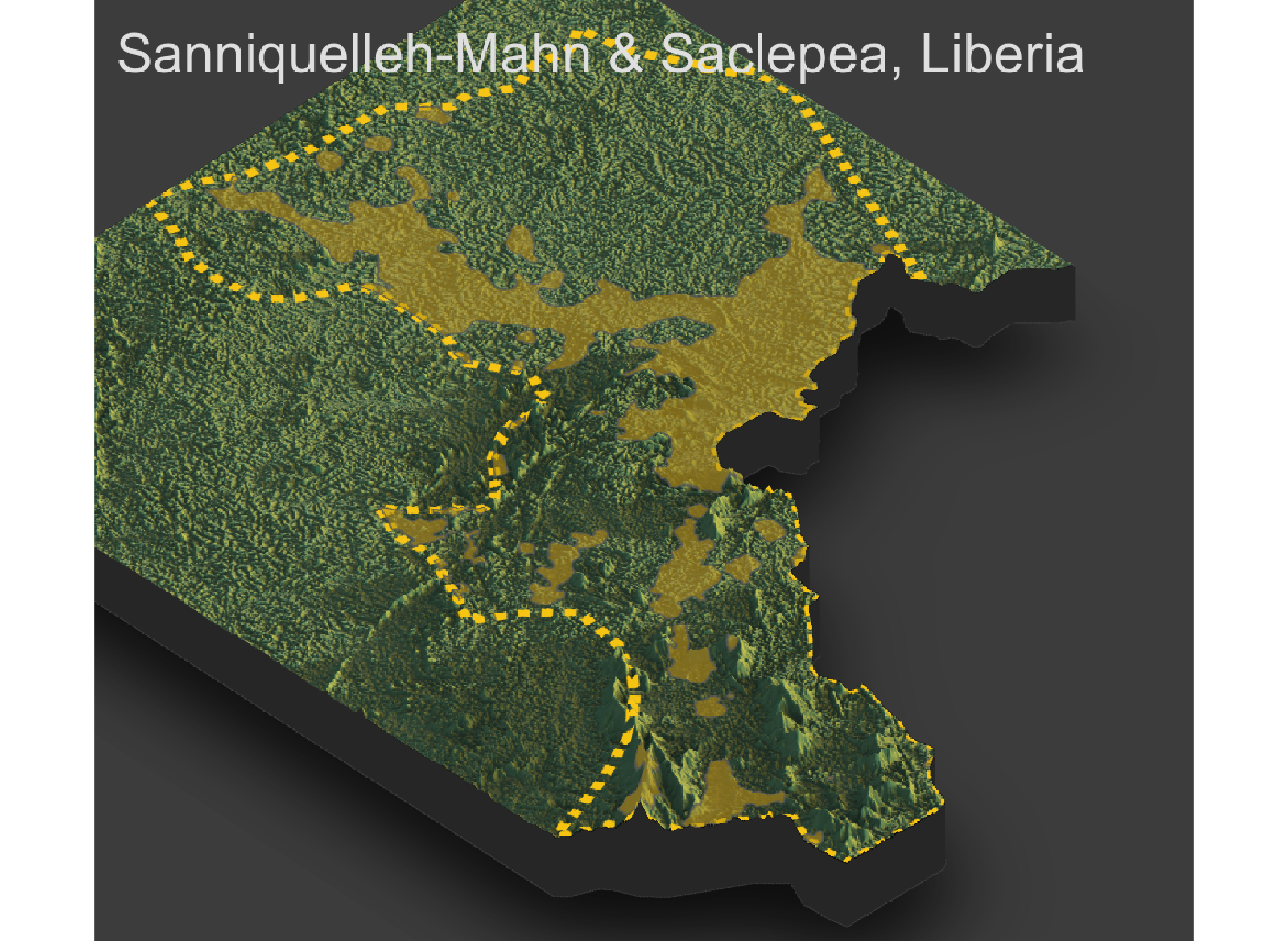
Next add your roads.

Then add your health care facilities.
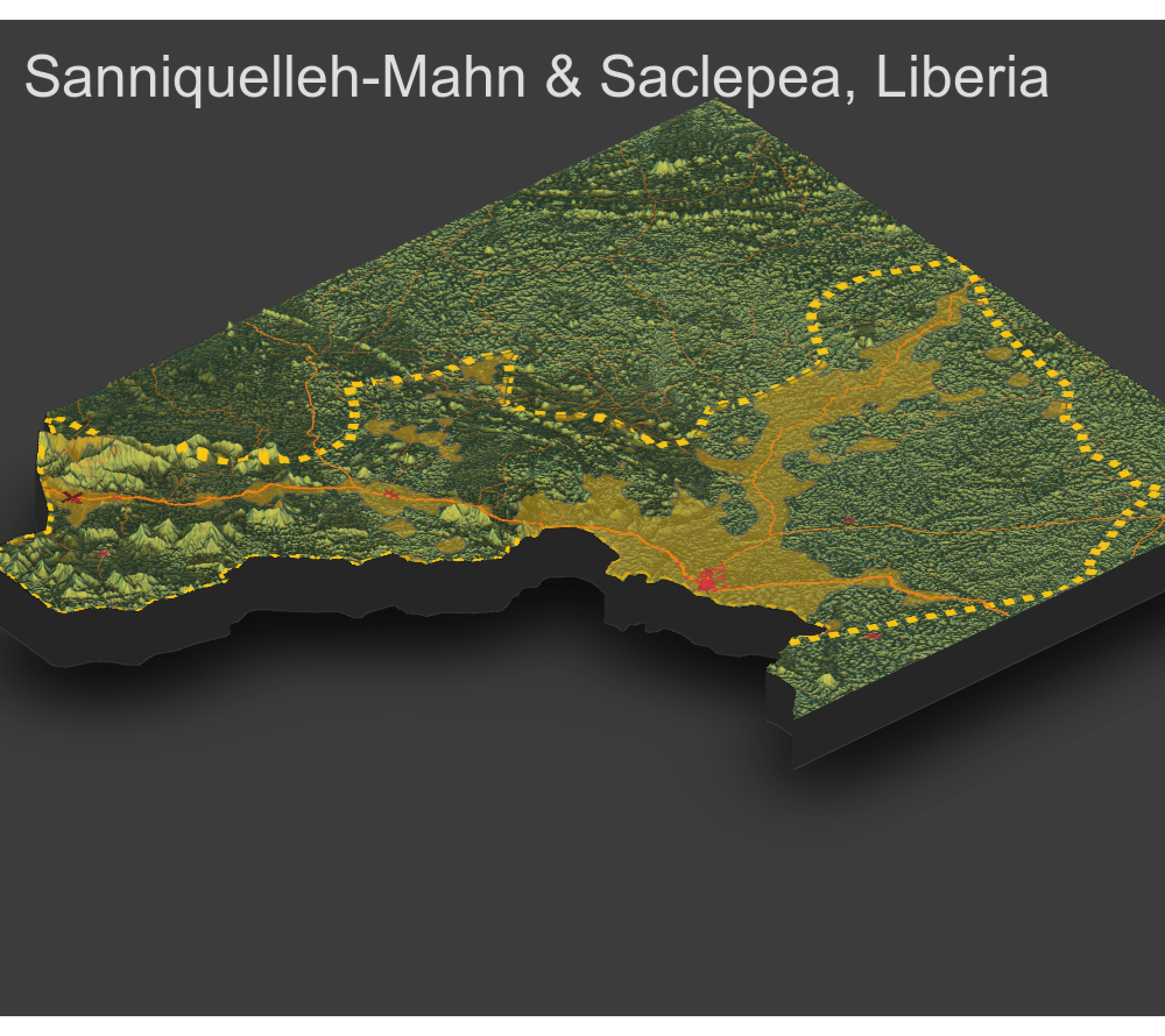
Finally, label the primary urban area. You will need to modify the x = and y = argument to properly place the label.
render_label(combined_matrix, "Ganta", textcolor ="white", linecolor = "white",
             x = 250, y = 575, z = 1000, textsize = 2.5, linewidth = 4, zscale = 10)
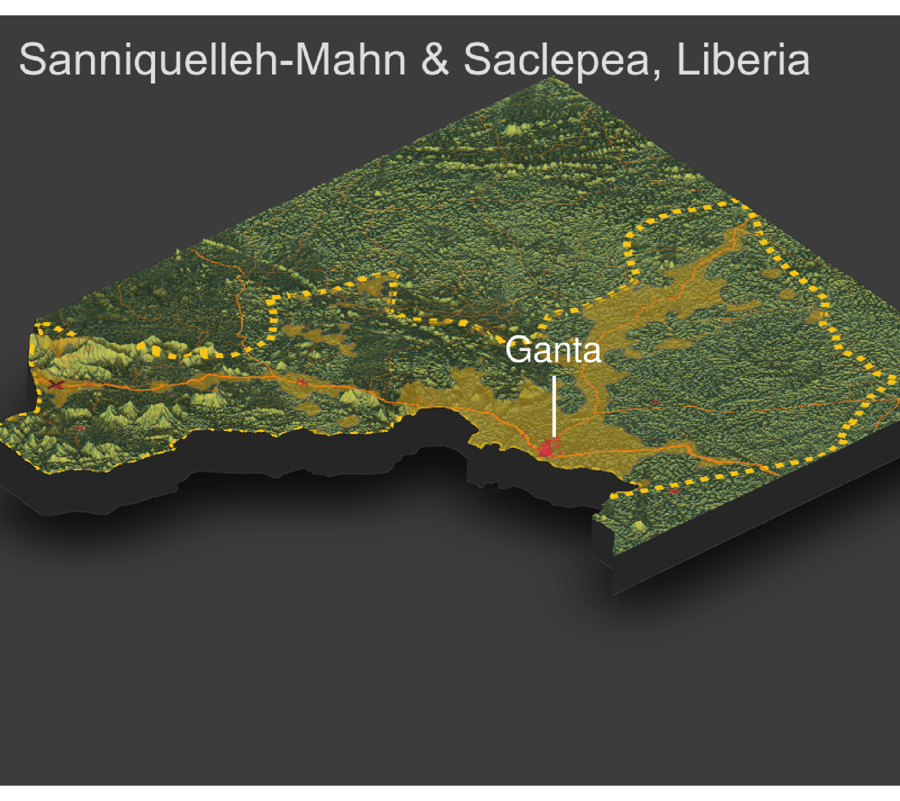
Project 4. Individual and Group Deliverable
Produce a three-dimensional, topographic plot that describes the de facto boundaries of urban areas, the center lines of classified roadways and the location of health care facilities by type throughout your selected and combined adm2, adm3 or adm4 areas. Combine your plot with each of your team members, and provide a single written statement that compares each of the selected adm2 areas, while also considering the following.
- How has topography appeared to have impacted the development of urban areas?
- How has topography appeared to have impacted the development of transportation facilities?
- How has topography appeared to have impacted the location of health care facilities?
- Has producing your three-dimensional map resulted in an interpretion that is different from your previous analysis?
Upload your group's finished product to the slack channel #data100_project4 no later than midnight on Thursday, April 30th. Your team will present an extended, comparison of your selected administrative areas within each LMIC, during the final group presentation, held on May 1st.
Chapter 2
Describe
Project 1: Site Selection
Part 1:
Creating a Geometric Bar Plot with your Simple Feature object
- Select a location. Produce a spatial statistical description of your selected areas administrative subdivisions. Also produce an accompanying geometric bar plot that also describes the population of your selected administrative subdivisions.
- Select a subdivision from within your initially selected location that will be the bases for your agent-based model. Set the boundary of your selected location such that the aggregate population is between 250,000 and 400,000 persons.
- Return to the previous exercise and repeat it, although this time produce the spatial statistical description and accompanying geometric barplot for your newly selected, higher resolution focus area with its increased scale.
- Do your best to include all administrative subdivisions available. If a simple feature object that describes higher resolution administrative subdivisions in their disaggregate (i.e. adm2, adm3 or adm4) is not available from GADM, check other source (geoBoundaries). Additionally, if higher resolution administrative subdivisions are not available, include all of the bordering subdivisions when generating your newly created units spatial description and accompanying bar plot.
Part 2:
De facto description of human settlements and urban areas
- define de facto settlement boundaries.
- Continue by further investigating your site for selection by defining de facto settlement boundaries.
- Continue by further investigating your site for selection by defining de facto settlement boundaries.
- Increase the scope of your investigation by adding an additional administrative unit or applying the previous exercise to the parent administrative subdivision.
- Apply Zipf's law
Part 3:
Description of Transport Systems
- measures of access
- system description and analysis
Part 4:
Project 1 deliverables : please include the following
- Geometric bar plots that describe the population distribution of the political subdivisions associated with your selected location. Include a justification for your selection and a basic description with your plot.
- Plot of the de facto settlement boundaries with geometric measures of population and density for all locations. Include linear descriptions of all transportation facilities. Also, include a description and analysis of the system of settlements that populate your selected location.
- Provide an analysis of the system of settlements sizes and relative location to one another.
- Provide an analysis of the transportation network and its capacity to facilitate access across your selected area.
Project 2: Generating Synthetic Populations
Part 1
- Visit the DHS data site, and select a standard DHS survey dataset to obtain.
- Register with DHS and login. Review the DHS video on how to create a new project, request access to DHS data for your selected study area, and to provide a description of your research (study) area.
- Post your study description, including your research question, research design and data analysis plan to your GitHub page and link it to you index. The study description should be more than 300 but not less than 2500 characters in length.
- Select a recent standard DHS survey and download the household and individual datasets. Using the stata format (.dta) for import to RStudio typically works fine.
- Review:
- DHS report
- questionnaire
- survey design
- .DO file
- Import households survey from DHS dataset
- Identify:
- Survey weights
- Number of household members
- Location of your selected research area
- Gender of household members
- Age of household members
- Post results to your GitHub pages site and link in your index
Part 2
- Import your DHS data
- Identify predictor variables within your dataset
- Stretch goal: import DHS cluster GPS coordinates and randomly distribute
- Clean DHS survey data for use
- Randomly locate each survey observation using a spatial distribution
- Convert and join predicted household locations with DHS household data
- Review stretch goal progress
Part 3
- Review methods for cleaning DHS data based on each select household survey
- Review survey design
- Transform survey weights
- Distribute households at adm0 & adm1
- Join spatial and survey data
- Join spatial and survey data
- estimate error
- analyze adm1 data
- disaggregate from households to persons
- Train, test & predict
Project 2 deliverables :
- Please upload and provide a link from your GitHub index to a 3 to 4 page project report that analyzes the synthetic household and person population you generated. Include arguments that address the following aspects from your work.
- Provide a written description of your selected household survey including the number of household and person observations as well as the variables in your source data.
- Provide a written description of your spatially located households at the adm0 level of your selected location, including how you located each household, generated the household structure including demographic attributes of persons, and the percent error calculated. If you faced computational issues at the adm0 level when attempting to pivot from households to persons, describe those limitations.
- Provide a written description of your spatially located households at the adm1 or adm2 level of your selected location, again including how you located each household, generated the household structure including demographic attributes of persons, and the percent error calculated. Further analyze your synthetically generated households and persons with regard to percent error. Do you think this population is more or less accurate than the one generated at the adm0 level? What could you have done to improve your measures of accuracy?
- When compared to a randomly generated synthetic population that describes the demographic attributes of households and persons, does yours more closely approximate reality? How is yours an improvement over a synthetic population that was generated in accordance with complete spatial randomness? Generate plots and incorporate results from your work as evidence in support of an argument that the synthetic population you generated is a good approximation of the reality that existed in your selected location at that given time.
Project 2: Generating Synthetic Populations
Part 1
- Import de facto settlement boundaries from project 1
- Import synthetic households and persons from project 2
- Create voronoi tessellations
- Introduce gravity model
Project 3 deliverables :
- Please upload and provide a link from your GitHub index to a 3 to 4 page project report that analyzes migration and movement at your selected location. Include analysis that addresses the following.
- Provide a written description of the analysis you conducted of the gravity model for London. Additionally, incorporate the Garcia et al. paper into your description while introducing your the migration data for your selected country. Supplement your introduction with spatial plots that describe in/out migration by adminsitrative subdivision.
- Produce an origin-destination matrix and include a portion of it as an exhibit in your write-up. Be sure to identify the number of rows in your data frame while also including the following.
- Names of origin and destination administrative subdivisions
- Distances between all locations
- Migration flows between all locations
- An additional variable that describes all origin and destinations to be used for further specification of a gravity model (one option you could use is to select night-time lights from WorldPop)
- Geometric description of all origin and destination center points
- Describe your OD matrix and how it is used to model migration across the administrative subdivisions that comprise your selected location.
- Produce an animation of migration and elaborate on how your OD matrix and gravity model could be integrated with your simulation.
- How would you modify the number of points departing from each origin?
- How would you modify the time variable? What scale is the temporal dimension at this level?
- How would the gravity model update these attributes in order to produce a different simulation of migration that more closely approximates reality?
- At the level of your selected, higher resolution administrative subdivision (where you produced de facto descriptions of settlements), use the center points of each settlement to produce a tesselation of voronoi polygons. Similar to your analysis of the higher level administrative subdivisions, address the following.
- How would you produce an OD matrix of these higher resolution entities? Which variables would you include? Are you lacking any data that would improve upon your model results?
- How would you modify the number of points departing from each origin? How would you determine each points destination?
- How would you modify the time variable? What scale is the temporal dimension at this level?
- How would the gravity model update these attributes in order to produce a different simulation of migration?
- How would you go about integrating migration and transport activities at the differing geospatial and temporal scales of these hierarchical levels?